A minimalist website design trend isn’t likely to end anytime soon. Simple, uncluttered sites will never go out of style.
Simple minimalist web designs provide the perfect layout for highlighting a singular objective for a page, or to drive users neatly through your sales funnel.
But how do you create a website with minimalist designs? Which websites have incorporated these design principles well?
In my latest article, you will learn vital principles in web design that improves not only your user interface (UI) and user experience (UX), but helps to also improve conversions.
Minimalist design became popular in the 1960s with a focus on geometric shapes and forms. Over time, the concept evolved into the minimalist websites we see today.
The uncluttered, sharp lines of a clean web design is always aesthetically pleasing. However, some artists nail the look better than others.
Here are six examples of clean web designs we found that set the standard for a minimalist website.
1. Limit Options
What is the goal of your page? When someone lands on your site, they should have limited options on what to do next. You want to move your user through the sales funnel without any distractions.
Try to stick to a single call to action (CTA) or only a link or two. You can always add something in the footer or link the user to your home page via your logo/home link.
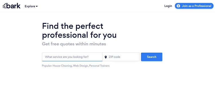
Bark is a site allowing people from a local community to search for professional services near them. Note how simple and uncluttered their landing page is. The background is white and they use black text and blue CTA buttons.
When someone lands on their page, they have the option to search for a service in their area or sign up as a professional offering services. There isn’t any extra stuff to confuse the user or take them off down rabbit trails.
2. Line Things Up
Clean designs tend to be fairly symmetrical. While it isn’t impossible to have a clean asymmetrical website, elements still need to align in some way and fit within certain parameters.
A grid design is one way to ensure the user’s eye goes in the pattern you want it to. Most people read sites in a Z pattern, starting in the upper left corner and working their way down.
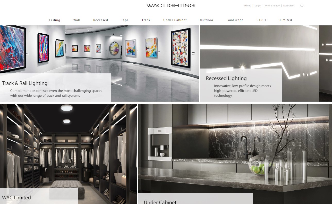
See how WAC Lighting’s layout is set up on a grid. Note how the images align along horizontal lines. At the same time, it isn’t 100% symmetrical, because the size of the images and boxes varies slightly. Still, the overall effect is very clean and uncluttered. There’s nothing to distract the reader from viewing the project images.
3. Use Video
You can say a lot with very little when using video. People love to stream videos and you can use them in your web design as a hero background or an option to gather additional information.
Some of the video types you can use include explainer videos, how-tos and even entertainment. Think about the message you’d like to send your site visitors and embrace the type of content working best to engage them.

Source: Because Creative Experiences
Because streams a video background in their header. It shifts through simple images of people engaging in different activities to show the varied people you might reach through your digital content. This immediately communicates what they do in an engaging and evocative manner.
The video takes center stage and the rest of the elements are kept minimal, including a headline, calls to action and a live chat button.
4. Focus on Hero Images
If you want to make a bold impression on site visitors without adding a lot of clutter, focus on an amazing and unique hero image in the header. A single image sets the tone without adding too much distraction.
Your hero image should embrace clean design as well, limiting the number of colors and objects within the photograph.
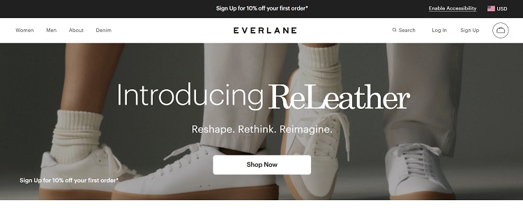
Everlane uses a simple hero shot with people wearing white pants, white socks and white shoes. The clean lines of the legs and laces fade into the background, giving the user momentum to focus on the CTA button and the headline info.
5. Perfect Navigational Hierarchy
The navigation of your site can make or break your clean design. If your users don’t know where to go after they land on your website, they may just bounce away. You can make their decision easy by limiting the top categories and adding subcategories as needed.
If your site grows exponentially, you may need to look at a mega menu that breaks things down even more with main categories, subcategories and sub-sub categories.

Lifehack does an excellent job keeping their content simple and easy to browse by embracing a clean navigation hierarchy. Note they have five categories across the top. As you mouse over each, you see additional options. They’ve even broken down topics into the most common ones they cover on the site.
6. Embrace White Space
Clean web designs tend to have quite a bit of negative space. One way to isolate the elements you want users to click on is by setting them off to themselves. You don’t have to fill every available slot in your design. Leave things sparse for an uncluttered look.
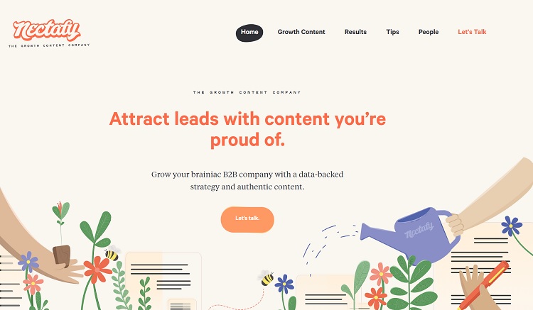
Nectafy leaves plenty of blank space around the elements on their landing page. Note how the CTA button is set off to itself and pops because there is nothing close to it. Even the menu has plenty of space between options.
How Can You Clean Up Your Web Design?
Even if you aren’t ready for a complete redesign, you can make your site have better flow by deleting unnecessary clutter and adding more space around objects. Look for ways to clean up what you already have and put the focus on the objective of each page.

Eleanor Hecks is editor-in-chief at Designerly Magazine. She was the creative director at a digital marketing agency before becoming a full-time freelance designer. Eleanor lives in Philly with her husband and pup, Bear.