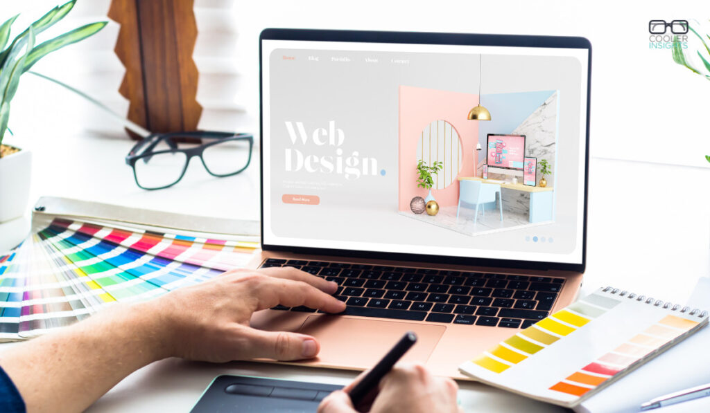
Textures in web design add depth to the look of a site and create visual interest without overpowering the aesthetic. The best website backgrounds do not grab attention but add to the site’s overall user experience.
However, textures appear in places other than backgrounds. They are noticeable in photos, accents and call-to-action buttons.
The best way to learn how to utilize textures in web design is by studying how other designers use them.
Improve a layout by choosing the right textures, considering contrast, showcasing products, optimizing for speed, balancing the look, keeping elements accessible and improving user experience.
Check out the following ideas and examples of excellent design using textures.
1. Choose the Right Textures
Just adding texture does not do much for the aesthetics of the design or meeting consumer expectations. Designers must match the look and tone of the rest of the site. Consider the colors and overall flavor of the design already there.
For example, if a site has a vintage look, it might use a background resembling vellum paper. If elements have a modern touch, choose a texture resembling modern-day living. Consider the tone of every image.
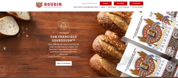
Source: Boudin Bakery
San Francisco’s Boudin Bakery showcases its famous sourdough bread against the backdrop of wood grain. Note how the slider has different textures but always focuses on its product — the food.
Adding texture to any background or image is possible, but be aware of how they all tie together and ensure the hues do not contrast.
2. Consider Contrast

Whenever adding texture to a design, consider how text and other elements might appear on top of it. For example, the headlines might disappear with a busy pattern.
Designers have many options, including putting a transparent box partially over the background to create a solid space for text. It may be necessary to play around with different combinations until finding one that is visually appealing and readable. A light background typically requires dark text and vice versa.
3. Showcase Products
Using textures in web design to showcase beautiful products is also possible. Share some images of texture to draw interest without detracting from a more minimalistic design. Add a variety of textures to a product description to show what is available.
A design should become almost a tactile experience when including these details. Imagine walking into a furniture showroom — they tend to have sample material books. A website needs the same feel digitally. Show them samples of what they might purchase.
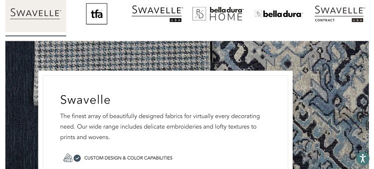
Source: Swavelle
Swavelle sells gorgeous fabrics for home design. To showcase some of its options, it layers images of material behind a white text box. The design catches the eye while still keeping the body text readable.
4. Optimize Images
When adding images versus a solid-colored background, the site might take longer to load. Visitors are impatient and may bounce away. Optimize images to create faster loading times when adding texture to designs.
The resolution necessary for web viewing is much less than for print. Reduce the size by compressing pictures. It is always possible to revert to a higher-pixel image, so try the smaller ones first and see how they look on various screen sizes.
5. Use Sparingly
Although texture in web design adds a lot of interest and engages readers, modern trends call for a more simplistic design. Users enjoy white space and less clutter. Whenever adding texture, limit the additions to a few images, the background or other spots. Do not try to do too much at once or it might overwhelm visitors.
When in doubt, create a split test and see how the target audience feels about a design with more texture versus one without.
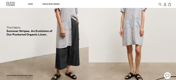
Source: Eileen Fisher
Eileen Fisher adds texture with the floor and in the images of the products. All the texture mixes with solid blank space to balance single colors and patterns. Notice the ample white space in the header and footer.
7. Improve User Experience
Textured web design can improve user experience if one uses it strategically. Consider where the layout has lulls. Do not let users pause for a second to consider bouncing away. Adding a bit of contrast and pattern in certain cool spots of a site could keep people scrolling a bit longer.
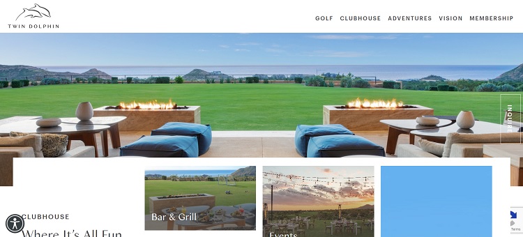
Source: Twin Dolphin
Twin Dolphin shows how to incorporate a more three-dimensional-textured website design look without changing the site’s user flow. It provides parallax scrolling to transition from one section to the next. The hero images stretch across the screen to break up the monotony and the smaller images have white space to set them apart.
Incorporate Textures in Web Design Today
After seeing the various ways to utilize textures in web design, give texture a chance and see if it increases customer engagement and retention. Add a few elements to a site and test them for results. The completed site will have a modern, exciting look that keeps people on the page.

Eleanor Hecks is editor-in-chief at Designerly Magazine. She was the creative director at a digital marketing agency before becoming a full-time freelance designer. Eleanor lives in Philly with her husband and pup, Bear.

Hello,
Textures in web design add depth and visual interest to the look of a website without going overboard with aesthetics. The best website backgrounds don’t draw attention, they enhance the overall website.
Thanks for sharing, have a nice day.
This article provides an excellent guide on incorporating textures into modern web design! In today’s digital world, where minimalism often takes the spotlight, it’s refreshing to see how textures can add depth and personality to a website. I found your practical tips, such as using subtle textures for background and paying attention to contrast, particularly valuable.