
Which party will you vote for? (courtesy of Channelnewsasia)
Today is the last day of campaigning for all political parties for Singapore’s General Election 2015 (GE2015).
Candidates in the political parties will go all out in their rally speeches to inform, persuade and entertain their audiences. Their objective is to motivate, inspire and cajole the electorate to “vote wisely”.
As the hustings grow to their feverish finish, emotions run high. Every Singaporean eligible to vote is talking about the elections. With 2015 being the golden jubilee for Singapore, pundits have proclaimed that the outcome of the GE2015 could be a watershed event for Singapore.
One of the major issues being aired by political parties was the one on the low wages and high cost of living in Singapore. A common grouse heard was that we have allowed too many foreigners to come into Singapore, thereby depressing our salary levels while the prices of everything from food to housing have grown astronomically around us.
Singapore has also been labelled as the “World’s Most Expensive City” by a report from the Economist Intelligence Unit (albeit for expats).
Being naturally curious, I decided to do a little investigation. While I am not an economist nor a CPA or CFA, I thought it would be useful for us to look at some statistics and figures to decide for ourselves what the real picture is like.
Singapore’s cost of living in the last 10 years
The cost of living in any country is normally calculated by what economists call the Consumer Price Index (CPI). According to Investopedia, the Consumer Price Index (CPI) is…
“A measure that examines the weighted average of prices of a basket of consumer goods and services, such as transportation, food and medical care. The CPI is calculated by taking price changes for each item in the predetermined basket of goods and averaging them; the goods are weighted according to their importance. Changes in CPI are used to assess price changes associated with the cost of living.”
In Singapore, the breakdown in the basket of consumer goods and services are as follows:
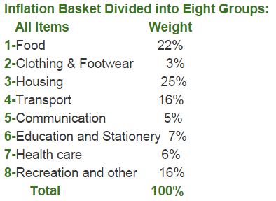
Source: GDP Inflation
In Singapore, the Consumer Price Index or CPI measures changes in the prices paid by consumers for the above items. We can see that the most important categories are housing (25 percent of total weight) and food (22 percent) followed by transport (16 percent).
So how does the CPI for Singapore look like over the past 10 years?
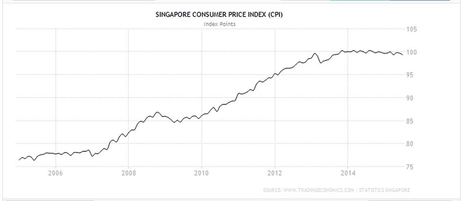
Source: Trading Economics
According to the chart above (calculated to date using the tool here), we can tell that prices have risen by between 23 to 24 percent over the last 10 years. While it may appear scary to some, our CPI has actually stabilised and fallen slightly in the past year or so (2014 to 2015).
Singapore’s inflation rate over 10 years
This brings us to the related topic of inflation.
If you read the newspapers or follow the news regularly, you would have heard of this term inflation. Investopedia offers a good layman’s definition of the term as follows:
“Inflation is the rate at which the general level of prices for goods and services is rising and, consequently, the purchasing power of currency is falling.”
So how was Singapore’s inflation rate like?
Well, if you look at the chart below, you would have noticed that inflation varies from year to year. Our average (or mean) inflation rate over the past 10 years was probably about 2.3% to 2.4% per annum.
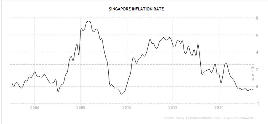
Source: Trading Economics
What’s interesting/worrying though is that we are actually in a period of deflation right now, with prices of consumer goods and services falling rather than rising. This could be due to the continued strength of the Sing dollar compared to other regional currencies (especially the ringgit).
What if we expanded outwards to the world?
Well, take a look at this infographic from Wikipedia outlining global inflation rates in 2012/13.
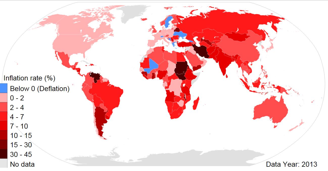
Source: Wikimedia Commons
From the chart above, Singapore’s inflation rate of between 2 to 4% in 2013 doesn’t actually look that alarming. While the inflation rates of Western countries like Europe and the US appear lower than us, those economies were still uncertain in 2013 (inflation is often pegged to economic growth). Often inflation rates correspond to economic growth, job creation and wages.
Gross monthly income in Singapore (2004 to 2014)
This brings us to the important issue of pay. The question is this:
“Are we paid enough to cater to our rising cost of living?”
Let us look at some indicators from the Ministry of Manpower. There are two tables here:
- Median gross monthly income from work
- Change in median gross monthly income from work
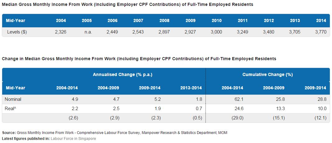
Source: Ministry of Manpower
In the above table, gross monthly income from work refers to income earned from employment, ie
- Employees: gross monthly wages or salaries before deduction of employee CPF contributions and personal income tax.
- Self-employed: average monthly profits from business, trade or profession (i.e. total receipts less business expenses incurred) before deduction of income tax.
There are two figures above, nominal and real. The nominal changes are the year-on-year change in the amount, while the real change accounted for corresponding increases in the CPI (ie it is deflated by the corresponding growth in the cost of living).
What the above figures show is that average income growths have outpaced inflation over the past 10 years by 2.2% (2004 to 2014). In other words, working residents gained a slight improvement in their pay relative to the increases in the cost of living.
Singapore’s household income versus expenditure
OK, so now we know that individual wages have slightly improved compared to the cost of living.
What about each household? With the rising costs of tuition, food, transport, milk powder, and diapers, would families be worse off now than they were 10 years ago?
If we looked at the household expenditure based on the Department of Statistics figures, we would see that it has increased from about $3,352 in 2002/03 to $4,724 in 2012/13 (ie over 10 years). If we only looked at figures from 2007/08 to 2012/13, it worked out to about 4.4% per year.

Source: Report on Household Expenditure Survey (2012/13)
What about household income?
If we compared across that same period of 5 years, it would appear that average monthly household income has increased from $6,179 in 2002/03 to about $10,503 in 2012/13. This worked out to about 5.3% each year from 2007/08 to 2012/13.

Source: Report on Household Expenditure Survey (2012/13)
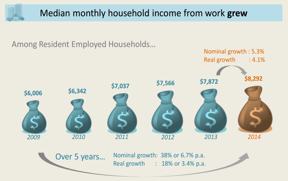
Using more recent figures from Department of Statistics (see infographic below taken from the “Key Household Income Trends, 2014” report), we would see that the median monthly household income grew from $6,006 in 2009 to $8,292 in 2014.
This was an increase of 6.7% per annum (nominal growth) or 3.4% per annum (real growth). The leap from 2013 to 2014 in real growth in monthly household income of 4.1% could probably be attributed to the slowing inflation rate in 2014.
Source: Report on Key Household Income Trends (2014)
Government transfers to help Singapore’s poor
OK, so the average household is keeping itself afloat and even bringing home a slight surplus over the past 5 to 10 years.
What about the poorer households? I am talking about those who live hand-to-mouth in 1 and 2 room HDB flats.
Well, first you need to understand this thing called Government transfers. In economics, this can be understood as a redistribution of income in a system, often for social reasons.
In Singapore, various schemes were introduced to assist individuals and households (you can find some of them in MOF’s website here). They include the Workfare Income Supplement, GST Vouchers, rebates on utilities, service and conservancy charges, and Pioneer Generation Package and others.
Once again, drawing from the Department of Statistics, I have extracted the table below from their “Key Household Income Trends, 2014” report. Have a look at the figures presented here.
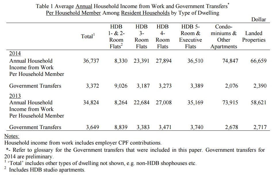
Source: Report on Key Household Income Trends (2014)
From the table above, we can tell the following:
- Government transfers to the poorest residents in 1 and 2 room flats were more than their annual household income. If we add both together, it amounted to over $17,000 a year.
- Folks living in landed properties and condominiums got a much lower share of Government transfers.
- Majority of residents who live in 3 to 5 room HDB flats get between $3,200 to $3,400 per year in transfers. This worked out to about 13.6% (3 room flat dwellers), 11.7% (4 room flat dwellers) and 9.3% (5 room flat dwellers) of annual household income.
Some concluding remarks
From the above analysis, we can summarise that the majority of Singaporean households and income earners could meet and exceed their costs of living over the past 5 to 10 years. While costs of living have increased over the past decade, incomes have improved by a bigger margin for the majority of workers and entrepreneurs.
Globally speaking, the increases in our costs of living have been measured while keeping pace with economic and job growth. Relatively speaking, inflation in Singapore has not been as wildly swinging as other economies.
For the poorer households and the economically marginalised, the Government has put in place social transfers in the last two years to improve their total household incomes or reduce their household expenses. This could be as much as or even above the incomes of the poorest households living in one to two room flats.
Note that I would like add the caveat that my analysis was taken from a layman’s perspective. As such, there will be limitations. Hence, I encourage those who wish to study this more deeply to scrutinise the statistics from their original sources above.
I hope that the above helps to give a clearer picture of what our true wages versus costs of living are taken as a whole. Hopefully, this will give us greater clarity as we step into the polling booths this Friday (11 September).