
They say first impressions are everything.
In the online world, you have just a few seconds to make an impact before the user bounces away to some other distraction.
In 1991, Tim Berners-Lee published the first website. Today, there are approximately 1.72 billion websites.
However, not all websites are the same. Many are not actively maintained nor thoughtfully designed.
If you think you can just wing it with a free website Content Management System (CMS) and use common themes, think again. You’re competing against sites similar to yours, plus ones with major entertainment value, such as social media giants.
Grabbing the user’s attention and sustaining them is vital. Or they may leave and never find their way back to you.
Fortunately, there are some actions you can take to make an impact on first-time visitors:
1. Add an Introductory Video
Words take time to read, and you have mere seconds to grab the consumer. An introductory video captures attention and gets your message across much faster than words alone. People enjoy watching videos online. It’s a quick way to absorb information and learn about a product or company history. Your introductory video can tell your brand’s story, introduce a new product or explain your unique value proposition (UVP).
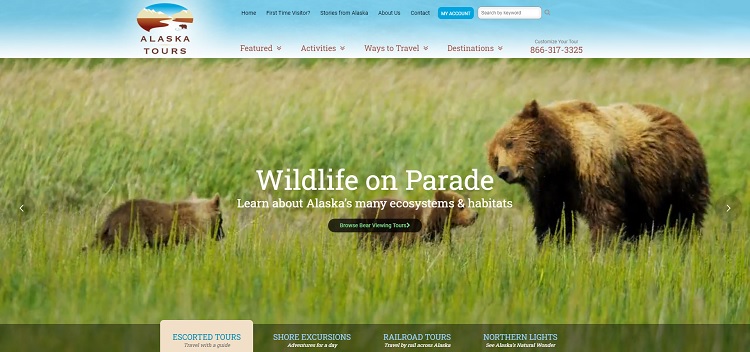
Alaska Tours utilizes a hero video to introduce some highlights from their tours.
You’ll see a mama bear and her babies in a field, glaciers caving into the ocean and images of the northern lights. Superimposed over each video is a link to get more information on the tours with those highlights.
2. Choose the Right Color Palette
Think about what colors represent your industry. If you sell eco-friendly products, greens and browns might be suitable choices. Consider the psychology of colors. Different hues trigger various emotions in the viewer. If you want to create excitement, you might go with a red call to action (CTA) button. If you’d like to show your dependability, dark blue is a smart choice.
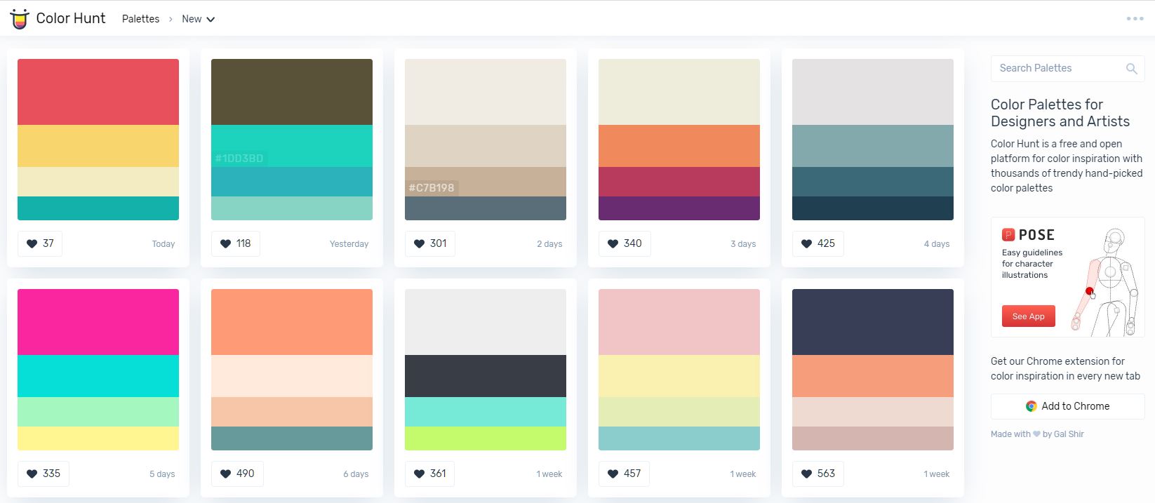
You can use free tools like Color Hunt to generate the right color palette for your website. Try it and see how it works!
Make sure that you remain consistent throughout your website with whatever palette you choose to go with. You should also use similar colors on social media and in print advertising.
3. Improve Your Call To Actions (CTAs)
Your CTA should be one of the first elements users see when they land on your page. Some people will already be several steps into the sales funnel and will want to move forward rapidly. Making your CTA easy to find helps them skip ahead without going through all the introductory information on a follow-up visit.
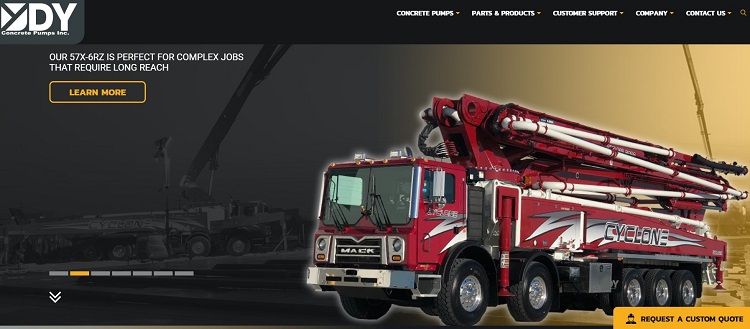
DY Concrete Pumps features a bright yellow CTA button above the fold on their landing page. Your gaze immediately goes to it. Note the language with the command to “request a custom quote.” The words show the user precisely what happens when they click on the feature. Those who are ready to get pricing information can skip ahead.
4. Hook Onto Social Media
It’s nearly impossible to have a successful online business without at least some presence on social media.
Look for ways to integrate your social networks with your website. For example, you could add a feed in the sidebar, featuring the most recent posts. Another idea is including links so people can follow you on their chosen platform.
Beyond this, make sure that you include social sharing buttons on your website, especially on your blog articles. These could help to improve social sharing on your web pages.
You could also simply ask for likes and shares on your blog content. Your fans are your best chance at word-of-mouth marketing.
5. Add Your Logo
Have you ever landed on a page and been unsure about what company it belongs to?
You want people to look at your logo and immediately associate it with your message and your company. Use the logo where it is easily seen and expected. Make that your first step in designing your website.
The most common placement is the upper left corner in the page’s header. Some sites also place it in the top center of the page.
Make sure you have a style guide highlighting when and how to use your logo. Create several versions for different backgrounds. What looks good on a light background may not appear the same on a dark background. The logo should also scale for different sized screens, so even mobile internet users see it as you want it to appear.
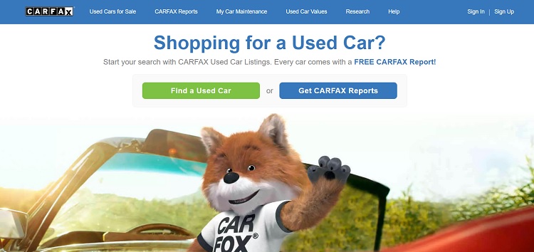
CARFAX does a good job of placing their logo against a contrasting background. Their emblem pops and catches your attention no matter which webpage you’re on. Since their name is their most powerful branding tool, this technique works well for them.
Read this article to learn how to design a logo even if you’re not a designer.
6. Create a Navigational Hierarchy
When people land on your website for the first time, they’ll look to your navigation to orient themselves. Hence, your navigation bars must help to direct them to the right pages in the simplest and most intuitive way possible.
You should include a home button or make your logo clickable to the homepage. A home feature gives people a path back to the front page no matter where they land.
Your next focus should be on your main categories. Limit them to five or six so that your user doesn’t feel overwhelmed. You can always add subcategories under each category or choose a mega menu for expanded options.
Here’s a good example of a website with a good navigational design, where the different categories are easily accessible through the different menus and sections.
In Short, Focus on Usability
Your website is only as good as the user experience (UX). If customers feel disoriented, you’ll lose them.
If they aren’t sure what the primary goal of the page is, they’ll bounce away. Think about the purpose of each page and make sure you’re guiding users through the sales funnel. Cut anything that clutters your pages and doesn’t serve a purpose. With a little attention to detail, your site will be one that wows anyone who enters.
PS – If you need help to select the right Singapore web design company, have a look at this resource here.
(Read more about designing a high converting website here.)
Lexie is a graphic designer and marketing enthusiast. She loves checking out local flea markets and taking her goldendoodle on hikes. Follow her on Twitter @lexieludesigner and check out her design blog, Design Roast.
Great tips!, This content is very very great content, I got really good information from this content and it helps me a lot, I hope it can help many people like me.
Great post!! It is really an informative article. A clean and straightforward layout enhances your website’s traction. However, most business owners may not precisely know what a clean and detailed design means. This means a solid colour scheme, a simple navigation bar and easy to read font. Also, there is an equal sign of the same template layout for all the pages. Thanks for sharing these ideas with us.