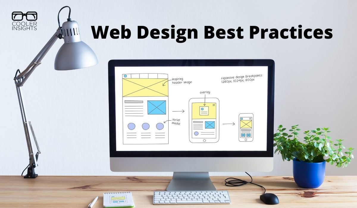
Updating your business website takes time and money. The last thing you want is a site that is so trendy that it has to be revamped in a few months!
Fortunately, we can look ahead to some of the trends and figure out the best practices for web design for the next 24 months or so.
According to the most recent information from Internet Live Stats, there are approximately 1.9 billion websites online. However, the number changes rapidly, going up by the millisecond.
If you want to stand out in a noisy digital world, you must make sure your site is user-friendly and current.
You’ve likely already considered some of the factors listed below in your web design standards, but others may be new to you. Here are the things we think will stay for at least two years or grow in usage.
1. Choose Beautiful Typography
Your typography needs to go beyond the overused Times New Roman. At the same time, it needs to be easy to skim and convert well on different screen sizes. Look for fonts that adapt to a variety of browsers and read the same on everyone’s systems. It places the emphasis where they want it and makes the design modern without affecting readability.
2. Choose the Right Colour Scheme
Colour trends come and go. If you try to stay too current with your colors, you risk making your design look dated.
It’s much better to choose a colour palette that matches your brand personality.
While the hues may be out of style here and there, they’ll come back soon and you’ll establish a brand identity people recognize. Customers will know they can rely on you to be consistent.
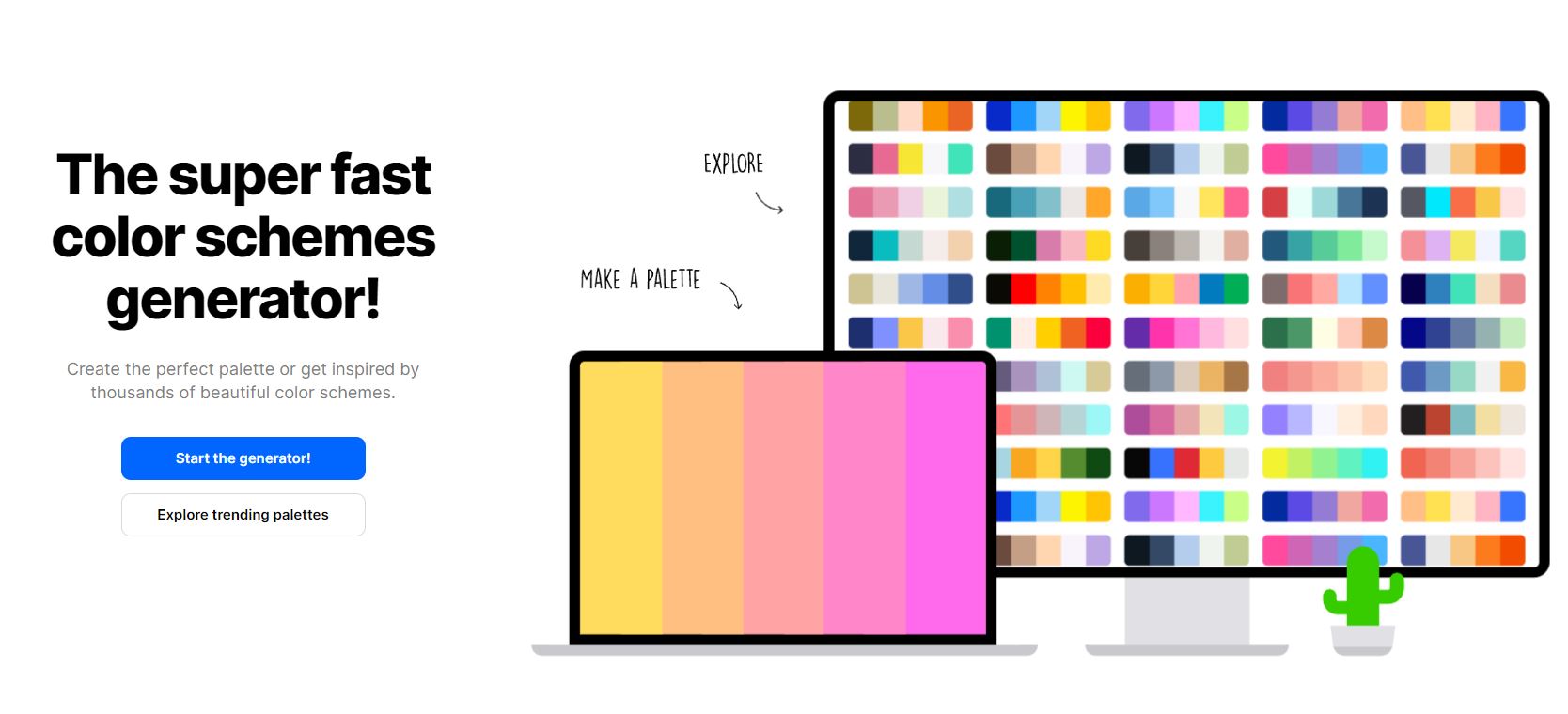
Here’s a useful resource to pick the right colour palette for your website.
3. Make Contact Easy
Today’s customers want to speak to someone immediately and they want to know they can reach you should they have an issue with their product or service.
List a phone number in an obvious location, add a live chat, make your forms easily accessible. The faster and easier it is for your potential customer to reach you, the better it’d be!
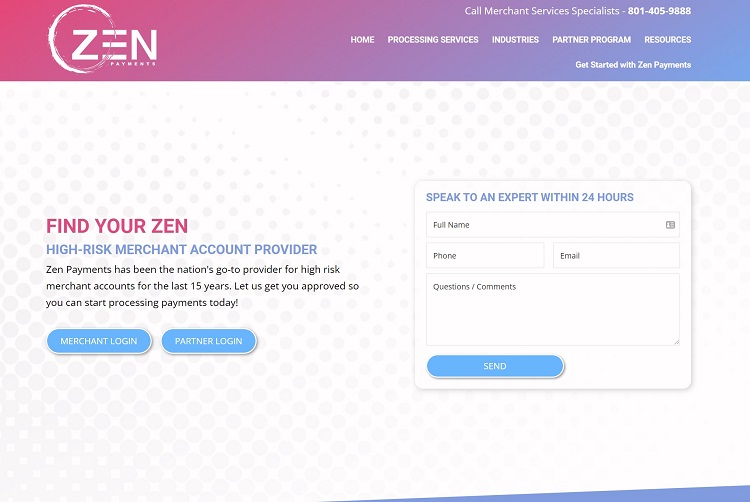
Zen Payments includes their contact information at the very top of their page. They also offer a form users can fill out and receive a response within 24 hours. They offer a live chat option near the bottom of the screen, so people can get questions answered immediately.
4. Consider New Technologies
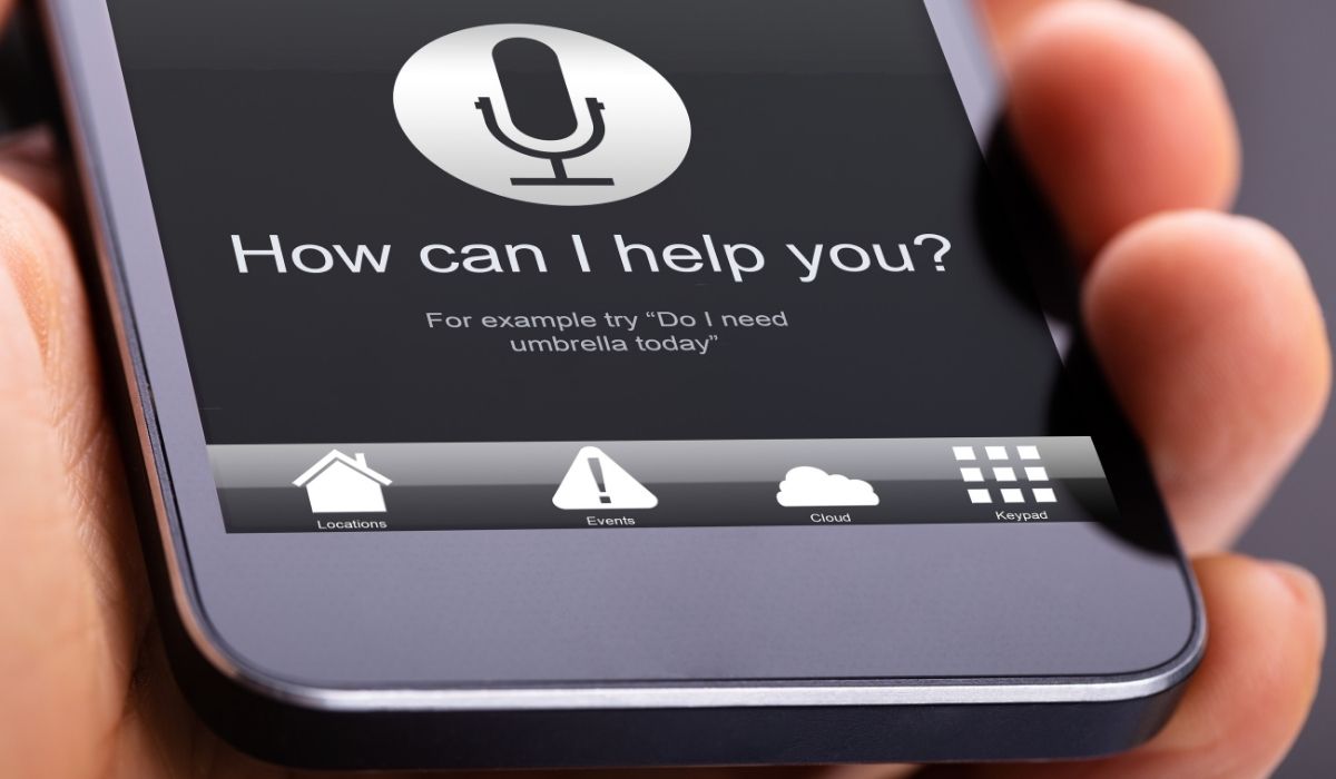
Think about some of the popular technologies of the day, such as voice search. With more people adding smart speakers to their homes and using their smartphones to conduct searchers, make sure your site is enabled for voice search.
How well do you answer natural language patterns? What are the questions someone might ask a smart speaker when looking for a product such as yours? Can you incorporate the language and answer on your site?
5. Utilize White Space
A minimalist look never goes out of style. Make sure you use plenty of negative space around key elements to put the emphasis on the important features on your page.
Spend time cutting any additional clutter. If there’s anything on your page not meeting the purpose of the page, remove it.
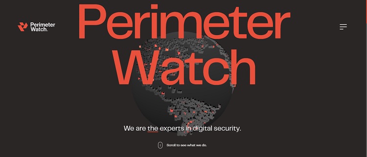
Perimeter Watch keeps a very simple design with tons of negative space. The focus goes to their name and then they offer a hamburger menu, a tagline and encourage the user to scroll for additional details.
6. Embrace Photos
Don’t be afraid to add beautiful images and take a little more bandwidth for your site visits. In the past, sites used fewer photos because they loaded slowly and created issues for users with slow connection speeds.
Today, high-speed broadband is in most areas and people can use their phones and satellite to access sites. Beautiful photos are a must to showcase products for consumers. Draw people in with highly relevant and gorgeous images.

7. Animate Your Site
Smartphones and computer screens have higher resolution capabilities than in the past. Combined with faster connections, the ability to animate parts of your design adds a depth to your site you otherwise wouldn’t get.
Use animation to point the way to a call to action (CTA) button. Show off what you do in a video. Add interest to your logo.
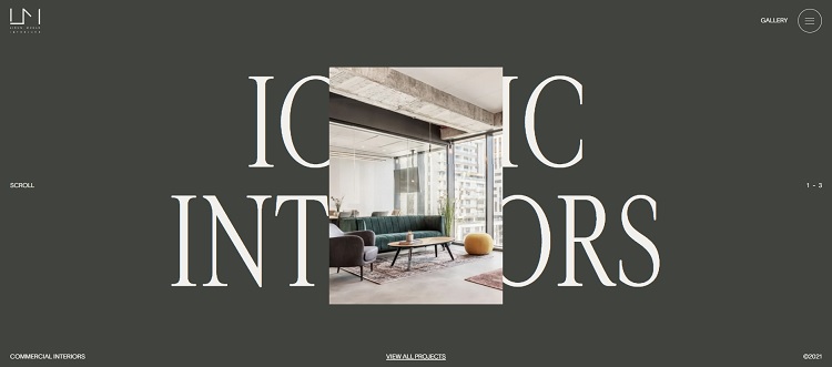
Liron Moran Interiors adds a touch of animation to their landing page to draw users in from the first minute. They use the headline “Iconic Interiors.”
An image of a beautifully designed living space unfurls up over the typography. As the user mouses over the image, it morphs and changes a bit.
8. Secure Your Site
With the implementation of the General Data Protection Regulation (GDPR) act and similar rules, it’s more important than ever for web designers to ensure their sites are secure. GDPR may fine companies who don’t actively seek to protect the personal data of European Union citizens.
Hackers love to attack unprotected sites and steal data or take the site over. The first thing you do before you worry about the look of your site should be to concern yourself with the security.
What Will Change in Web Design?
There’s no telling what new technology is on the horizon. However, you can make sure your site is usable by staying on top of the trends and talking to your customers.
Ask them about features they’d like to see and do your best to implement the most useful ones.

Eleanor Hecks is editor-in-chief at Designerly Magazine. She was the creative director at a digital marketing agency before becoming a full-time freelance designer. Eleanor lives in Philly with her husband and pup, Bear.

I like the valuable information you provide in your articles. I am quite sure I’ll learn many new stuff right here! Good luck for the next!