Do you know what a landing page is? Or how it can help you to increase leads and generate sales?
Contrary to popular belief, landing pages are not “microsites.” Neither are they just for short-terms campaigns and promotions—although they can certainly be launched for those purposes.
Nor should a landing merely be any page on your website where your products and services are described.
What is a Landing Page?
So what is a landing page?
While Google Analytics would categorize a landing page as any page on your website where visitor traffic first arrives, I tend to define it as such:
Definition: A landing page is a specific web page where visitors be after clicking on a link served by a specific and targeted marketing campaign. Often, landing page visitors are asked to fill up a form (opt-in), download or sign up for an activity, or make a purchase.
In other words, most landing pages are built to handle online conversions.
Now when we talk about landing pages, your goal is to improve your conversion rates using the art and science of Conversion Rate Optimization (CRO).
Your source of traffic to a page may come from an attractive offer delivered in an email, social media post, article, or online ad.
Often, a landing page provides a compelling offer behind an opt-in device which we call a lead capture form. They have what we call a strong Call To Action or CTA. The idea here is to convert visitors into leads whom you can follow up with, or even customers by offering a free limited-time trial followed by paid subscription.
So what are the winning ways to build a highly converting landing page?
1) Have a Great Offer (aka Lead Magnet)
The first thing you need to consider is what you are offering your page visitors. In most cases, the best landing pages have a free gift that a visitors can download if they visit it for the first time.
Also known as a lead magnet, your offer could include any of the following incentives:
- Free tool or template which your target audience could use
- Free eBook providing great advice and tips
- Free checklist or questionnaire
- Free calculator to assess their current status (often financial planners use these)
- Free training (normally an online seminar)
- Free limited time trial for a paid subscription product (usually a software)
- Free consultation (usually a 30 minute chat)
Courtesy of Conversion XL
2) Razor Sharp Focus
Unlike other web pages, your landing page should provide visitors a hyper-focused experience that “slides” them through a specific page along a clear path towards an end goal.
You do not want to distract your visitor with confetti and water cannons. Instead, your landing page should only convey three simple things:
- Where your visitors are (ie where they have “landed”);
- What they are in for if they sign up (and how wonderful that is); and
- What their next step should be (either to buy or sign up).
Courtesy of Web Profits
Doing so will help you improve your conversions and get your readers to do exactly one thing.
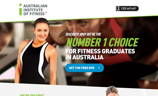
3) Match Your Ad Scent
One of the cardinal rules in digital marketing is maintaining a consistent “content scent” or “ad scent”.
If your advertisement or blog post promised something that your prospect would like (eg an e-Book, 101 guide, or training video), you need to be sure that he receives just that.
The way your landing page is designed and written should also correspond to your ad.
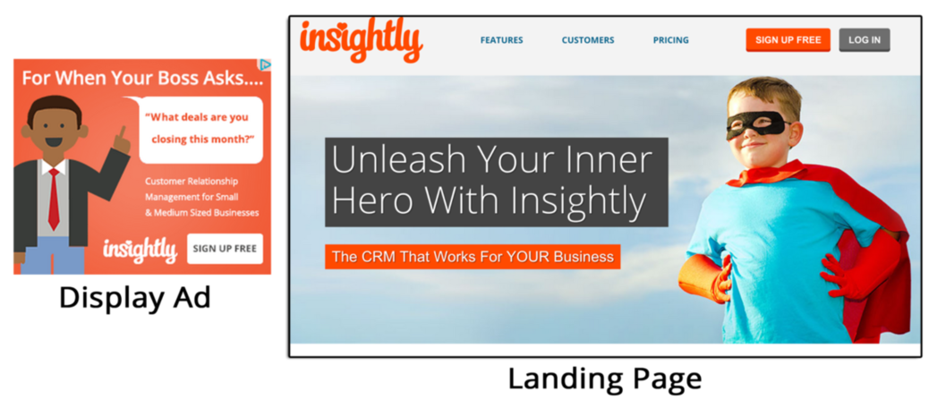
Here’s a good example of an ad and landing page with a fragrant ad scent. Notice how similar the offers in the ad and website are.
Courtesy of Conversion XL
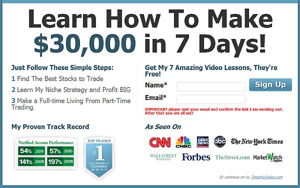
Message mismatch is the number one reason for people to “bounce” (ie leave without clicking further) from a landing page immediately after they have arrived. Check out the example below and see how mismatched the ad and landing page are.
Courtesy of Wordstream
4) Kill Links and Buttons (Except Your Opt-in)
Remember that your job in creating a landing page is to lead them down a single path. Avoid creating multiple hyperlinks or navigation bars which distract and disrupt your visitor’s flow.
What about social sharing buttons? Wouldn’t you want your visitors to help your landing page “go viral” and share them with their friends?
Well, studies have shown that removing social share buttons actually increased conversion rates. When Kuno Creative removed social sharing buttons on their landing page, conversion rates grew by a whopping 18%!
Courtesy of think SEM
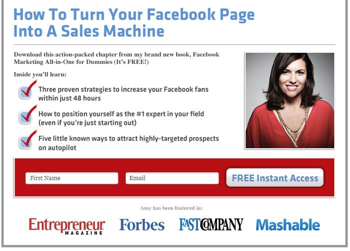
5) Keep Your Headline Benefit-Driven
Repeat what’s awesome about your offer by telling customers what’s in it for them. Focus on creating a benefit-driven headline rather than a product or feature-driven headline.
This is a great way to ensure that your customers know exactly what they are in for, like the example below from Amy Porterfield.
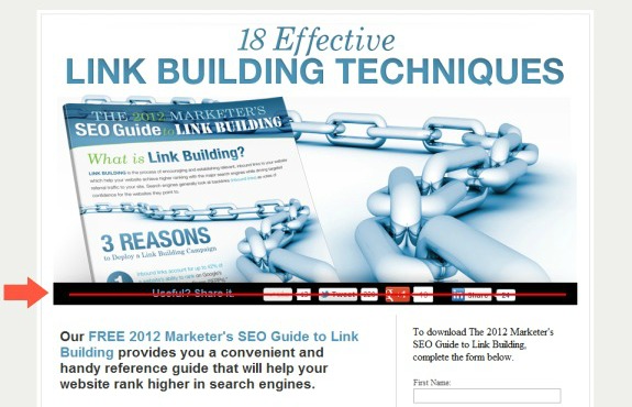
6) Use Subheads, Bolds and Different Coloured Text
Remember that nobody likes to read a wall of text. Especially when they are using a mobile device to do so.
Use subheads to break up your text. Let your visitors eyes “dance” on your page. Doing so helps to lead them through the main highlights of your offer, or to educate and entertain in a fast-paced manner.
See the example below to learn what I mean.
Courtesy of Unbounce
7) Showcase Your Product
Make sure that your product or service is well featured on your landing page. Nobody likes hidden surprises, or to be “conned” into signing up for something which they do not need or want. Transparency is king here.
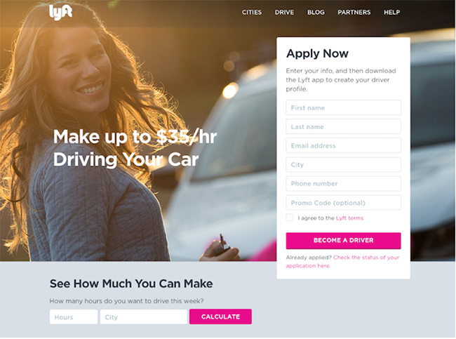
Courtesy of Lyft
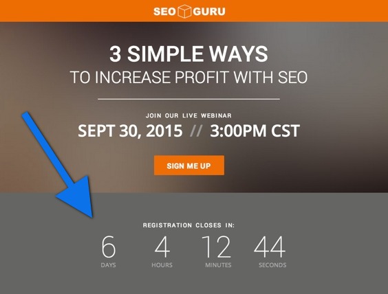
8) Create a Sense of Urgency
Create a sense of urgency in order to close the deal. People tend to procrastinate or delay when it comes to parting with their money.
By including your deadline, you will help them to decide quickly if they want your product and service. Or not.
Here are some examples:
- Sign Up and Get 50% Off Today Only!
- Download the Build Apps E-Course for $30 $10!
- Register For The Ultimate PPC Webinar (Limited Places Only)!
Here’s a great example from SEO Guru which even incorporated a countdown timer!
Courtesy of Wishpond
9) Design the Right Call To Action (CTA) Buttons
Remember that the purpose of your campaign content is directed towards an action which is usually to click on a link, purchase, sign up for a newsletter, or enrol in an event. This is where your Call To Action (CTA) buttons comes in.
To ensure that your target audience will take the right action, you need to make your CTA buttons stand out.
Here are some useful tips to consider:
- Use colours that strike out. In reported tests around the world, green and orange buttons seem to perform nest.
- Ensure that your text is LARGE and highly VISIBLE. Make sure that there is sufficient contrast with the surrounding copy.
- Keep the text on button as short as possible.
- Use button copy to include your value proposition. For example “Get FREE Ebook” or “Buy at Half Price”
- Experiment with arrows and other design elements to draw attention.
- Consider having one CTA button at the top, one in the middle, and another at the bottom.

Source: Conversion XL
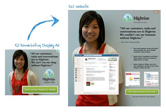
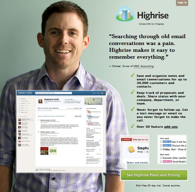
10) Include “Click Triggers” beside CTA button
To reduce fear, build trust and increase clickability, consider including what Copyblogger refers to as “click triggers.”
Some examples of click triggers include:
- Customer Testimonials
- Anxiety-Suppressing Info (e.g. No credit card required)
- Key Benefits
- Data Points (e.g. users see a 40% increase in shares when using X)
- Awards and accolades
- Media Coverage features
- Credible partners and suppliers
- Research studies or endorsements by personalities
Here’s a brilliant example of how High Rise incorporated “trust builders” on their landing page.
Source of image
11) Follow the Reading Flow
In most English speaking culture, we read from top to bottom and from left to right. Conversely, if you create a landing page in a different language, you need to consider the direction of reading.
This may be in an F-direction or a Z-direction, where your audience would scan the page and their eyes would dart from left to right, up and down quickly.
Most studies have shown that the bottom or right of the content is the best place to include your CTA buttons, although the results may vary.
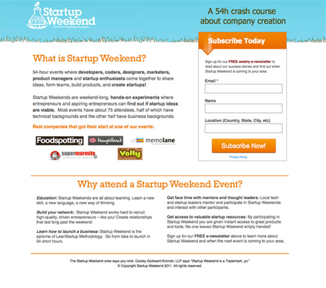
12) Provide Enough White Space
Don’t cramp too much into a small space!
Where possible, keep a healthy chunk of white space around your CTA buttons. Doing so helps to call your users’ attention to the button and help it to stand out. Like the example below:
Courtesy of Instapage
13) Use Bullets and Boxes. Be Brief
There is a time and place to use bullet points. Now is the time.
Using lots of bullet points and boxes helps to break up the monotony of your text. Minimise the number of words so that you can cut to the chase quickly. Remember, your job is to break up that wall of text into bite-sized pieces.
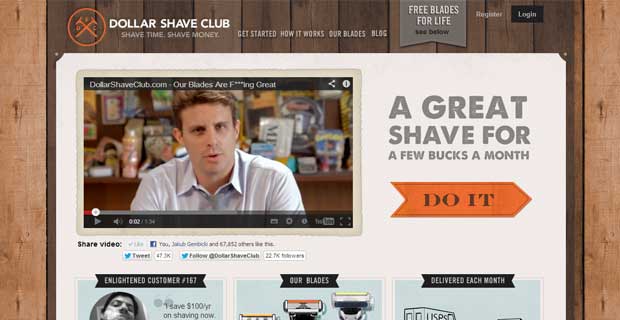
14) Embellish with Videos and Images
According to some digital marketing experts, videos and images work very well on landing pages. In fact, conversion rates for landing pages with short and targeted videos may be higher than those without.
Dollar Shave’s landing page has a video which drives sales, as you can see below:
Courtesy of Web Analytics World
15) Use Active Language
Address your landing page visitor as you would a friend. Let your prose speak to them directly using lots of you and your.
Here are some active words to consider vis-à-vis their more passive counterparts:
| Write this… | Instead of this… |
| Get or Go or Start or Try | Submit |
| Download Now | Enter Your Particulars |
| Get a Quote | Submit for Your Quote |
| Call ______________ | Register Your Interest |
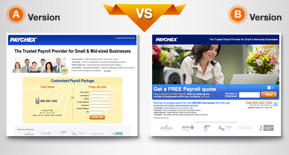
16) Test Different Versions of Your Landing Pages
Like in all things digital, do remember to text different versions of text and visuals on your landing pages, and to see which version provides a better conversion. Most landing page apps like Wishpond or Lead Pages or Unbounce allows you to do that.
An example is seen below. Guess which version experienced a higher conversion rate?
Courtesy of Business2Community
17) Ask for Minimal Information
Do not over burden your users by soliciting for their family history, employment history and intimate details. Keep your sign-ups as simple as possible.
(Having said that, asking for more information may help to improve commitment and result in higher quality leads. However, you need to balance between quantity and quality.)
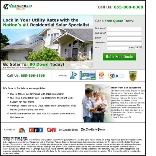
18) Feature Essentials “Above the Fold”
Pare down the words and images on the page to the bare essentials. The less content you have on the page, the easier it’ll be to feature the important information “above the fold” without having your visitors to scroll down.
This normally includes the CTA button too.
19) End with a Hardworking “Thank You” Page
Remember not to neglect your “Thank You” page after the leads are captured or registration/purchase is completed. The best “Thank You” pages provides assurance to your prospect, invites him/her to share the joy, and may include a possibility for a value added upsell.
Just look at the example below from NatureBox, which includes a nifty coupon code for further redemption:
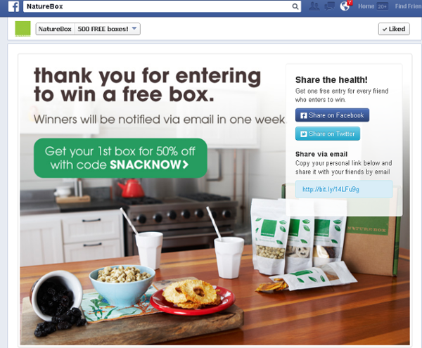
Courtesy of Impact Branding and Design
Wish to Improve Your Landing Page Conversions?
Fill in the contact form below for a free 30-minute Skype or Zoom consultation session!