Improving conversions is the Holy Grail of every digital marketer.
A website, Facebook Page or email which fails to turn a prospect into a customer is practically worthless.
Conversions are so important that a new buzzword – Conversion Rate Optimization or CRO – has been coined for the art and science of online conversions.
A good place to begin your journey into better online conversions is the book The Smarter Screen – Surprising Ways to Influence and Improve Online Behavior.
Written by Shlomo Benartzi with Jonah Lehrer, it provided lots of useful insights on how behavioural economics can shape how people make decisions on screens. These are grounded in the disciplines of information architecture (eg User Experience or UX and User Interface or UI) and choice architecture.
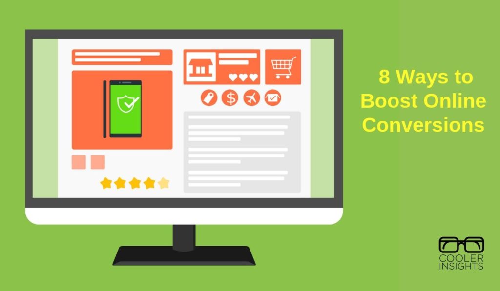
In the book, eight key areas influencing online behaviours were covered.
#1 Avoid User Overwhelm

Do you know that Overseas Travel Agents (OTAs) like Booking.com, Kayak, Expedia or Hotels.com charge commissions as high as 20 to 30 percent?
They can get away with this because they’ve optimized their websites to help people think and choose better online. Doing so reduces overwhelm and improves attention.
- Design your website to limits of attention – the magical number of the mind is less than four
- Consider their attentional environment. GPS screens can display more information at red lights, for example.
- Compress your information, use visuals instead of words
- Boost attention with personalised videos
- Use a whiteboard to sketch out and design a new site focusing only on the essentials (think Google)
#2 Ace Online Aesthetics

People tend to judge a brand or company by how they process the aesthetics of their websites, social media accounts, and emails. Often, their perceptions may be unconscious or subliminal.
The speed of perusing on mobile screens make first impressions count even more.
Here’s how you can improve functionality and trustworthiness:
- Do a “fast-test” of your website. You have only 50 milliseconds to impress.
- Consider the halo effect, and improve perceived usability and trustworthiness of your website by making it prettier
- Make everything simple
- Consider your user’s sense of beauty. Different demographics prefer different web styles.
#3 Consider Visual Biases

It is useful to think about your users’ visual biases. From numerous user studies conducted with eyeball tracking exercises, certain consistent patters emerged.
Incorporate these points in your website design:
- Middle Bias: Place important elements on the middle of your screen
- Top-Left Bias: On smaller screens where a middle isn’t obvious, the top-left cell grabs eyeballs
- Cultural Differences: Do people read from right to left or left to right?
- Cold Spots: These are at the periphery of the screens – places where you can place less important information
- Enhanced Biases on Screen: Visual biases may be more apparent on a screen
- Blind Spots: Consider the blind spots of your users if they choose to zoom in on any segment
- Horizontal Bias: Our retinas search the world horizontally – rows work better than columns
- Decision Speed: Faster search and choices makes our visual biases stronger
#4 Provide Right Feedback

User feedback is a key part of engineering great online experiences. This would be the elements that communicate progress or movement online in response to user interactions.
Here, the authors suggest that you should try to mirror your users when you design your online sites. Using a mnemonic device, the book proposed seven useful behavioral principles with the world DIGITAL:
- Dosage: Are you delivering too much feedback? Or too little?
- I: Do you make it easy to personalise your website?
- Good: Is your feedback too negative? If so, try to look for opportunities to offer more positive language.
- Intuitive: Are you taking advantage of the affect heuristic? In other words, does your feedback mechanism trigger an emotion in your user?
- Timing: Are you delivering your feedback at the most effective possible moment?
- Actionable: Do people know how to react to your feedback? Do you have a plan for improvement, like step-by-step instructions?
- Learning: Are you measuring the outcome of your feedback? Does it improve user behaviour? Do numerous tests to improve.
#5 Fix Your Fluency (Ease of Reading)

Ensure that your website content (copy, designs, visuals) have the right levels of difficulty.
While people may read much faster on screen, their levels of comprehension often suffer compared to reading on paper. Thus, we need to consider the right levels of fluency (ease of comprehension) and disfluency in our content.
a) Identify Your Conversion Goal
Before you decide on which levels of fluency to achieve, think about what you wish your users to do.
Do you want them to complete a purchase as quickly as possible? If so, make your website process as fluent (ie smooth) as possible.
Do you want them to remember what they read? Or think about what they’ve read? If so, introduce some ways to slow their mind down, like including more text.
b) Consider Different Types of Disfluency
There are two main types that you can consider incorporating in your website.
- Visual disfluency: These could include font changes (eg unfamiliar typefaces) or unusual layouts
- Cognitive disfluency: These may include using “fancy words” or forcing users to enter information to slow them down
c) Prescribe the Right Dosage of Disfluency
Getting the right balance is essential. Too easy and you might not grab attention. Too difficult and you turn people away.
Use A/B testing and eye-tracking data. Focus on the part of the screen that eyes skim over.
#6 Practice Personalisation

Information specifically tailored for your targeted customers tend to do better.
This can be designed based on their unique preferences, interests, history, demographics, behaviours and other factors.
In thinking about your customers, consider crafting a detailed customer profile, and investing in a CRM system. Once you’ve got useful data on your customer, you should send them emails that are specific to their needs.
Beyond your content, think about your timing of content. Consider the context of your customer and what the big news of the day is.
Also, consider if you should have different versions of your websites for different clients. How much of an ROI can you achieve with digital personalisation? To what extent is this necessary?
#7 Correct Choice Architecture

It is important to design the right set of choices and to guide your users in doing so. This helps to ensure that they do not face the issue of “decision fatigue” and avoid taking any action altogether.
In doing so, consider coming up with a “choice algorithm” that leads people through a series of steps.
4 is the magic maximum number of choices that your users should make. Reduce multiple options into 4 choices for each step.
Also, think about offering a “easy-middle bias” when you set up a consideration set. So one with say three to five options might street people towards the middle option, while a set of four options may get people to think more about trade-offs.
Think about using personalised categories that seem tailored to the specifics of each individual you are targeting. For example, “For educators,” “For small businesses,” “For students,” and “For large companies.”
Minimise the number of clicks needed, but balance between increasing commitment. More clicks usually deliver better insight.
Manage regrets carefully. Using certain negative words like “DECLINED” can direct consumers to certain desired pathways.
Reduce attribute overload by trimming down the total number of features and complexity of attributes presented.
#8 Test and Think

Last, but certainly not least, you should consider the additional dimension of behavioural sciences, and how people think.
My article summarizing the salient lessons from The Art of Thinking Clearly is a good way to start. From there, you can consider different cognitive biases prevalent in humans, and design the right screen-based options for your customers.
A Good Guide for UX and UI Designers
In a world where mobile devices take centre-stage, optimizing your online user’s behaviour is critical to digital marketing success.
From websites to Facebook pages, Instagram posts to email newsletters, designing the right information architecture and choice architecture can make a radical difference between online success and failure.
Drawing knowledge from consumer psychology and neuroscience, The Smarter Screen is a good starting point for UX and UI designers, app developers, web designers, as well as content strategists to improve how their information flows.