
Long after they leave your website and bounce around to other locations in cyberspace, users remember how your site made them feel.
The usability and experience buyers have while there has a big impact on whether they’ll convert into leads or return in the future.
Common sense tells you if you improve UX, you boost return on investment (ROI). Different reports put the amount between $2 and $100 for every dollar spent.
In a study by Forrester, researchers found that reducing friction in your design could improve customer conversions by 400% or more.
When you run a business-to-many (B2M) operation, you have to figure out how to improve the usability for both consumers and businesses. The more people you serve, the more potential for friction as the two factions bump against one another.
Fortunately, simple changes go a long way toward improving your website’s design and increasing engagement for all.
1. Choose Vivid Color Combinations
Your brand may already have a chosen color palette. However, when it comes to web design, you can certainly throw in some additional accents. Adding a pop of color for a call-to-action (CTA) button allows you to draw user attention where you want and showcase the most important elements on your page.
Bright hues such as red or medium blues draw the eye. Think a little outside the box, and don’t be afraid to try design techniques such as gradients and transparency. Test everything and see what your customers respond to best.
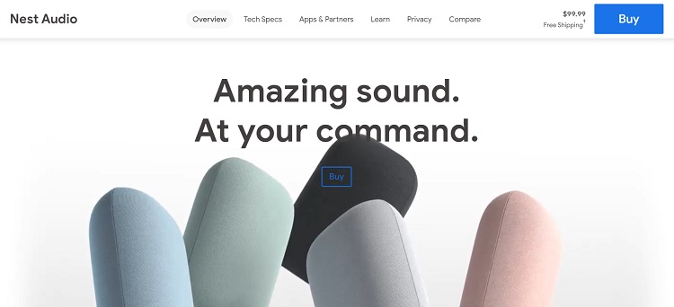
Nest Audio offers a simple design that is very minimalistic. The focus is on the images of the speakers and the text. The equipment reaches a wide range of different buyer types, so it has a somewhat generic design. However, it adds a pop of vivid blue to draw attention to the calls to action.
Notice the button on top of the photo with a transparent background so the speakers peek through. It has a blue outline matching the other colors on the page, which creates a seamless look for the user. Finding the CTA is easy on this site.
2. Use Concise Language
Users should never have to guess what your page is about or what action they should take next. Know what the goal is when someone clicks on a CTA. What will happen? The user wants to find out, or they won’t bother clicking on it. You should clearly lay out the steps to walk through the buyer’s journey.
Don’t try to use cute or ambiguous language. There is a time and place for puzzles and games, but your landing page isn’t it. Instead, be clear and brief to avoid confusion and improve UX.
3. Create Buyer Personas
You’ve likely heard the advice you should know your target audience. The more details you have on the people who buy from you, the better you can engage them when they land on your site.
Start by making a list of the different customers you serve. As a B2M company, you help both consumers and other business owners. Start with two columns, and list the elements each group has.
You may have more than one buyer persona within each group. Look at demographics, such as average age, gender, location and even career. Dig into psychographic elements, such as what emotions drive the person to go to your website in the first place.
Once you have a list of traits, name your buyer personas and create a mock person you can speak to when creating content or tweaking your design. Also, look for similarities across your audiences, so you know where it makes sense to overlap.
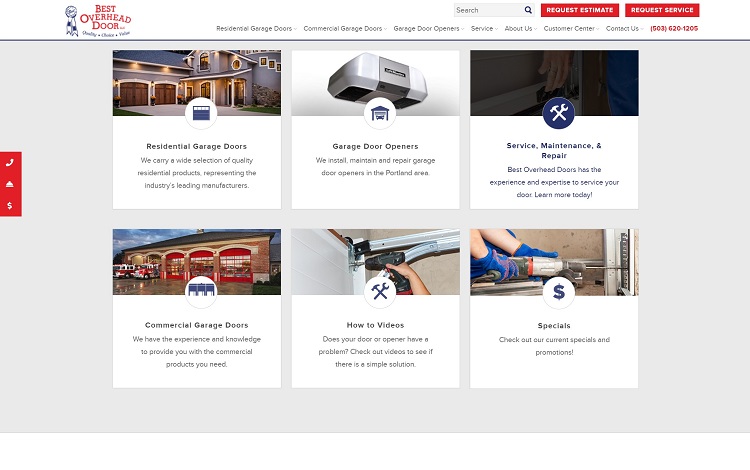
Best Overhead Door does a good job of reaching all its buyer personas on the landing page. It understands that it might get queries from homeowners and also from commercial ventures. It’s thought through the pain points driving customers to the site and presented solutions for each one. The company broke them into a grid showing options such as garage door openers, repair, and commercial and residential options.
4. Speed up Your Site
No matter what type of business you run, any website benefits from faster speeds. Unbounce’s Page Speed Report estimates the average website load time is 15 seconds. However, around 50% of people bounce away if a page takes longer than three seconds to load.
Your goal as a website owner should be to get your page to load as quickly as possible.
Your design can make or break your speeds. Optimize images, utilize a content distribution network (CDN) and invest in the most powerful hosting package you can afford to benefit all your users.
5. Adopt Interactive Elements
Engage your users and keep them on your page from the minute they land there.
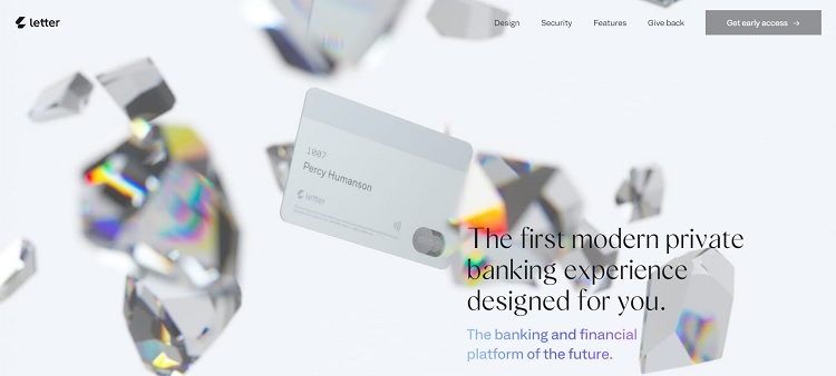
Letter knows it has to reach both business owners who might provide staff with credit cards and families who want everyone in their household to have a custom card. It keeps different visitors on the site scrolling by using vivid images that break apart and come together as the user scrolls. The interactive elements keep shoppers entertained while they learn about the card and its benefits for them.
6. Improve Mobile UX
Most people access the internet via their smartphones at least part of the time. No matter what type of buyer you wish to reach, making sure your site is mobile-friendly is a vital part of great UX.
Some people will refuse to use a website that doesn’t present well on mobile devices!
Think about your typical customers. If they are baby boomers, then mobile-friendliness may not matter quite as much as if the majority of your patrons are millennials.
You don’t want to lose any potential buyers, so even if only a small percentage use their phones to access your site, you should take a mobile-first approach to your designs.
7. Embrace Navigation Hierarchy
When people land on your page, they look to your navigation bar to orient themselves. Your navigational hierarchy allows you to reach different factions of your customer base. Create categories for each type of user to ensure they can easily find needed information.
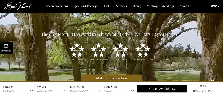
Sea Island places a navigation bar across the top of the page. You can see how it meets the needs of its diverse audience. People looking for a family vacation find information on activities and packages. Those wanting to host a business meeting or plan a wedding can peruse a special section for groups. You immediately see where to navigate for the information you need.
8. Improve Readability
Something helpful to all your customers is making your page more readable, no matter who they are. There are several ways to accomplish this, but keep in mind that most visitors scan down your page looking for specific information.
Include plenty of white space so headings and subheadings stand out. Use bullet points to set off important information. Arrows can point to action items, and animation draws attention to elements people might otherwise overlook.
Fix the Little Things
Start by fixing any minor issues. Look at your customers’ feedback, check for broken links, and improve the minor problems with your site. Next, move to specific elements your target audience desires in a website. Over time, your site will become the perfect landing spot for all your customers as you learn to juggle the needs of many.
I was looking for the easier ways to improve the usability for both consumers and my business website. This information is going to me help me a lot. I am very thankful to the author for sharing the article.