
Click-thru rate (CTR) is one of the more vital aspects of your website data. Measured as the number of clicks divided by the impressions served, it helps you understand your customers’ needs better.
Fortunately, you can try several tactics to improve your CTR and thus turn your average site visitors into leads.
Experts believe that customer loyalty is worth 10 times the amount of a single purchase. If you can get people to click on more information or somehow invest time and effort into your brand, you’ve engaged them more deeply. They’re more likely to buy from you in the future and even tell family and friends about your company.
How can you improve your click-thru rate (and thus your conversion rate)? A great place to start is with your user experience (UX).
Intuitive designs make customers happy. The happier they are, the more likely they will click on an offer. You can easily improve your CTR by trying the following UX improvements.
1. Optimize Headlines
Your headlines are often what people see when pulling up search engine results pages (SERPs). They will also see them when they first land on your webpage — be it on a specific landing page or your home page itself.
To work well, your headlines need to grab attention with action verbs. They also need to summarize what the page is about and communicate the objective for the user who visited the page.
People sometimes just need you to tell them exactly what action you’d like them to take. Done well, your headline can immediately drive the right responses from your audience.
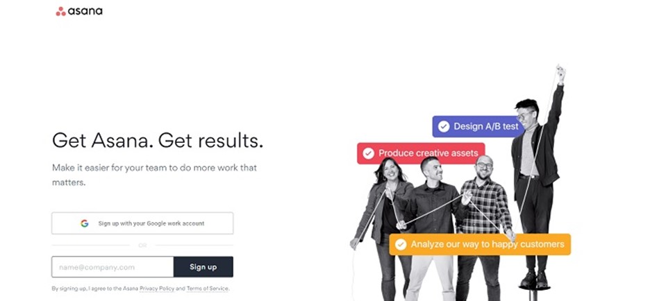
Source: https://asana.com
Asana uses action words to drive the user toward the signup button on the page and get results for click-thru rates. The headline reads, “Get Asana. Get results.” The heading is also situated just above the signup box so the eye naturally flows toward the objective.
2. Use Contrast

Some of your users may have visual impairments, making it difficult to see where the call to action (CTA) button is. Using contrast helps elements on your page stand out for all users. For example, choose a dark text if you have a light background.
If you want to place an image on the page, make sure it stands out from the background. Take a step back from your computer and see how the site looks from a distance. View your pages on small screen devices, such as a smartphone, as well as desktop computers. Can anything be sharper?
3. Make Your CTA Pop
Your CTA button should vary from the rest of your color palette. You want the hue to complement your design, and you also want to signal to users that this is something they need to click on. A bright color helps indicate they should take action.
For example, if your site is blue and gray, you might want a contrasting color such as orange or red. Some designers add a touch of the CTA button color to other sections, such as underlining the active page in the navigation bar.
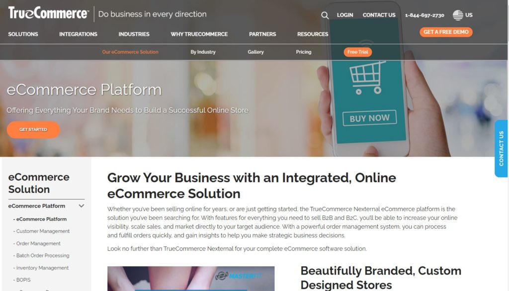
Source: https://www.truecommerce.com/solutions/ecommerce
True Commerce adds a bright orange CTA button to its site that reads “Get Started” to encourage visitors to click through to the signup form. The pop of color draws the eye and meshes well with the other elements on the page. Orange is opposite on the color wheel to blue and really stands out.
When choosing the color for your CTA button, you might want to test different options and conduct some A/B studies to see which ones have the higher CTR. You can often improve your click-thrus simply by trying different colors until you hit on the one working best.
4. Add Trust Factors
Put yourself in the shoes of a person visiting your site for the first time. They may not know your company or much about you. They have no reason to trust you’ll do what you say. One way to overcome their objections is by adding trust factors to make them feel more at ease.
What do trust factors look like?
You can include a toll-free number to show you’re available for questions or concerns. Post a few testimonials to show you have satisfied customers and an excellent reputation. Add badges for any organizations you belong to, such as the Better Business Bureau.
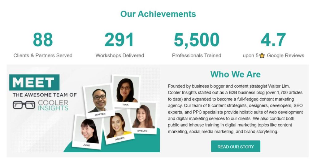
You can also include evidence of your organisation’s achievements over the years, such as this example on the Cooler Insight’s home page.
5. Use Relevant, Professional Images
The photos you use on your landing pages make a big difference in how long people stay on your site. If they bounce away too quickly, they may not click through to your offer. Make sure any images are relevant to the topic at hand.
It’s better to hire a professional photographer and take custom pictures, but if you can’t yet afford to do so, at least invest in some quality stock photography.
Think about how the images might move a user through your sales funnel. For example, if you add a photo of a person, they should point or look toward your CTA button. If you add graphics, put arrows or lines leading to the button you want people to click.
Everything on your page should point to where you want the user to move next.
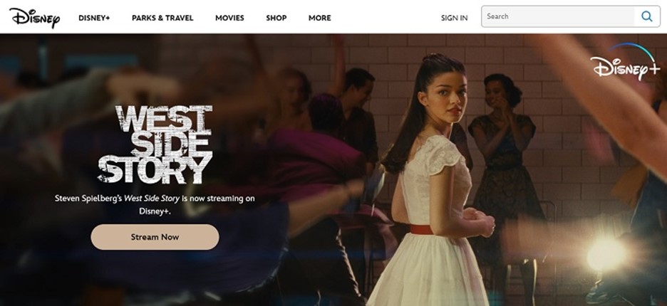
Source: https://www.disney.com
Disney often changes the goal of its page, depending on what is happening at its parks or what new releases come out. Check out the example above for streaming the remade version of “West Side Story.”
The image in the background shows a scene from the movie and the woman’s leg on the left is in a kick position that aligns perfectly with the “Stream Now” CTA button. Additionally the character is looking back toward the call to action. This draws the user’s eye to the button and hopefully, they click on it.
Make Small Improvements to Improve Click-Thru Rates
Every tiny improvement that you make can significantly increase your CTR.
Look at your site through the eyes of your average website user. How can you make it more attractive, narrow the focus and move them toward the action you want them to take? Try different tactics and see what works best with your customers.

Eleanor Hecks is editor-in-chief at Designerly Magazine. She was the creative director at a digital marketing agency before becoming a full-time freelance designer. Eleanor lives in Philly with her husband and pup, Bear.