Wish to know the website design trends coming up in the next year? What should you consider in designing your website to keep up to date with the latest look and feel online?
Trends come and come, some with a bit more staying power than others. Looking into the future can help you come up with a design that stands the test of time.Technology advances at a rapid pace. Some changes are necessary to keep up with shifts in smartphones and the way we are interested in the internet of things (IoT). Other design trends fall into the category of what’s popular at the moment.
Web design and graphic design, on the other hand, often looks towards tastes on the fashion runways, interior design trends, as well as what other web developers are doing.
What Is the Future of Website Design?
If you spend a minute on the Internet Live Stats website ticker, you’ll see the number of registered sites go up by the millisecond. As the world’s population grows, the need for new businesses increases.
One thing is certain about the future of web design is that the need for new designs are increasing.
The United States Bureau of Labor Statistics predicts a 13% industry growth rate through 2030–making web development and designing top growing jobs. You may still have some competition for the best gigs out there, so it’s smart to look at some of the design trends you’ll see in 2023.
Prepare now so you can hit the ground running when the new year starts.
1. Minimalism
Minimalism isn’t a new concept. It’s been around for decades.
However, the popularity of the design styles increases and wanes from one year to the next. At the moment, flat designs are all the rage again, and this should continue into 2023.
Taking the time to get rid of unnecessary elements on a page puts the user’s focus on the call to action (CTA) and other points you want to drive home.
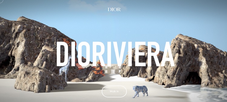
Source: Dioriviera
The Dioriviera website uses a minimalist theme. The only thing you can do on the page is enter the site for more information.
However, their landing page is far from boring.
They use a beautiful image that grabs attention with a big cat walking the beach and some other animals tucked in here and there. The water has an animated, magical effect. The entire site screams to move forward and learn more.
2. Ample White Space
You’ve probably noticed more sites have a lot of space that isn’t utilized for anything. Breaking up blocks of text gives the reader a chance to take a break and not become overwhelmed with information.
Consider every element on your page. Is it really necessary for the goal of your website? If not, cut it.
Keep in mind that white space doesn’t have to be white–it is the lack of engagement in those areas that drives the user the way you want them to go.
3. Monochromatic With a Pop of Colour
Monochromatic sites will be in as the year progresses and into 2023. We’re already seeing a number of sites use a single colour to create a mood. Keep in mind that there is a psychology to all hues. If you want to create an emotion in your user, select wisely.
However, tomorrow’s monochromatic sites won’t just be a single colour. They’ll also use a contrasting hue to make the CTA and other important elements pop against the single color in various hues. CTAs become even more powerful against a monochromatic colour palette.
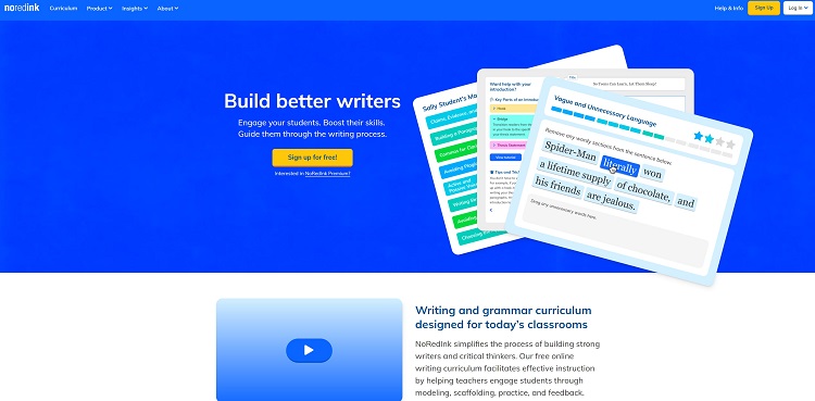
Source: NoRedInk
NoRedInk has a monochromatic design with blue nailed down. The hues are on a gradient with the top navigation bar being a slightly less vivid blue than the body of the page. The white text creates a nice contrast that makes the site easy to read.
To grab attention, the designer used yellow for the CTA button. There is no doubt what the user’s next step should be when viewing their landing page.
4. Calming Nature
One trend we’re seeing moving into next year in interior design is soothing natural elements. Bringing the great outdoors in will continue to expand as more people focus on the beauty of the earth.
We expect to see this trend move into 2023 digital designs as well. Expect to see natural elements such as wood grain, fauna and water in designs.
Depending on your industry, these elements may or may not make sense. Just understand they are popular in interior design and likely to filter over into web design in the near future.
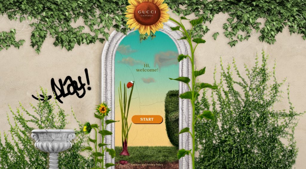
Source: Gucci Lady Bug
Gucci Lady Bug is an example of such a website, where natural elements are woven into the entire website design in a tasteful manner. Its actually a game but the way nature is designed into it makes it a restful yet delightful experience for users.
5. Micro Animations
Taking some elements on a page and animating them can draw user interest where you want it to go. Micro Animations have increased slightly in 2022 and may become even more popular in 2023.
Imagine a page where the logo jumps into place, grabbing the user’s attention and solidifying branding. Perhaps the CTA button morphs slowly into a different color. There are numerous ways to use micro animations to your advantage.
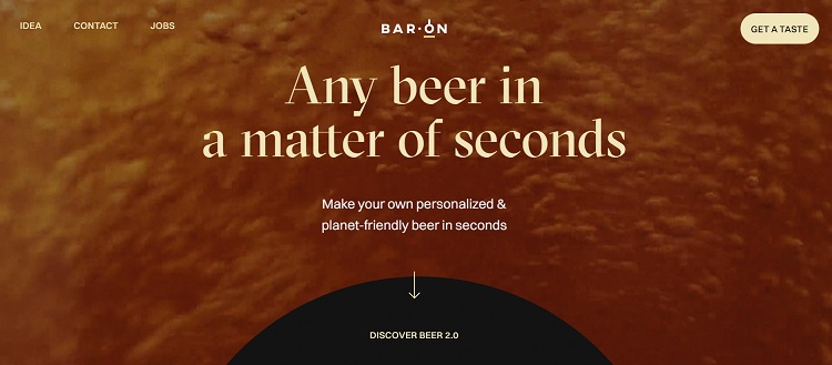
Source: Bar On
Bar On uses a micro animation where the background looks as though someone pours an amber beer. As the user scrolls down the page, the round black element flattens and becomes rectangular, opening up additional options for movement through the buyer’s journey. Other micro animations include bouncing bubbles and text that scrolls in from the side. You’ll see different micro animations as you move through the website.
6. Vivid Colours
Another trend we’re seeing on various design sites is the return of vivid hues. Bright orange-yellow, electric-blue and psychedelic-purple all grab user attention because they stand out from the more muted colors of neutrals.
Of course, you have to consider the personality of your brand. Are bright colours the right choice for your audience? Only you can decide.
Increased Computer Generation
As machines become smarter and people use artificial intelligence more and more, expect to see unusual colour combinations you might not have thought of.
Pay attention to new trends as they arrive. Choose the ones that make the most sense for your designs and forget the others. Popular design elements change rapidly, so go with good basic design over flash and you can’t go wrong.

Eleanor Hecks is editor-in-chief at Designerly Magazine. She was the creative director at a digital marketing agency before becoming a full-time freelance designer. Eleanor lives in Philly with her husband and pup, Bear.
