What can you do to create a winning Facebook advertisement? How can you win the war for attention on the world’s largest social network?
Anybody who has managed a Facebook page before knows that it isn’t easy to succeed in this space.
The stakes would only rise in the months ahead.
Social networks like Facebook will continue to change their algorithms such that only your most dedicated fans would see your Facebook posts (read my article on the Filter Bubble here).
Drop in organic reach
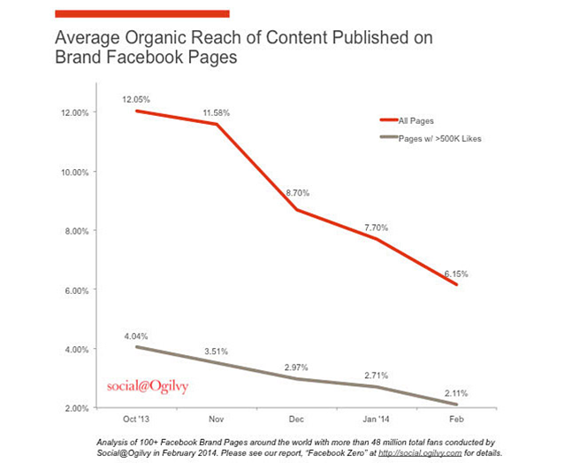
Like it or loathe it, organic reach for posts on your Facebook pages have mostly been dropping.
According to Social@Ogilvy, the organic reach of content published on multiple Facebook pages have declined precipitously after the event called “Facebook Zero”.
Courtesy of Social@Ogilvy
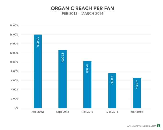
These findings were backed up by an earlier study by Social Bakers which showed a decline in the reach per fan across multiple Facebook brand pages. Median Facebook reach has declined steadily over a two year period as shown below:
Courtesy of Social Bankers
While there are many ways to improve the organic reach of your Facebook content, it does seem that you can’t avoid investing some money in advertising on Facebook.
To learn more about Facebook ads, check out this earlier post I wrote about the basics of Facebook Advertising. For today’s post, however, let us focus on the content of the ad itself.
Use the right Facebook ad image
As the largest photo sharing website on the Internet, Facebook has ruled the visual content space. With four billion video views per day versus YouTube’s seven billion views, Facebook is also fast dominating the social video sharing landscape.
For Facebook ads, what kind of images would work best? Here are five points to consider.
#1 Choose the right size
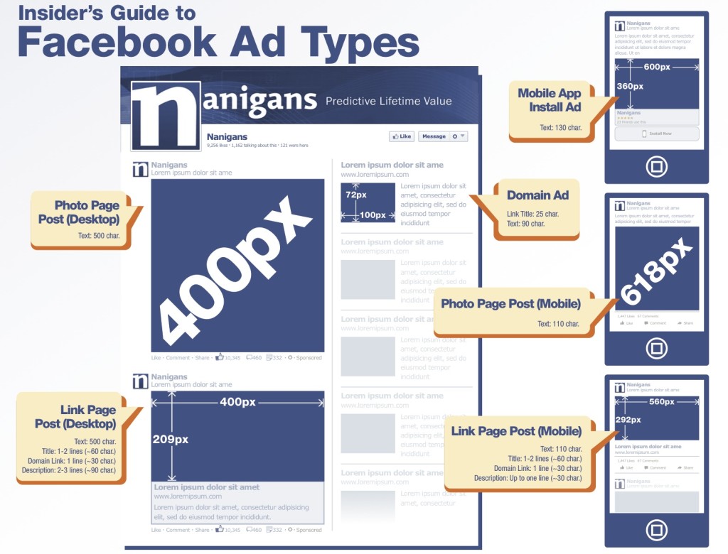
First, you need to ensure that your images are correctly sized. Thanks to resources like the one below, we now have a convenient guide to sizing our images such that they fit the different spaces available on the Facebook newsfeed and wall.
Courtesy of Ad Week
#2 Observe composition and rule of thirds
When you choose an image to represent your brand on a Facebook ad, you need to choose a well composed photograph. Use the rule of thirds (easy with the ready-made grids in most camera phones and cameras) to shoot a photo that does justice to your brand.
Courtesy of iStabilizer
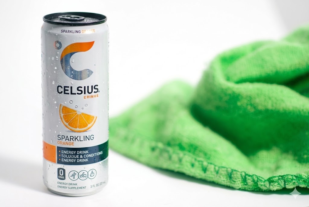
#3 Keep subject clear and close
The best images are those which have a clearly defined focus. Avoid cluttering your image by trying to squeeze in multiple elements. Instead, keep it as simple and clear as possible, with the main subject right smack where you want it.
#4 Split test your images
Other than kittens, puppies and babies, human photos (oh babies are people too… Lol) work very well in most Facebook Ads. Somehow or other, we are attracted to a person’s face or figure – especially if he or she looks attractive or interesting.
I guess this is why the Humans of New York Facebook Page have continually charmed audiences over the years.
Courtesy of Humans of New York
If you’re unsure that a human image worked better than an alternative, you could try split testing.
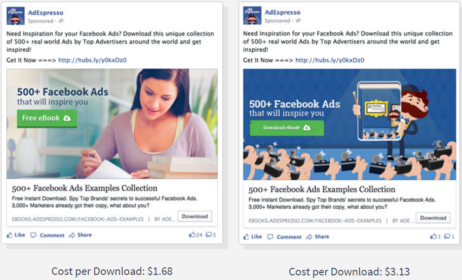
In this example below from AdEpresso below, we could see that the cost per download of a Facebook ad featuring a real life human was superior to one featuring a cartoon figure.
Source: AdEspresso
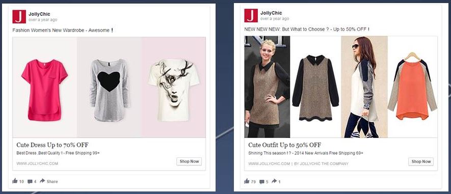
Here’s another example from JollyChic that reveals how an ad with humans performed significantly better than one without.
Courtesy of Connectio
Now this doesn’t mean that all ads which feature cartoons would fare worst than those with human figures. But research does seem to show that we are partial to those thus far. (You can read more about split testing techniques in Connectio’s blog post here.)
#5 Feature your customers
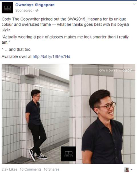
The best kind of humans you should feature on your ads are your customers. Or personalities that typify who your customers should be. This is why I love what Owndays Singapore is doing with their series of ads featuring hip young urban professionals – their key target group.
#6 Ensure images are on brand
Last, but certainly not least, do ensure that the images you have selected are aligned to your brand identity. Keep to a consistent look and feel so that your audience does not get confused about the visual identity of your ad.
No prizes for guessing where this photo was taken (image source)
Craft compelling Facebook ad copy
While a beautiful image may draw your audience to your ad, it is your text which moves them to take action.
Copywriting for Facebook ad needs to consider the unique properties of the social network. As an example of a native ad, Facebook ads need to feel natural and organic, even though they are interruptive in nature.
#1 Keep it believable
This is the most basic element of a Facebook – or any – ad. When your ad copy and visuals do not match, you may end up with horrific combinations like the example below:
Question: Would you click on a Facebook ad like that? I certainly wouldn’t!
#2 Use storytelling methods
As a social networking platform, Facebook works well for storytelling ads. At least according to Facebook marketing science ads research manager Neha Bhargava.
In this report from Facebook themselves, two examples of storytelling ads yielded better ROI for customers:
- Funnel-based storytelling, when an advertiser uses a series of messages to “walk” a potential consumer down the purchase funnel
- Priming-and-reminding storytelling, when an advertiser uses multiple Facebook ad formats to both “prime” people with the brand’s story via video ads and “remind” people of the video narrative with display ads
An example of a great storytelling ad is the one below from Odigo Travel. I love how it promoted an article from the advertiser’s page without any form of hard-sell whatsoever.
#3 Ask questions
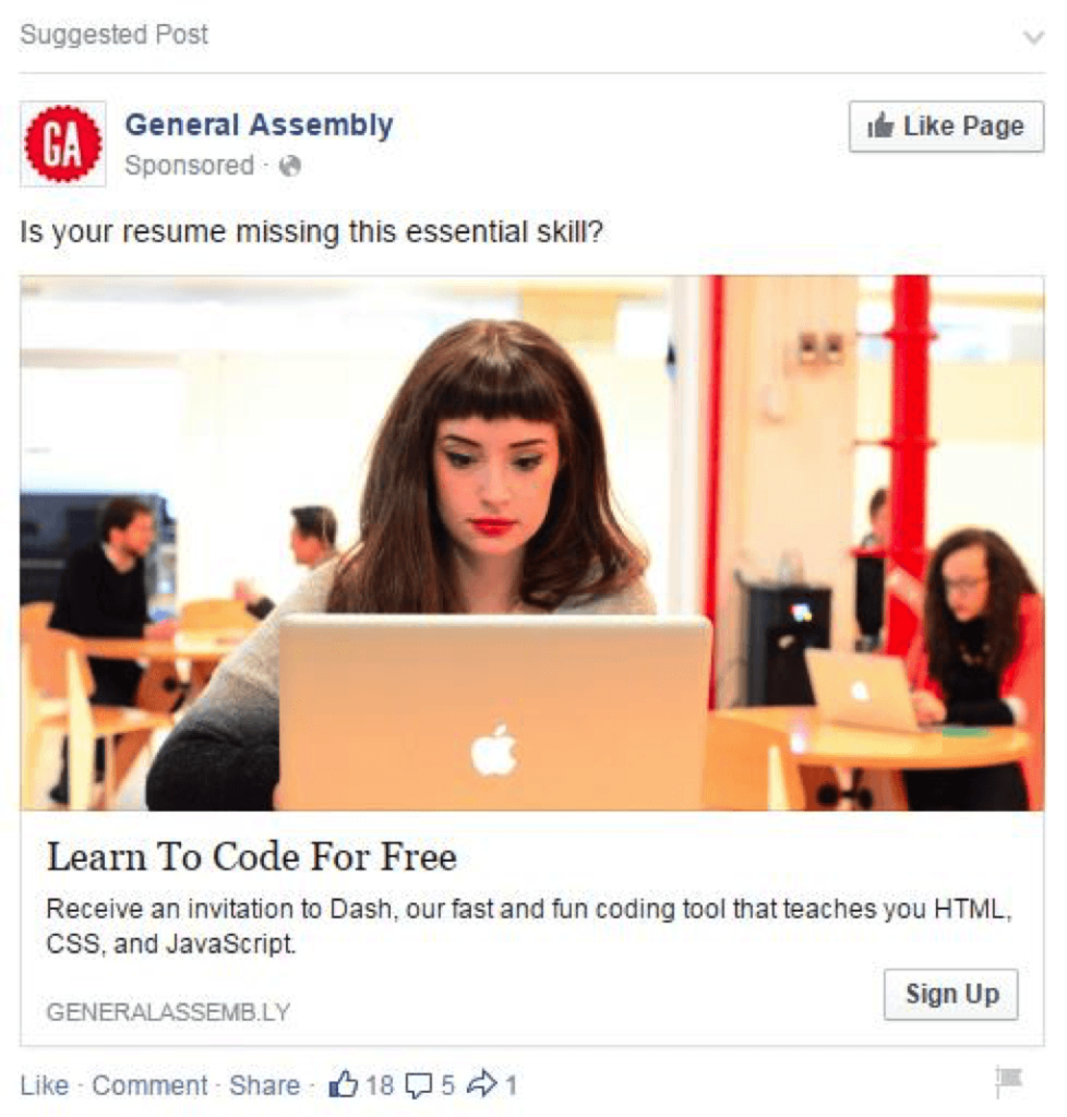
Questions have always worked well across most social channels. The same applies for Facebook ads, especially if the questions are targeted like in the example below from General Assembly.
Source of image
#4 Experiment with different copy lengths
I know I know. We have all heard that old ad-age (pun intended) that less is best when it comes to Facebook copy.
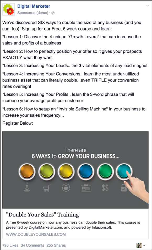
The truth, however, is that copy lengths work differently for different target audiences. For example, check out this super long copy ad which helped DigitalMarketer secure 20,000 leads in 2015!
The thing here is to provide VALUE to your audiences through your copy as much as possible.
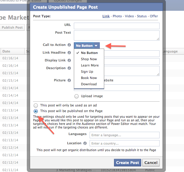
#5 One Call-To-Action (CTA)
With the limited space on Facebook ads and the super-short attention spans of consumers, your call to actions should be limited to just one if possible. Getting your ad readers to do multiple actions may dilute the efficacy of your message.
There are various CTAs that Facebook ads offer – just choose the best one that suits your offer. Here are some examples of the CTAs available in Facebook’s ad creation tool.
Courtesy of Duct Tape Marketing
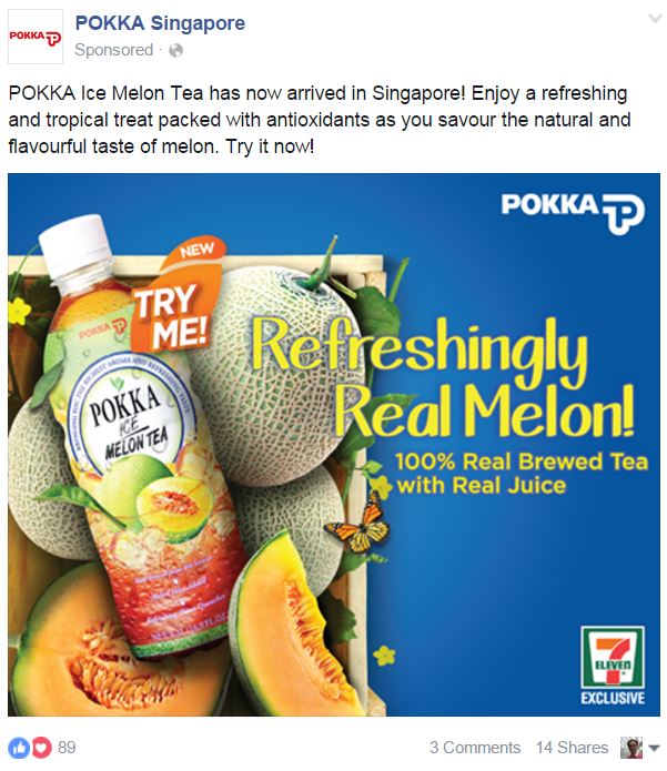
#6 Highlight Your Customer Benefits Upfront
This is advertising 101. Instead of burying your benefits deep within your landing pages or ad copy, put it upfront in both your ad copy and visual. See the example below from Pokka Singapore to get a good idea of how this can be done.
#7 Include dates, times, prices and other actionables
Don’t forget that your Facebook ads should contain information like the 5Ws (Who, What, When, Where, Why) and 1 H (How).
A good example is the ad below from Starbucks promoting the World’s Largest #StarbucksDate.
#8 Boost your content through ads
Finally, consider how you can use Facebook ads to boost your most popular blog posts and content, like the example given below. When I clicked on the ad, I was brought to a useful article which provided renovation tips for folks with homes in Singapore’s hot and humid weather.
More in my social media marketing workshop
What I’ve covered above is just the tip of the iceberg. Social media marketing covers many other areas – from understanding how each social channel works, knowing which content format to use, to measuring and managing success.
After almost 10 years in social media marketing, I will be sharing share what I know in a comprehensive two day social media marketing training course which runs every month or so.
Done in partnership with Equinet Academy, this rigorous two-day workshop will equip you with practical hands-on experience in social media marketing.
Click on the link here to sign up today.
Oh and let me know too if you’ve got any thoughts on what you can do to begin your social media marketing journey. I’d love to hear your ideas!

