A picture paints a thousand words. Especially on social media channels like Facebook.
With nearly 80 percent of social media time spent on mobile phones, Facebook users are scrolling through their News Feed with the flick of their thumb.
To stop them from bypassing you, you’ll need “thumb stopping” visuals that grabs the attention of your audiences. These visuals may be images, infographics, cartoons, or other designs that complements your Facebook Ad copy, and drives them to act on your offer.
Thanks to a podcast episode on Perpetual Traffic and guidance from the Ultimate Guide to Facebook Advertising, you can now short cut the process of creating effective creatives for your Facebook ads.
Let me walk this through you while adding my own insights.
6 Things Your Facebook Creative Need
Contrary to popular belief, you shouldn’t just feature your offer in your creative.
Instead, consider the psyche of your audience, and think about how your Facebook ad (which is really just another post on their News Feed) can stand out and move them to act.
There are six things which your Facebook creative need.
#1 Be Reflective of Your Hook
Your hook is the way you sell and market your offer. Also known as your marketing message, it’s the thing that intrigues your would-be customers and reels them in.
Your hook is often conveyed in your headline or lead sentence, and may include the following…
- A Knowledge Gap: “Can you really want to quit your job? Find out here.”
- A Desirable Outcome: “The four hour work week,” “Get a good grade”
- A Transformation: “How to win friends and influence people”
- A Cure for a Pain: “Eliminate stubborn tummy fat without starving yourself”
When thinking about your creative, ensure that it catch eyeballs in a way that is related to your hook. Like this example from NTUC Income (an insurance firm) below.

#2 Tell a Story
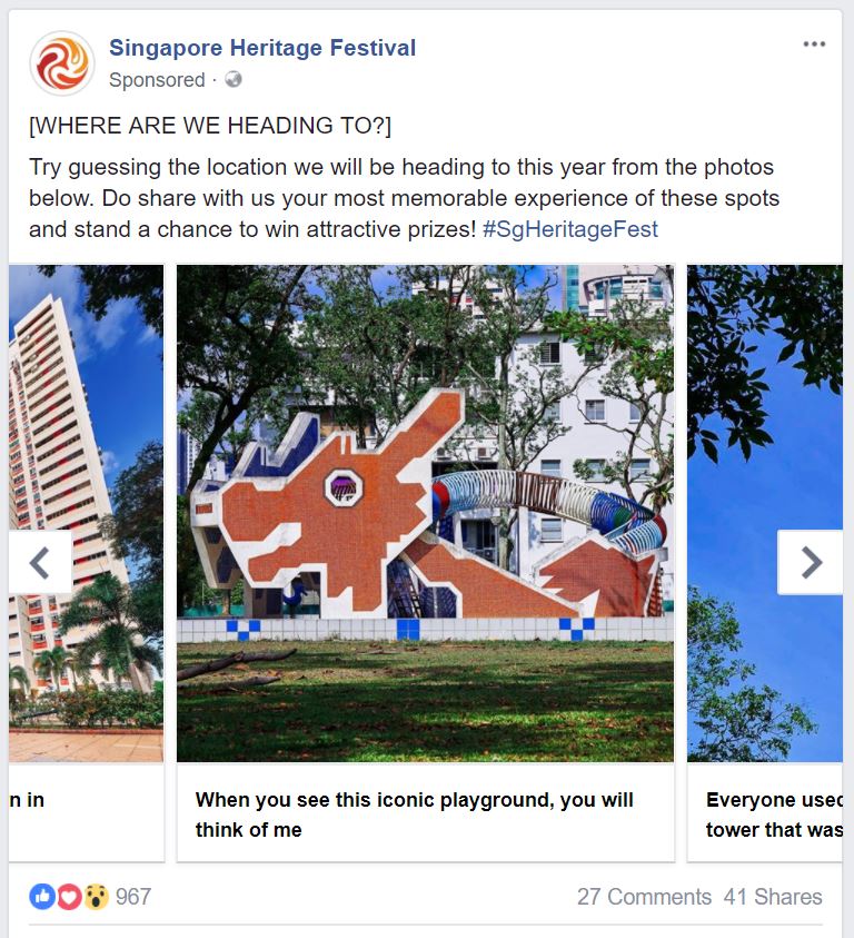
Storytelling is a great way to grab the attention of your Facebook audiences, and there is no better way to do that then to weave your creative into a Carousel ad.
Here is an example of storytelling visuals done right on a Carousel Facebook ad by the Singapore Heritage Festival. Notice how the visuals blend in nicely with the curiosity gap created by the copy.
#3 Display the Product
This is almost a no-brainer. However, not all products or services work well here.
If you are selling a B2B service (like consulting), it may be more effective to showcase who your clients are rather than what your product actually does. Or to demonstrate the benefit that they can gain.
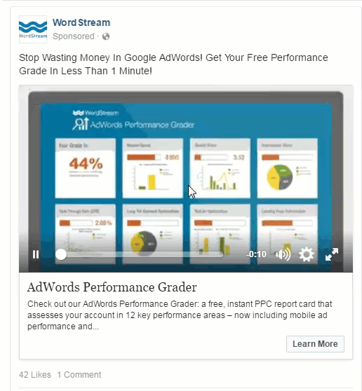
#4 Stand Out in the News Feed
There are some tricks which you can employ here:
- Use contrasting colours to grab attention
- Consider little videos or GIFs that move
- Make use of charts, graphs or cartoons
Here’s an example of a GIF ad from Wordstream.
#5 Be On Brand
This is an important reminder for us not to be so zealous about standing out that we forgot to be consistent.
Staying on brand, however, doesn’t mean that you should keep using the same designs for your ads. Rather, it is about putting in little consistent touches across all your images.
These may include…
- Including your logo and tagline across all creatives
- Using a consistent style, eg human images or cartoons; line drawings or vectors
- Conveying your brand feel, eg playful and irreverent, or clean and contemporary
Here is an example of a Facebook ad creative from AppSumo which seeks to be consistently on brand.
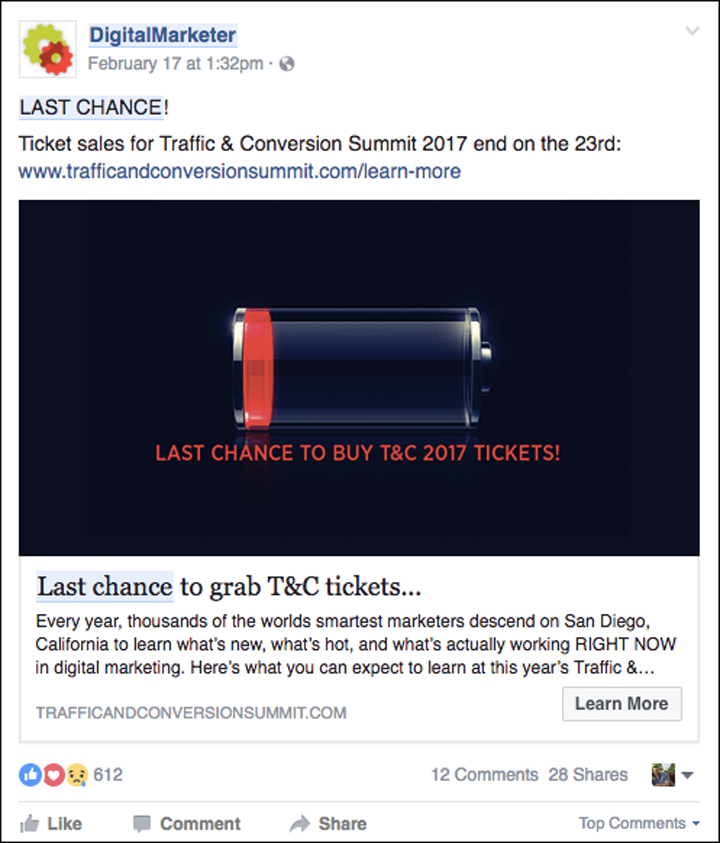
#6 Play Off Emotions Associated With an Image
If you know that certain images have already been ingrained in people’s minds to mean certain things, you can use those images to elicit the same emotions.
A good example here came from Digital Marketer’s Facebook ad for the Traffic and Conversion Summit, where they used a iPhone battery that was low to show the idea of scarcity in their ad.
Examples of Facebook Creatives That Work
From my experience in running Facebook ads for clients, I notice that creatives which work tend to…
- Be simple to understand and appreciate
- Be clean and uncluttered
- Clearly communicate the hook (and sometimes offer)
- Have some text overlaid on them
- Have a storytelling element
- Cleverly use metaphors and analogies to communicate their message
Let’s look at more examples of strong creatives below.
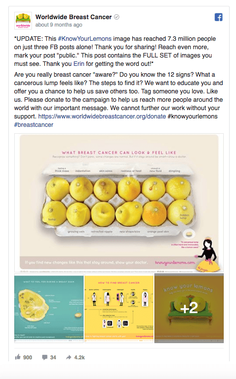
#1 Worldwide Breast Cancer’s #KnowYourLemons
I love how this campaign used different shapes and types of lemons as a metaphor for regular or irregular shapes and lumps that a woman would need to be mindful of in her breasts. By using these strong visuals, the campaign succeeded significantly to get the message out.
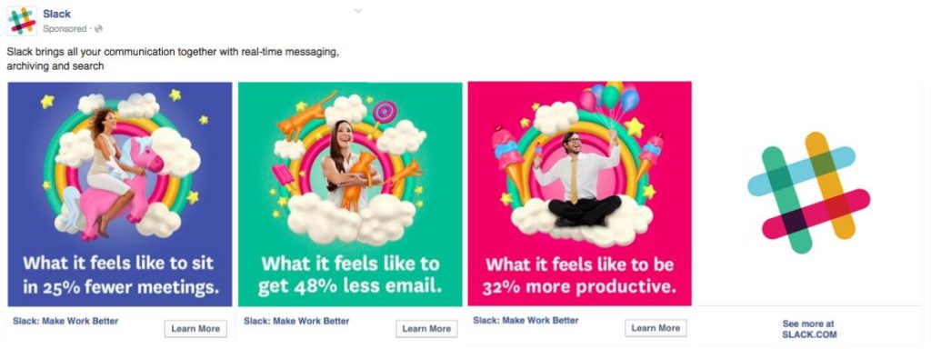
#2 Slack’s Facebook Carousel and Like Ads
I love this series of Facebook ads by Slack – the maker of a productivity software and app which allows teams to collaborate online.
The creatives of the ads are not only visually attractive with contrasting colours; they also convey the sense of freedom, enjoyment and fun which you don’t often find in software companies selling a B2B solution.
Courtesy of Nanigans

Courtesy of Nanigans
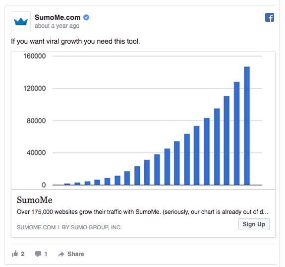
#3 SumoMe’s Growth Chart
I love everything which SumoMe does, and the brand certainly knows how to create fresh and interesting creatives on Facebook.
Here’s an example from 2017 which simply shows a chart that depicts growth. Beyond the eye-catching chart, I also like how it uses social proof to convince potential clients to sign on with them.
#4 Workforce Singapore’s ICT Career Facebook Ad
Also known as WSG, Workforce Singapore is a government agency promoting career development in various sectors.
I like how they’ve adapted the concept of “plugging” into job opportunities in the InfoComm Technology (ICT) sector with this ad showing a series of cartoon professionals standing on a LAN cable. The overlay text also works well in this example.

Avoid These Facebook Creative Mistakes
Now that you’ve learned all about the good, it is time to consider the bad. There are numerous examples in the Facebook Ad hall of shame, but generally I find that the following are usually common in these bad ads:
- Use of stock images which are attractive but do not relate to the product or service
- Creatives which do not relate to the hook or offer
- Misleading creatives that prey on people’s gullibility (eg by featuring an unrelated celebrity)
- Overly cluttered images
Let’s look at some examples.
#1 EE’s Eeky Facebook Ad
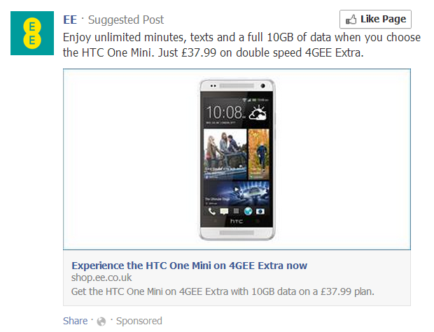
Courtesy of Andrew McCarthy
For the ad above, you’ll notice that the visual is totally uninspiring and does little to convey the qualities of the new phone. The copy zooms in directly to the features of the phone, without considering who the target audience may be.
#2 UpCode Academy’s Ho Hum Photo
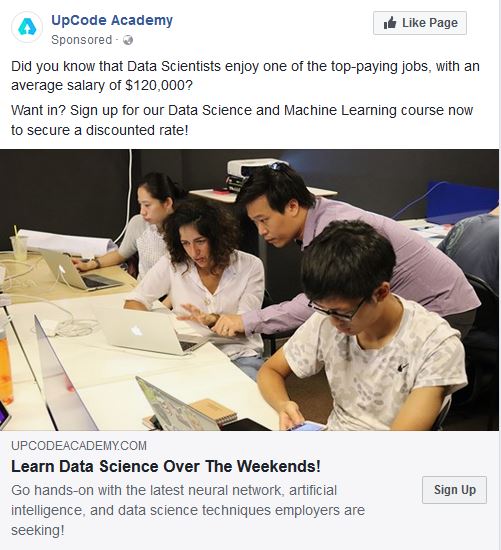
This second example from UpCode Academy uses a photo which they’ve probably taken during one of their classes. While it is certainly fine to feature your students in your ads, I wished that they’ve chosen one which conveys more emotion.
(PS – notice what the guy in the T-shirt below is looking at.)
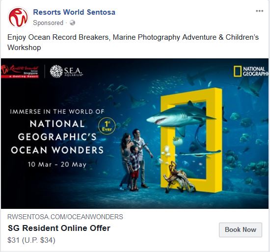
#3 Resort World Sentosa’s Overcrowded Creative
With a huge annual advertising budget and wonderful attractions, I’d imagine that Resorts World Sentosa would be at the cutting edge of Facebook advertising. Instead, I saw something like this on my news feed.
While the information isn’t wrong, I felt that the creative is very cluttered while the offer isn’t very clearly communicated. The copywriting for the Facebook ad can also be further improved.
Facebook Ad Creative Checklist
To ensure that your next Facebook Ad works harder for you, consider adopting the following checklist developed by DigitalMarketer:
- Create a powerful message when you conceptualise your images
- Sketch out ideas FIRST before laying out any design elements
- Use complementary or contrasting colours
- Pick the right fonts – where possible, avoid cursive or handwritten type fonts which are hard to read
- Add text and a Call To Action (CTA) in your image – make sure these are succinct to avoid Facebook’s 20 percent text penalty
- Make sure image is congruent with your brand
Conclusion
I hope that these ideas for Facebook creatives were useful for you. From my own experience crafting copy and designing visuals for clients, I find that coming up with the right creative involves a lot of experimentation and testing.
If you wish to learn more about Facebook advertising, check out my other posts below:
- Learn the basics of Facebook advertising here
- Consider Digital Marketer CEO Ryan Deiss’s tips on crafting influential ads
- Guest writer Victoria Greene shares her views on advertising strategies on Facebook