
Wish to improve the performance of your website? Consider using a clean web design.
A minimalist design puts the focus on your product or service. It reduces distractions and shines the spotlight on your product or service.
Too much clutter distracts from the goal of a website. It can also signal to potential customers that you aren’t very organized.
If you feel a clean website design is for you, the best way to learn the elements of it is by studying what other companies create.
According to the Small Business Administration, there are approximately 31.7 million small businesses in the United States. The majority have some sort of web presence.
Your job is to stand out from all the noise through a simple, intuitive design that meets user expectations.
While there are many different design types, and new trends emerge every year, a clean web design offers a classic look that doesn’t grow dated.
Here are the five key areas to focus on when creating your own minimalist design. We also share examples of some of our favorite clean looks.
1. Use Straight Lines
There is a time and place for geometric patterns and curves. If you want to keep your website design clean and uncluttered, though, stick with a grid pattern.
Focus on clean, straight lines with minimal or no deviation. Your navigation bar, content and anything else you place on your page should all line up along grid lines.
If you’d like to add visual interest, you can vary the size of your boxes and use the Rule of Thirds to place important elements in a spot where users notice them more easily.
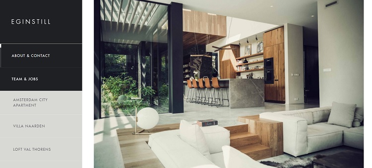
Eginstill creates one-of-a-kind furniture and fixtures.
To put the focus on their designs, they’ve stayed with a very simple website design. Note the navigation bar on the left with rectangles. The photo is a square. Even the text lines up within the grid.
2. Add One Cool Element
Just because you’re creating a clean design doesn’t mean it has to be boring. You can still tap into the trends and add things such as animation, video and even bright colors.
The key is to utilize the trend making the most sense for your brand.
Limit yourself to one cool thing instead of trying to do everything on a single page. For example, you might add an animated logo or a background video but not both. If you put in too many moving parts, people will feel confused and unsure of where to look.
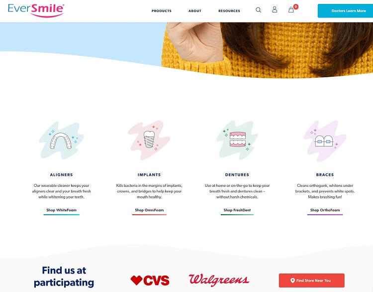
EverSmile uses an animated model to show how their product works. By highlighting how simple their whitening trays are, they pull the user in and engage them right away.
The company also simplified their navigation menu, limiting their user’s options to three choices. The call to action (CTA) button is above the fold, highlighting the goal of the page and pushing users into the sales funnel.
3. Share Top Benefits
When users land on your site, they want to know why your product or service is best for them. Think through the benefits you offer that no other company does.
What is your unique value proposition (UVP)? How does it add value to your customers in a distinctive and differentiated manner?
Once you understand the unique pros of your product and which ones your users care most about, you can share that information within your design. Use visual cues and text to list the advantages of your company.

Lucid Motors shares their Lucid Air model in the above website. As a video feeds in the background, highlighting the simple lines of the car, they add text on top explaining some of the best features of the vehicle.
Note how they explain the starting price, how far the range is for the battery and how much horsepower the vehicle has.
To discern what your UVP is, look at the common questions your leads have about your product. These provide valuable clues to what they care most about and which ones you should share on your website.
4. Limit Your CTAs
You may have more than a single purpose for each page of your site. Maybe you serve both businesses and consumers. Perhaps your customers buy one of two or three items, so you need to share CTAs linking to each.
However, you’re much better off funneling users toward a single purpose. Try to narrow down the options and limit your CTAs.
At the most, you should have two. If you find you have more than two CTAs, you may need to create buyer personas and send different customer types to landing pages. Personalize the experience as much as possible.
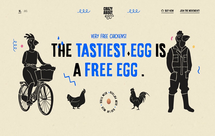
Crazy About Eggs uses a solid color background to highlight the silhouettes on their page. Notice the spacing to keep things focused on just a few key points.
They also limit their CTA to “Buy Now” and “Join the Movement.” You can scroll down to learn more about eggs from free range chickens
5. Limit Your Color Palette
One of the top things you can do to create a simplistic design is to stay within a limited range of colors. Choose two or three hues and design within that range. You can also go with a monochromatic look for a more traditional flare.
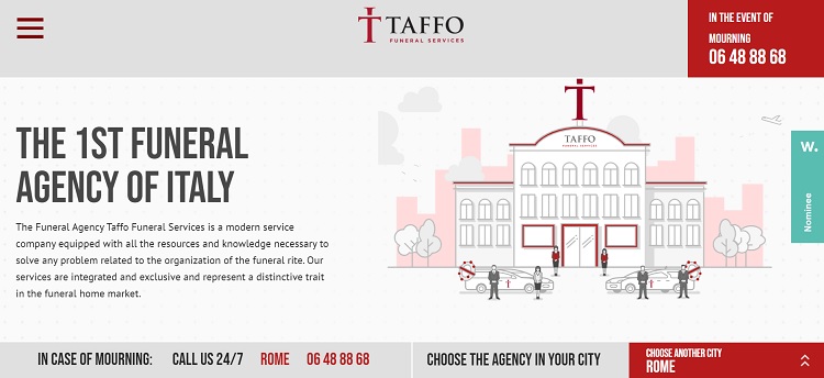
Taffo Funeral Services sticks with one accent color, a beautiful red and then some neutrals. The result is a very clean look that pops where the CTAs are. Note the use of white and black to impart information without distracting from the main purpose of the page.
Declutter and Simplify
Keep only what you absolutely must when designing a clean look. Ruthlessly cut anything not moving the user to the goal for the page.
With a little work and a lot of white space, you’ll come up with a design that is minimalist and beautiful.

Eleanor Hecks is editor-in-chief at Designerly Magazine. She was the creative director at a digital marketing agency before becoming a full-time freelance designer. Eleanor lives in Philly with her husband and pup, Bear.
Nice its been good to read this web designing blog