Infographics are becoming increasingly important in today’s visual-first digital world.
As visual representations of data or information, infographics are often used to communicate complex ideas clearly and effectively.
Used in a variety of ways, from marketing campaigns to educational tools, infographics help to visually convey information in a succinct fashion without the need for verbal explanations.
Indeed, an infographic can be used to highlight facts, statistics, trends, tips, or even opinions.
Why Are Infographics Important For Social Media?
An infographic is a great way to visually share information in a bite-sized and manageable fashion. They’re easy to understand and digest, making them perfect for sharing across multiple platforms.
They’re also very effective at getting attention on social media because they help you get your message out there quickly and easily. And they are shareable and embeddable, meaning you can hopefully get some quality backlinks in return for the knowledge you shared on your blog pages.
Here are some reasons why infographics are so popular:
#1 They’re Easy To Understand
They’re simple to read and comprehend. This makes them ideal for anyone who has trouble reading text. You don’t need any special skills or education to create one either – just a good eye for design and the ability to add colour and images.
#2 They Can Be Used In A Variety Of Ways
You can use infographics in a number of different ways. You can create infographics that will appeal to the eye, like this one about the benefits of using a mobile phone for learning.
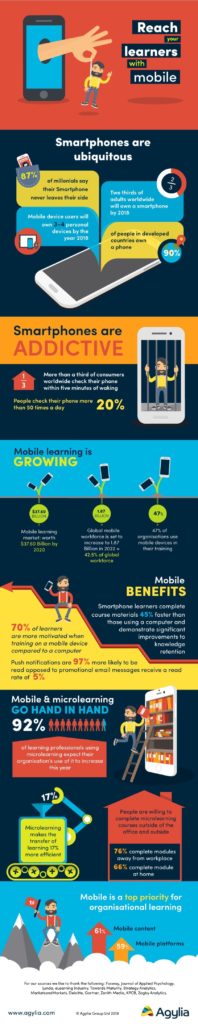
Image source: eBookFriendly
Or you can create infographics that have more of an informational focus, such as this one about the best places to eat in New York City.
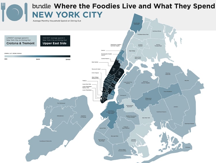
Image source: Fast Company
#3 They Are Easily Created
You don’t need any special skills to create an infographic. All you need is a good idea, a camera, and Adobe Illustrator or Vectornator (or similar software). Once you’ve created your graphic, you can then upload it to sites like Flickr, Tumblr, Pinterest, Google+, Instagram, Twitter, Facebook, etc., where others can view and comment on it.
#4 They’re Effective At Getting Attention On Social Media
Infographics play a big role in getting your content noticed on social media. They allow you to put together a quick and concise piece of content that gets people talking. People are also more likely to remember the information because it is visually displayed.
How Can Infographics Be Used On Social Media?
On social media, infographics can be used in two ways. They can be used as a standalone piece of content or to supplement a long-form piece of content.
If you want to post an infographic as its own piece of content, you need to make sure that it’s well designed, clear, and interesting enough to be shared on social media. If it doesn’t stand out, no one will notice it.
Infographics can also be used as part of a larger story on social media. If you want to include an infographic in a longer article, blog post or video, then you should try to integrate it into the overall flow of the piece. It’s not always possible to fit everything into one piece of content, but if you do, then you should ensure that the infographic fits within the context of the rest of the piece.
There are many different types of infographics such as data-driven infographics, infographic timelines, infographics with graphs, infographics with maps, and infographics with charts. Each type of infographic has its own unique style and uses so make sure you choose the right one for the job.
Now how do you ensure that your infographic visuals are the best of the best?
10 Best Practices For Keeping Your Infographics Eye-Catching & Effective

To create eye-catching infographics you need to know what works and what doesn’t. Here are 10 tips to keep in mind when creating infographics that work on social media:
#1 Make Sure The Infographic Is Readable No Matter The Screen Size
How often have you seen an infographic that looks great on a desktop screen, but becomes illegible when viewed on mobile devices? Wondered why some infographics are so good at grabbing our attention?
Well, they’ve got a secret weapon – readability. In order to create an effective infographic, you need to ensure that it’s readable no matter the screen size.
To create a good infographic, you should consider the size of the screen on which it will appear. If you are using a smartphone, you may want to consider creating two separate infographics. One for desktop and another for mobile.
#2 Include Your Logo Or Company Name
How often do you see infographics that don’t include a company name? This is a wasted opportunity for building the creator’s brand name.
To create an effective and useful infographic, you should always include your company name. This way, you’ll be able to connect with your audience and get them interested in your brand.
Adding a logo or company name to your infographic can further give it a professional look, boost its credibility, and add value to your brand.
In addition, it makes it easier for your readers to identify who created the infographic.
You can include your company logo in your infographic using a variety of methods. For example, you can add a watermark, overlay your logo onto the image itself, or simply place your logo at the bottom of the graphic.
#3 Make Use Of White Space
Infographics without white spaces may look great, but they don’t always tell a story. The key to creating compelling visual stories is to use white space effectively.
White space is an important part of graphic design.
The blank area between elements and an image, white space helps create depth and clarity in your designs. It makes your message stand out from the crowd and gives it context.
White space also helps your readers to focus on the main points of an infographic. If you don’t give your audience enough breathing room, they might miss out on the crucial details.
#4 Keep Your Fonts And Colour Scheme Simple
It is important to choose the right typefaces and colours for your infographics. The wrong choice can distract from the message. To create an effective infographic, you should focus on three things: simplicity, clarity, and creativity.
#5 Have A Catchy Headline
Infographic headlines are usually short and sweet. They should only include the main points of the graphic, without unnecessary details.
A good headline is essential to grabbing attention. The goal is to capture attention and encourage readers to click through to read the rest of the post/infographic.
#6 Make Sure The Infographic Flows
A great infographic will tell a story through visual elements like images, charts, graphs, and illustrations. It should be easy to understand and follow without distracting from the main message.
If your infographic doesn’t flow well, people won’t read it. It has to be easy to understand and follow. Don’t forget to include important information at the beginning of the infographic so that your readers know what they’re looking at.
#7 Make It Shareable
Infographics are great at getting people to talk about a topic. But they don’t always translate well into social media posts. A standard infographic may look like a wall of text, which makes it hard to share.
To make your infographic more shareable, consider adding text boxes at the top and bottom of the infographic so that people can add their own content. You can also use buttons to link directly to other websites.
#8 Make It Relevant and Focused
If you want people to read your content, your infographic needs to be interesting.
The best way to do so? Focus your content on only one topic. For example, if you’re writing about the ketogenic diet, don’t write about everything else – just focus on what makes the ketogenic diet so effective.
You also need to ensure that your infographic is engaging by making it relevant for your audience. If they don’t understand what you’re talking about, they won’t care about it.
#9 Use The Right Data Visualization Types
Data visualization is one of the most important tools in any infographic design. It helps your readers understand complex information by breaking it down into simple, digestible chunks.
There are many ways to visualize data. Some people like pie charts, others prefer bar graphs, and some love scatter plots. Each data visualisation type has its strengths and weaknesses.
For example, pie charts are great at conveying relative sizes, but they don’t show any information about the actual values.
Bar graphs are excellent for comparing two sets of numbers side by side, but they don’t convey much information about the relationship between them.
Scatter plots, on the other hand, are great for showing trends, but they don’t really tell us anything about the underlying data.
#10 Balance Text & Visuals
The balance between text and images should be kept at 50/50. If you choose to include too many photos, it will distract from the message. Similarly, too much text can be overwhelming.
The best infographics balance text and visuals so that they don’t distract from each other.
To balance between text and visuals, try using a grid system. This will ensure that all elements are evenly spaced out across the page.
Bonus Tip: Make Use Of A Graphic Designer & Graphic Design Tools
The best way to create an infographic is to hire a professional graphic designer who has experience creating infographics. They will know what works and what doesn’t, and they can ensure that your infographic looks great.
What if you can’t afford a graphic designer and need to create your infographics yourself? If you don’t know where to start, try using a free online tool like Canva or Piktochart.
These sites will allow you to drag and drop images into place to create professional-looking infographics. They also offer numerous templates that are social media friendly.
The best way to find out what works is to test different designs. Start with a simple sketch before moving on to something more complex. Once you know which type of design works best for your audience, you will find it easier to replicate this approach across all your content formats.
5 Examples Of The Best Social Media Infographics
There are hundreds of thousands of infographics out there on the internet and on social media to inspire your own creations. But, how do you know which are worthy of your attention?
Below we have a number of great examples of infographics found across a variety of different social media platforms.
#1 Budget Speech Summary By Liberty
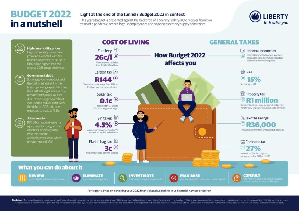
Image Source: LinkedIn
Budgets and finances are things that most people struggle to understand, which is why Liberty took it upon themselves to create this fun yet informative infographic for their clients (or anyone else who stumbles upon it).
Since Liberty is a financial services company, an infographic on budget couldn’t be more relevant to their target audience. Their logo and company name is very clearly included in the top right-hand corner so everybody knows who to thank when they read this summary.
#2 Monitoring Progression By The Bodybuilding Dieticians
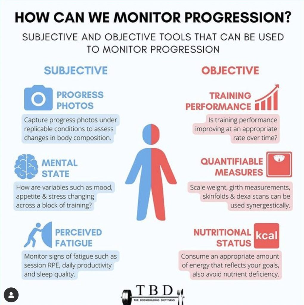
Image source: Instagram
What makes this infographic amazing is the simple fonts and colour scheme they have used. The font is all the same, with weight being the only differentiating factor and the colour palette is minimal – blue and red.
Neither detracts from the overall message of the infographic which is how to monitor bodybuilding progress.
Plus they have included memorable icons that correlate to each method, upping the overall effectiveness of the infographic.
#3 Project Management Tips By SprintZeal

Image Source: Facebook
This infographic is great in the way that it flows, with the right visuals chosen to represent each tip. However, what we want to focus on is the shape and size of the infographic. It is perfect for social media.
Why? Since it is longer and narrower it can easily be read on a phone (which most people use to access social media) simply by just scrolling down.
#4 The Cost Of A Big Mac By The Economist
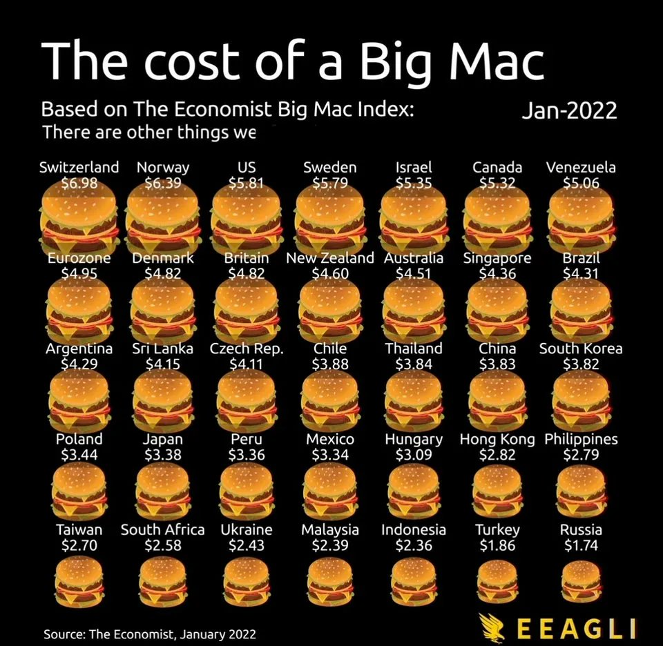
Image Source: Twitter
What makes this illustration so effective is the fact that you do not even need to read the numbers to know which country a Big Mac is the most expensive in. All you have to do is look at the size of the burger.
That image is more likely to stick in your mind than mere text with the prices.
The headline is also big, bold, and eye-catching so you immediately know exactly what the infographic is telling you.
#5 The Ultimate Guide To Product Design By Visme
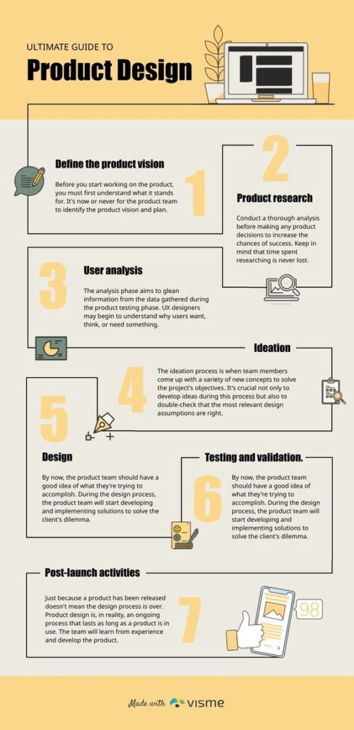
Image Source: Pinterest
There is one element that we want to focus on here and that is the visual flow. It is off the charts! The simplicity of including a line that guides your eye from point to point, is almost too wonderful.
Forget the numbers, the line is the star of this infographic.
Conclusion
As you can see, there is no one size fits all solution when it comes to creating amazing infographics that can be used to adorn your social media feed.
However, if you follow the best practices above and draw inspiration from the examples we have provided, you are sure to be on the right track to making all your infographic dreams come true.
Author

This article was written by Darya Jandossova Troncoso. Darya is a photographer, artist, and writer working on her first novel and managing a digital marketing blog – MarketSplash. In her spare time, she enjoys spending time with her family, cooking, creating art, and learning everything there is to know about digital marketing.
Business representatives predict that infographics will be an important part of their marketing campaign in 2021-2022. Charts, graphs and illustrations increase user engagement by 80%.
Interestingly Informative