Social media platforms are amazing places to grow your brand, get followers, and make yourself seen.
You may have noticed or even clicked on links on social media profiles before — and been brought to a page where you get more information about the offer or product that you’re interested in (which is what prompted you to click the link in the first place).
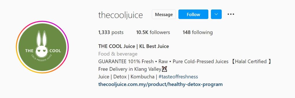
Source: Cool Juice’s Instagram Profile
For example, if you were looking to lose weight and hoping to feel more energized, a healthy detox program may just be the thing you’re looking for — hence you’ll click the link in the Instagram profile above.
Many small businesses (and large ones as well) use this low cost method to get their target audiences onto their landing pages. It is effective, straightforward, and a good source of organic leads.
Think Instagram, Facebook, TikTok, Twitter, LinkedIn and more — you’re posting daily and getting tons (or at least a decent amount) of engagement. You attract people who are interested in what you have to offer. Some may even start messaging you directly about it.
Now, DMs can certainly be a great way to make sales. However, if you want to scale, you’ll need a social media landing page to direct your audiences to.
But… what happens after they land on your page? Let’s find out.
This blog post will walk you through:
- What social media landing pages are
- Why you need them
- Elements of a successful social media landing page, and
- Lots of examples to give you more ideas and inspiration.
What Is A Social Media Landing Page And Why Do You Need One?
Social media landing pages are destination pages that come right after someone clicks a link that you’ve shared on your social media profile.
These destination pages (also known as social landing pages) are part of a marketing funnel. These pages have one single purpose — to either offer something in return for the audience’s email address (and sometimes mobile nos), or to get the audience to purchase from the page.
With email addresses, the funnel continues into nurturing your leads and sending and re-sending them to more landing pages. The cycle continues.
Social media ads, such as a Facebook ad, an Instagram ad, or even a LinkedIn ad, are all part of advertising campaigns that aim to drive audiences to these very same landing pages as well.
A good landing page allows you to bring your customer base off of social media sites and onto your own website. It is extremely important that what you offer on your landing page is exactly what you promised they would get in your social media profile.
Let’s go through some examples so you get an idea of what social media landing pages are like:
1) A lead magnet – such as a downloadable template, eBook, PDF, or resources one can obtain for free in return for an email address
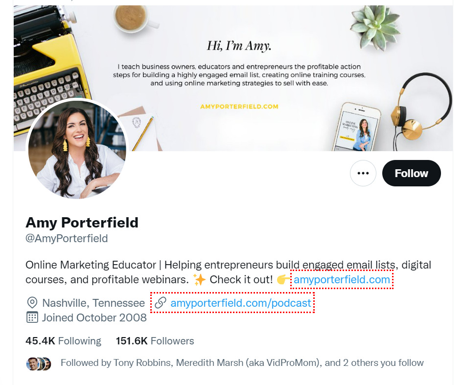
Source: Amy Porterfield
Amy Porterfield’s Twitter bio has 2 links, one that brings her audiences to her home page, and another to her podcast.
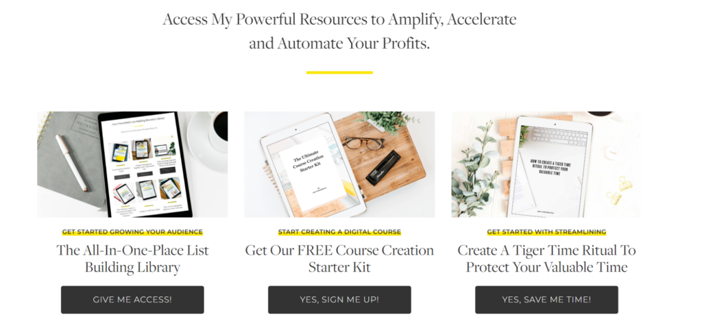
Her home page (which is also her landing page) features some amazing free downloadables that you can get simply by submitting your email address.
Let’s check out her landing page!
Source: Amy Porterfield
She offers a list building resource, a course creating starter kit, and a time management journal to help you manage your time. All these are great tools you can get for free the moment you opt in to her email list.
Her bio states that she helps entrepreneurs build engaged email lists, profitable webinars and digital courses.
Her lead magnets on her landing page fulfill those promises.
2) A free masterclass or webinar
Jasmine Star is a popular social media strategist, and her link to her social media landing page is clearly displayed on her Instagram profile. Her bio states that she has an upcoming class on how to build an Instagram sales machine.
If you were an entrepreneur looking to build your brand on Instagram, you’d click and head over to her landing page.

Source: Jasmine Star’s Instagram Profile
Her landing page does indeed promote a free class that teaches you how to monetize Instagram with the correct strategy. A strong CTA (call to action)button encourages her visitors to sign up for her masterclass.
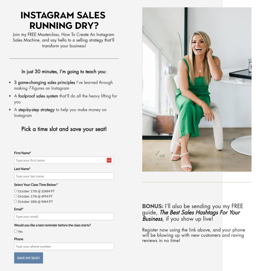
Source: Jasmine Star
Even a huge influencer like Jasmine Star knows that the money is in the landing page. Unless you run a store on Instagram, social platforms are not the best place for making money or growing your email list.
3) A free trial to a software or a physical product
Shopify generates brand awareness on Twitter by creating a social media post every few days to stay top of mind.
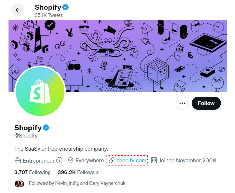
Source: Shopify’s Twitter Profile
Its SaaS landing page offers a 7 day free trial to its app. Free trials are a great way to collecting email addresses — in fact, Shopify states clearly that upon signing up, you agree to receive marketing emails from it.
4) Purchasing a product
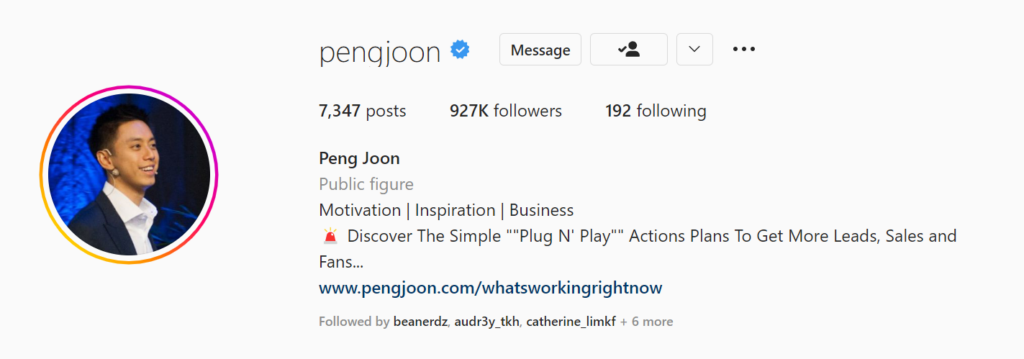
Source: Peng Joon’s Instagram Profile
Peng Joon has a link on his profile that sends his target audience onto a highly optimized landing page that encourages them to purchase a digital product from him.
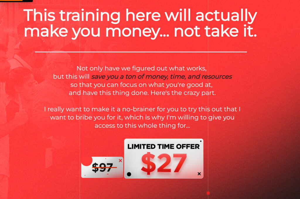
Source: What’s Working Right Now
His bio tells you that he has a ‘Plug and Play’ action plan to get you more sales, leads and fans, and that all these are available inside of his $27 product.
His landing page goes on to fulfill this promise with highly targeted copy of what this digital product contains and why you should get it right now.
What Makes A Great Social Media Landing Page?
Now that you’ve seen several social media landing page examples and have an idea of what they are and why you need one, let’s talk about the elements of an effective social media landing page.
Your audience has reached your landing page, and you want them to take a specific action there. You naturally want a page that is well designed, showcases your brand, and which has a high conversion rate.
Here are some tips to make your landing page awesome:
1) Clear Headline and Pertinent Information
The information that you see on a social media ad, post, or profile has to be relevant to what the audiences will be seeing when they land on your page.
Let’s check out this example:
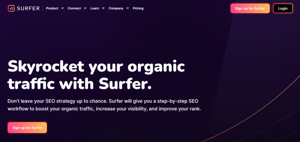
Surfer SEO’s Facebook ad tells you to stop guessing how to rank content.
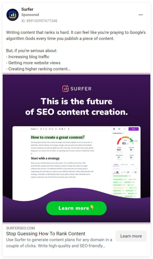
Their landing page continues the message by telling you to get high organic traffic by using the app. In this instance, the messaging is clear and pertinent to what was promoted on the Facebook ad.
2) Simple Layout and Consistent Design
Confused customers don’t buy, hence your landing page has to be simple, not overwhelming, and easily understandable. Good design in web pages is one of the most important factors when it comes to user experience.
White space, strategically placed copy and supporting graphics are all part of a high converting landing page.
If you’re completely new to web design, a simple way to approach this will be to either hire someone to create and design your page for you, or simply make use of a landing page template.

Source: A Clickfunnels Landing Page Template
Many landing page builders come with multiple themed templates, suitable for all sorts of niches. The type of landing page you want will depend on the type of marketing campaigns you are doing — you may be running an eCommerce site and want to sell physical products.
You may — as listed above — offer free downloadable resources or sell digital courses.
Let’s check out some great examples:
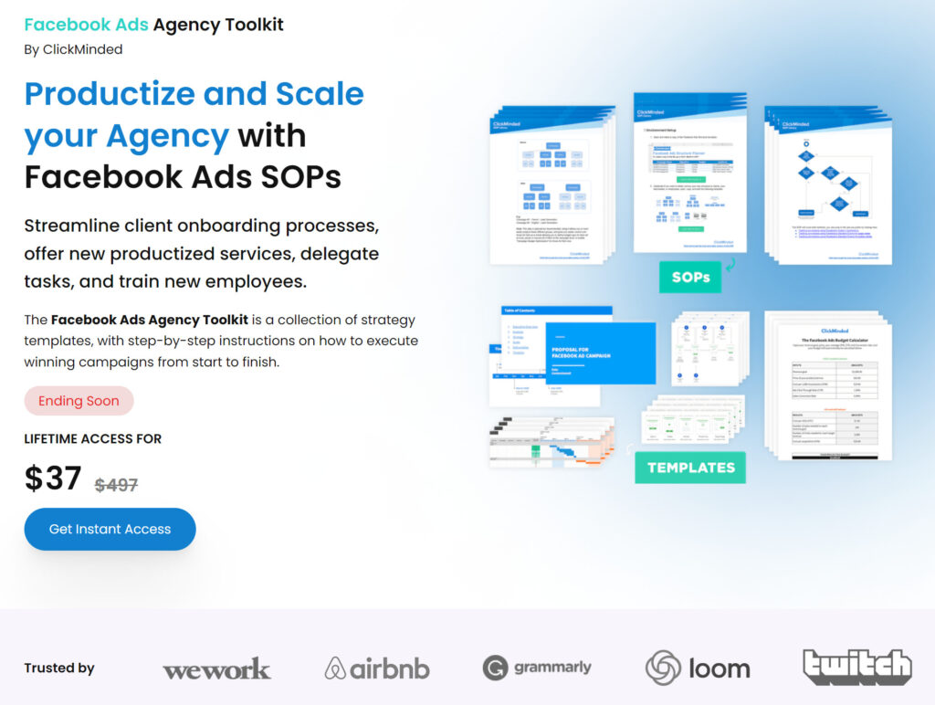
Source: ClickMinded
ClickMinded’s page is clean, with a clear cut headline, a simple color scheme, an image that supports the copy, and a simple CTA that gets its visitors to buy.
Let’s check out another one:
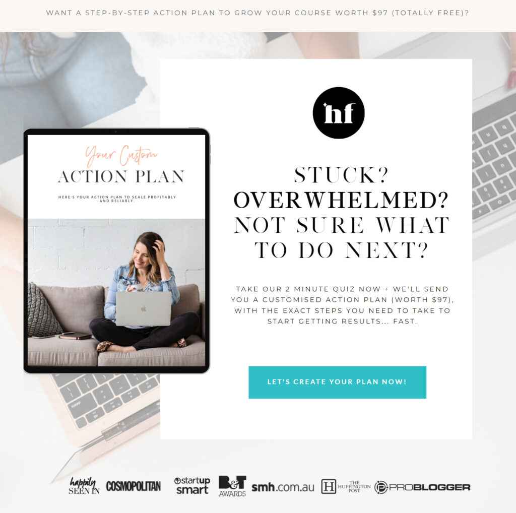
Source: Hello Funnels
Hello Funnels’ landing page is simple – offering a resource worth $97 when you take their free quiz.
The headlines immediately grab your attention, coupled with visual elements that are supportive and easy on the eyes.
3) Social Proof
Social proof and testimonials, when displayed correctly and in the right place, offers a boost to the power of landing pages. Social proof builds trust and authority, and indicates that your brand is widely used and vouched for.
In the Hello Funnels and ClickMinded examples shown above, social proof was clearly displayed for audiences to see.
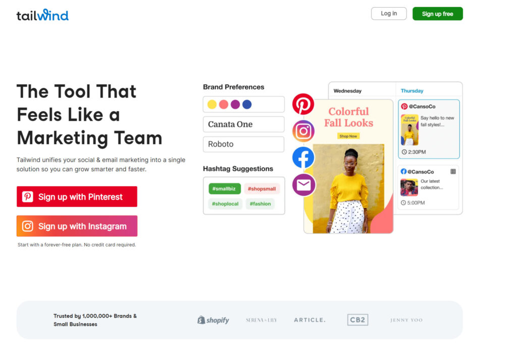
The same goes for Tailwind in the image appended below – social proof states that Tailwind is trusted and used by over one million brands.
Source: Tailwind
4) Strong CTA (Call To Action)
A strong call to action or CTA button acts to push your visitors into taking action. CTAs can be funny, persuasive and attractive.
Let’s check out some awesome examples of CTAs.
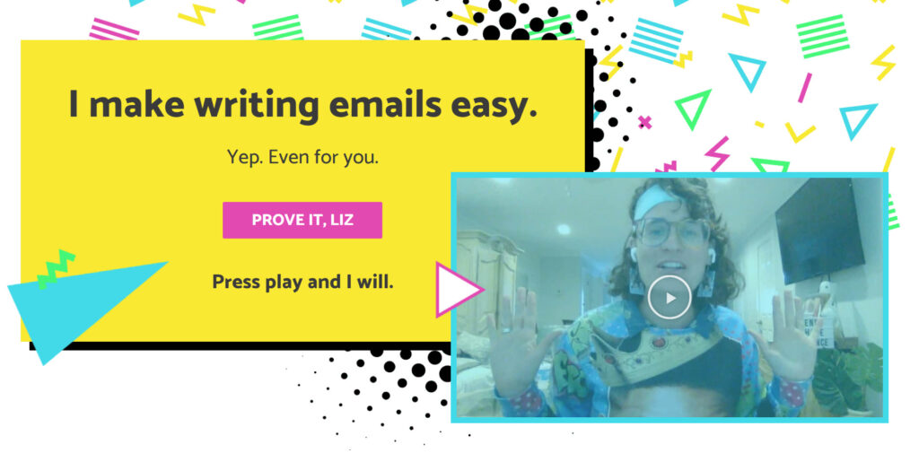
A cute one from Liz Wilcox gets you interested in playing her video.
Source: Liz Wilcox
Michelle Hon from The Chill Mom has an action-taking CTA that invites you to click on it and learn how you can make money working from home.

Source: The Chill Mom
5) Mobile Optimized
As of September 2022, 50.48% of web traffic comes from mobile devices. It goes without saying that your social media landing page has to be highly mobile phone friendly.
It will never do to have missing text or ungainly images fill your screen – your audiences will click out within the second!
Expert advice says that one should always design for mobile before optimizing it for desktop, and that’s very true. A good SEO strategy to getting seen on search engines is not just to have the correct keywords, but also to have your landing page be able to provide good user experience, especially on mobile.
Let’s check out mobile versions of some of the examples listed above.
Source: Liz Wilcox
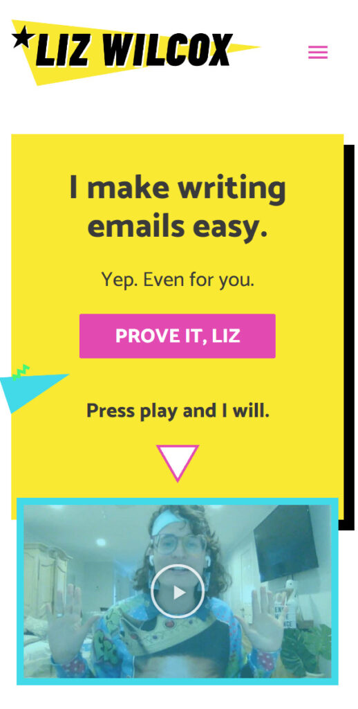
Liz’s page on mobile is highly optimized – there is one clear call to action button, and the loud headlines as well as the CTA are the first things you see when you land on her page via mobile. This is keeping all important visual elements above the fold, so action can be taken by the visitor without having to scroll further down the page.
Source: ClickMinded
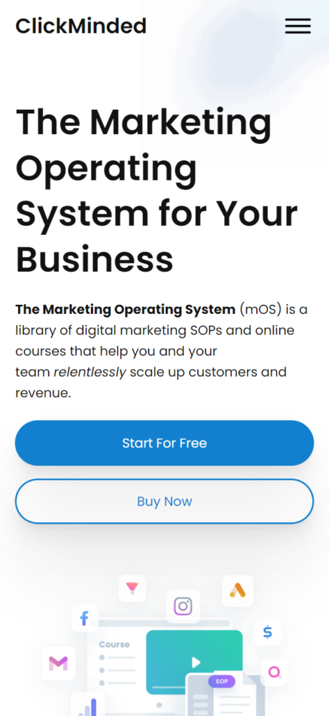
The same goes for ClickMinded – a clear headline, a clean design, and a strong CTA, all seen above the fold, ie without having the scroll down the page.
Key Takeaways
Now that you’ve gone through multiple examples and know the main elements that make a winning sales page, it’s time to grow your list and make money with an effective social media landing page of your own.
Couple that with your social media profiles, and you’ll be running successful social media campaigns in no time!
It is always good to remember your conversion objectives, what you want your audiences to do on your page, and that what you’re offering to them is exactly what they’re looking for.
There’s no better time to start. Digital marketing (especially in Singapore) is on the rise, and having followers on social media platforms alone is no longer a viable business decision.
Pro tips:
- Always track your results and tweak where necessary to improve conversions
- Do A / B testing (split testing) when necessary
- Model what other successful sites or competitors are doing on their landing pages
Let’s go!

Kristy is a pharmacist turned funnel builder. She builds funnels and copywrites for 7 figure businesses. She is also an avid blogger, loves geeking out over SEO and writes regularly for publications on Medium.com. She shares her journey and tips for freelancing at https://kristyting.com.
