(photo credit: Microsoft Stock Images)
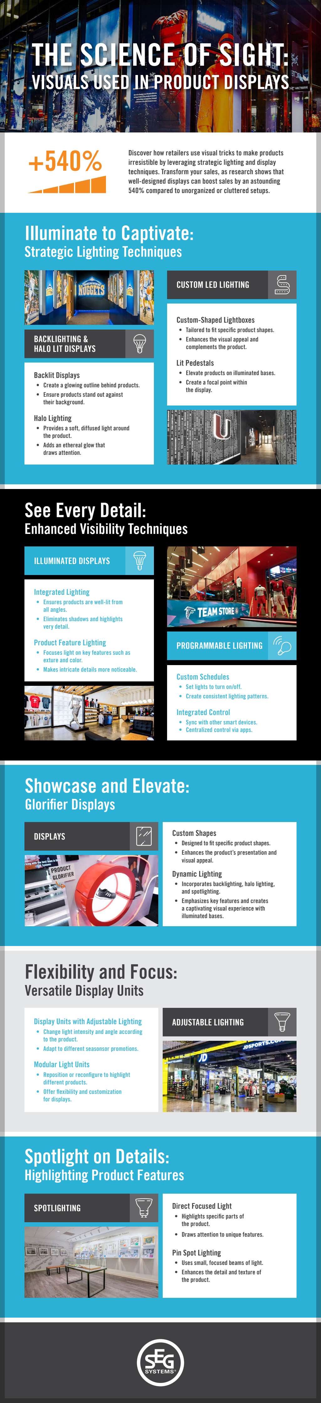
Retail environments rely heavily on visual input. Long before a customer reads a label or compares prices, the brain has already processed color, shape, contrast, and motion.
Product displays succeed or fail based on how well they align with the way human vision actually works.
How the Brain Processes Visual Information
Vision is the dominant sensory channel in retail settings. The human brain processes visual cues in milliseconds, prioritizing contrast, movement, and novelty.
Peripheral vision first detects broad patterns such as color blocks and lighting shifts. Foveal vision then focuses on details like typography and product features.
Displays that rely on clutter or excessive information overload the visual system. Cognitive load theory explains that when too many stimuli compete for attention, the brain filters aggressively and often ignores secondary information.
On the flipside, clean layouts with clear focal points allow the eye to settle and evaluate.
Visual hierarchy plays a central role. Larger elements, higher contrast colors, and brighter lighting naturally draw attention first. Structuring displays around a primary focal point reduces confusion and increases comprehension.
The Role of Color and Contrast
Color influences both perception and emotional response. Research in color psychology suggests that warm tones such as red and orange attract attention quickly, while cooler tones such as blue and green are associated with calm and trust.
Contrast between foreground and background improves readability and product recognition.
High contrast edges help the brain distinguish objects more efficiently. Products placed against backgrounds that are too similar in tone blend visually and reduce impact. Added to this, clear separation through light and dark variation improves clarity.
Consistency also matters. When color schemes shift abruptly without logic, the visual field feels disjointed. Coordinated palettes guide the eye smoothly from one element to another.
Movement, Light, and Depth Perception
The human visual system evolved to detect motion quickly. Subtle movement, such as rotating platforms, digital screens, or changing light patterns, can attract attention without overwhelming the viewer. However, excessive motion distracts from product evaluation.
Lighting influences depth perception and spatial orientation. Directional lighting can highlight texture and shape, while diffuse lighting softens edges. Three-dimensional displays create depth cues that increase visual interest. Strategic layering of products allows the eye to move through space naturally.
A well-structured store window display often uses depth, lighting contrast, and limited motion to draw attention from a distance while maintaining clarity at close range.
Gestalt Principles in Display Design
Gestalt psychology explains how people perceive groups of objects as unified wholes. Principles such as proximity, similarity, and continuity shape how products are interpreted.
Items placed close together are perceived as related. Similar shapes or colors reinforce grouping. Continuous lines or repeated patterns guide the eye along a path. Applying these principles creates coherence and reduces visual friction.
Negative space also plays a role. Empty areas around products give the brain room to process information. Displays that lack spacing appear crowded and diminish perceived value.
Attention Span and Visual Simplicity
Modern shoppers process large volumes of visual information daily. Research on attention suggests that clarity and simplicity increase retention. Clear messaging, limited focal points, and organized layouts support quick comprehension.
Typography contributes to readability. Sans serif fonts often improve legibility at a distance, while clear alignment prevents visual fatigue. Text that competes with imagery reduces effectiveness.
Balancing novelty with familiarity supports engagement. Unexpected elements capture attention, but recognizable structures maintain comfort and ease of interpretation.
Visual design in product displays is grounded in cognitive science rather than trends alone. Sight operates through predictable patterns of attention, contrast detection, grouping, and spatial processing. Displays that align with these principles support clearer communication and more efficient decision-making.
Retail environments that respect how the visual system works create spaces that feel intuitive rather than overwhelming. When the science of perception guides design choices, visual presentation becomes purposeful, structured, and easier for customers to interpret. Check out the infographic below for more information.