
What can you do improve conversion on your website? How should you optimize your copy and designs to increase opt-ins and purchases?
In our digital and mobile-first world, having a well-designed and User Experience (UX) optimized website is an absolute must.
This is well-backed by Google’s Consumer Barometer research, which reported that an increasing number of consumers researching product and service information online before making their purchases. Google’s findings applies equally to both local and international shoppers.
As one of the final “port-of-calls” in your customer’s online buying journey, your website is often your most important channel for lead acquisition and customer conversion. It also forms the hub of all your content marketing efforts.
To succeed, however, you’ll need to do a lot more than just include your product information, benefits, distribution channels and pricing on your website.
Instead, you need to do this one thing.
Wrap Your Content Around Your Customer
Yes, you need to shine the spotlight on the person who truly matter – your customer.
So what do I mean by the above?
First, you need to obsess over how every single pixel of your website looks and feels to your potential customer.
Begin by building a detailed customer profile. Dissect and analyse every attribute of your customer – from her demographics, psychographics, online behaviours, purchase behaviours to social groups.
It also makes sense to study what content marketing leaders in your industry do. As your potential customers will navigate the different pages on your website before making a buying decision, it is important for you to pay close attention to the content that you put up.
Here are 7 ways to make your website a dream come true for your customer – and your business!
Include Customers In Your Visuals
As social animals, human beings thrive on mimicking others. Neurologists have discovered that the mirror neurons in our brain fire off in an empathic response whenever we see something happen to somebody else.
This is why we recoil in horror when we watch a disaster scene in a movie, or we laugh uproariously when something comical occurs to somebody else.
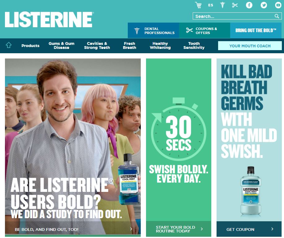
Riding on this, it is important for you to feature your customers prominently on your website. By doing so, you can trigger off the right feelings and emotions in their brain. Here’s an example from Listerine Mouth Wash.
Write Copy That Speaks To Your Customer
While a picture may paint a thousand words, it is the text which drives action.
The best websites do not just laud their brand’s benefits or features. Instead, they focus intensely on their customers concerns, needs, wants and desires.
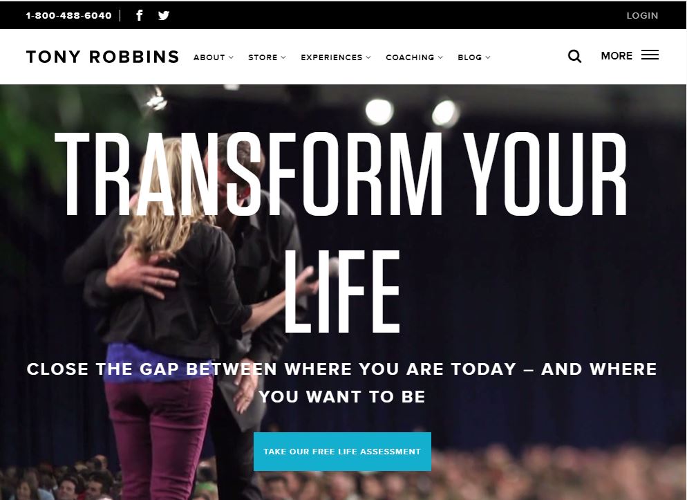
Here’s who world renowned motivational speaker Tony Robbins does it on his website. Beyond the flashy videos and emotionally stirring imagery, the website makes use of highly customer-centric language throughout its pages. An example can be seen from its home page below:
Show That You Care
“People don’t care how much you know until they know how much you care” – Theodore Roosevelt
In wrapping your content around your customer, you need to consider how you can embrace them – metaphorically speaking.
Depending on who your customers are, your content should be geared towards demonstrating empathy. Don’t preach from your brand pulpit. Instead, walk beside your customers like a friend offering advice and suggestions.
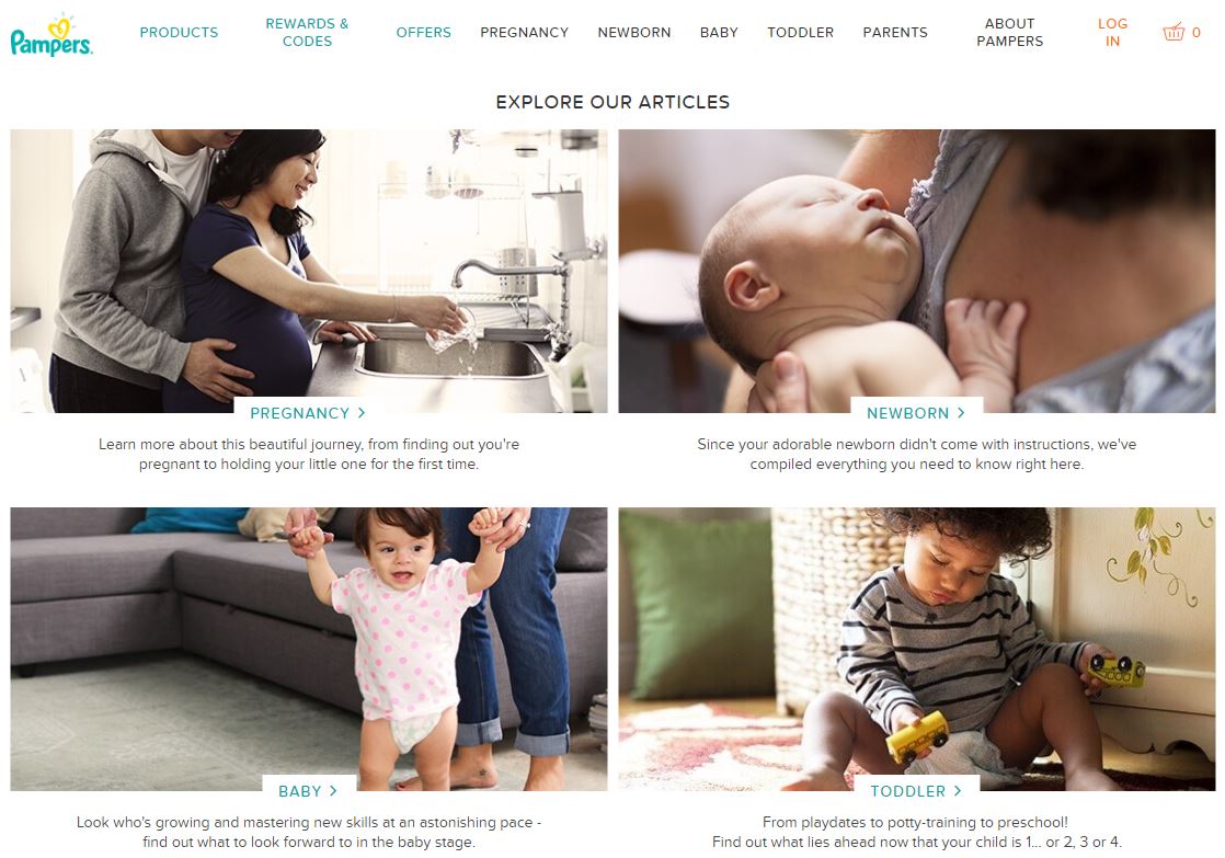
A clear winner here is Pampers. Their website is focused entirely on young parents from the pre-pregnancy to toddler stages. I love how they’ve crafted content which addresses their customer’s concerns throughout the different stages of having and raising a baby.
Guide Them With Useful Content
Utility (or Youtility) is at the heart of all content marketing efforts. Nobody will visit your website if all you offer are shill content nudging them to buy.
(Regular readers of my blog would know that I loathe to sell.)
If you focus on teaching your community how to become better at what they do, you’ll build heaps of goodwill, trust and respect. And guess who they’ll look for if they need help?
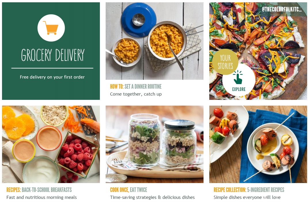
One of my favourite examples here is Whole Foods Market. Their website provides a tonne of useful content for home chefs. Visitors can pick up a wealth of valuable content – from weekly meal recipes to special diet meal plans to ideas for school lunch boxes.
Answer Their Most Common Questions
Tried to renovate your home without getting ripped off? Chances are that you’ll find it a nightmare trying to navigate the maze of building approvals, quotations, materials, designs, and furnishes needed to build your own home.
If only there is a website that lists down all the questions that a new home owner may ask.
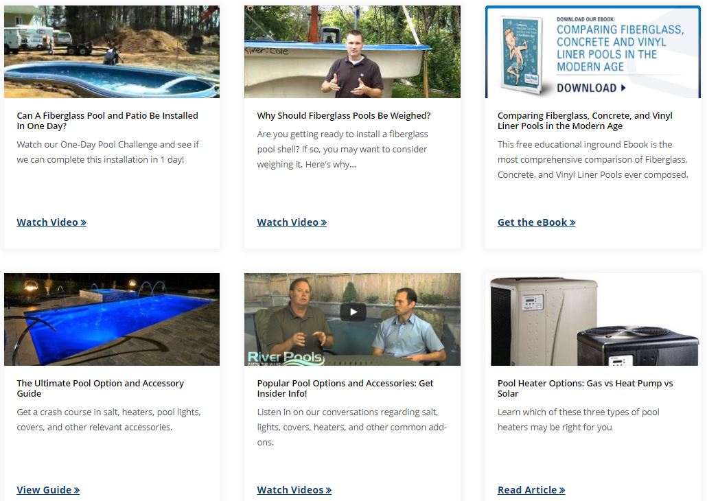
Well, if you’re looking to build a fibreglass pool in your home (lucky you!), you may find River Pools and Spas website a boon. Created by Marcus Sheridan, the company grew to become North America’s largest fiberglass swimming pool manufacturer and installer just by answering questions.
The company’s Learning Center has a whole host of Questions and Answers on possibly any topic that a potential customer may ask – from the size of different pool options, time needed to install a pool, to a comparison of different building materials. Have a look at some of the questions they answer below.
Share Your Customer and Stakeholder Stories
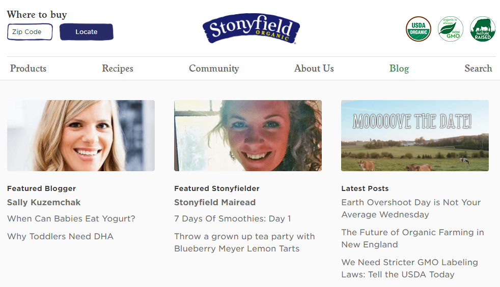
Stonyfield, the organic yogurt company, knows how to tell their brand story. Their website is rich with stories and content focused on the origins of their products, how they contribute to their community, as well as recipe ideas for yogurt lovers.
What you’ll find especially endearing, however, is the section of Stonyfield’s website focused on their stakeholders. In this case, both Stonyfield staff (aka Stonyfielders) and bloggers in their community are regularly featured on the website.
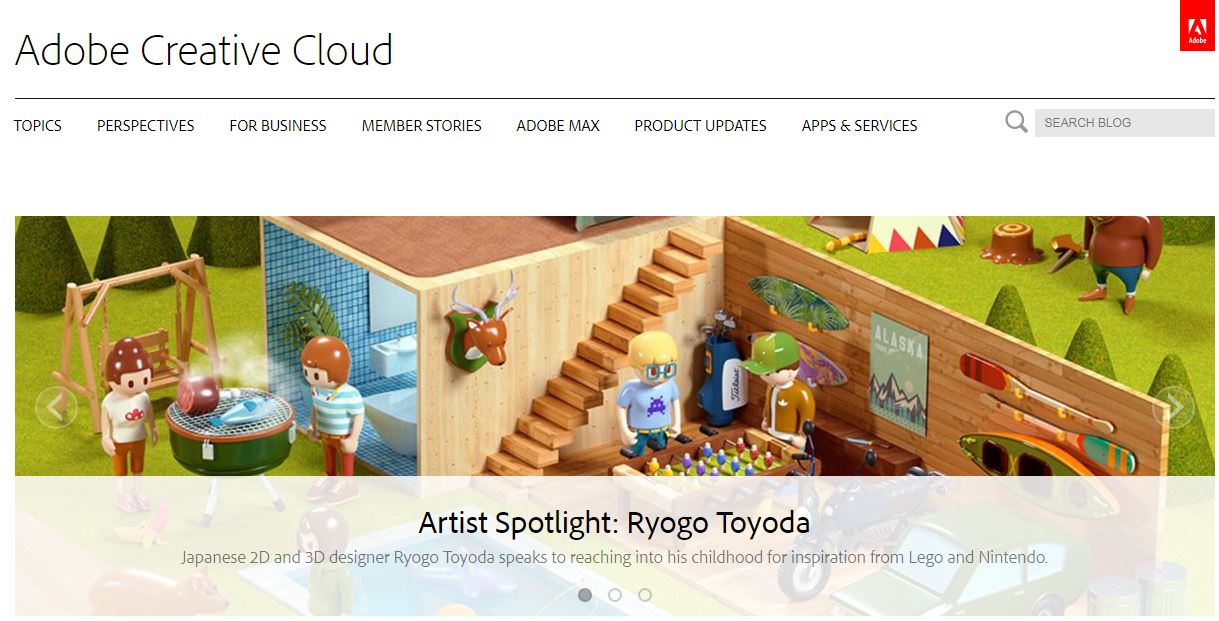
Adobe is another fore-runner when it comes to featuring their customers. Both their highly popular Behance online gallery and Adobe Creative Cloud blog profile their customers (mostly designers and artists) and the work which they do.
Make Your Website A Breeze To Navigate – And Buy!
To be truly customer-centric, you’ll need to design your website and write your content in a way that is intuitive to your customer.
This means using language which your customer immediately understands, and putting your Call To Action (CTA) buttons, links and navigational call-outs at the right places.
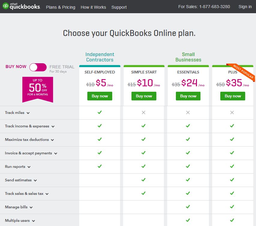
Accounting software provider QuickBooks is a exemplar of easy to navigate website. Their Plans & Pricing page provides a bullet points of the features available for each pricing plan, as well as which companies or businesses they are suitable for.
Talking about QuickBooks, this article comparing the features of QuickBooks Online with QuickBooks Desktop is another example of a nifty way to organise content to make it useful and easy for navigate.
Now that you’ve learned how you can boost your conversion rates on your website, the ball is over in your court.
How will you be revamping your website content to focus on your customer? I’d love to read your thoughts.