
Woman photo created by drobotdean – www.freepik.com
You ran the perfect digital marketing campaign. Or so you think.
Facebook fans are responding liking, commenting, and sharing your posts. You achieved a Cost Per Click (CPC) that is way below your industry’s average. Your organic reach is astounding.
Heck, your latest newly minted video is going viral! Plus you are getting some attention from influencers in your space – even your teenage son and his friends are talking about your latest “crazy” campaign.
However, something is amiss. People aren’t signing up for your programme. The sales orders are not coming in. The cash register is not ringing.
The problem, my friend, is conversion. Or rather, the lack of it.
Enter Conversion Rate Optimization (CRO)
One of the hottest buzzword in the digital marketing space now, Conversion Rate Optimization or CRO is defined as the process of improving the percentage of your web visitors to convert into a lead, subscriber or a customer.
Often, it involves studying the online behaviours of visitors to websites, tracing how they “move” and navigate through the page, and devising ways to get them to click on a Call To Action (CTA) button and respond to your offer.
There are two types of conversion:
- Micro-Conversions: Signing up for an email list, filling up a form to download an eBook, or signing up for FREE event
- Macro-Conversions: Purchasing a product online, requesting for a quote, or signing up for a PAID service
While it is possible to convert a prospect to a customer offline, doing so may not be as cost effective or efficient as doing it on a landing page on your website.
Unfortunately, many companies do not invest sufficiently in building conversion optimized web pages. Here are 10 of the most common mistakes that I see them committing.
#1 Slow Web Loading Speed
A slow website is a dead website. With a thousand online things to distract them with, your prospects will not hang around forever to wait for your website to load.
Here are some useful tools you can use to gauge your page load speed (and fix them):
- HubSpot’s Website Grader
- Google’s Page Speed Insights
Beyond ensuring that your website loads in a flash, you should also ensure that it is mobile responsive.
Either create a mobile-friendly version of your page, use a mobile plugin on your Content Management System (CMS), or start with a mobile-first responsive web design (more from Practical Commerce here).
#2 Poorly Developed Offer
Do your visitors know what you have to offer them? Are your benefits compelling enough to stand out from the competition?
A strong Unique Selling Proposition or USP is one that helps to differentiate your business from others.
The best USPs possess the following:
- Personality and swagger
- A unique style
- Outstanding customer service
- Focused on a specific target audience
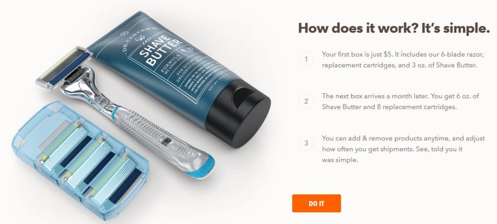
Dollar Shave Club has one of the best USPs I’ve seen on the planet, offering shaving men a neat, cheap and simple solution. Have a look at how its communicated on their website.
#3 Cluttered Web Design
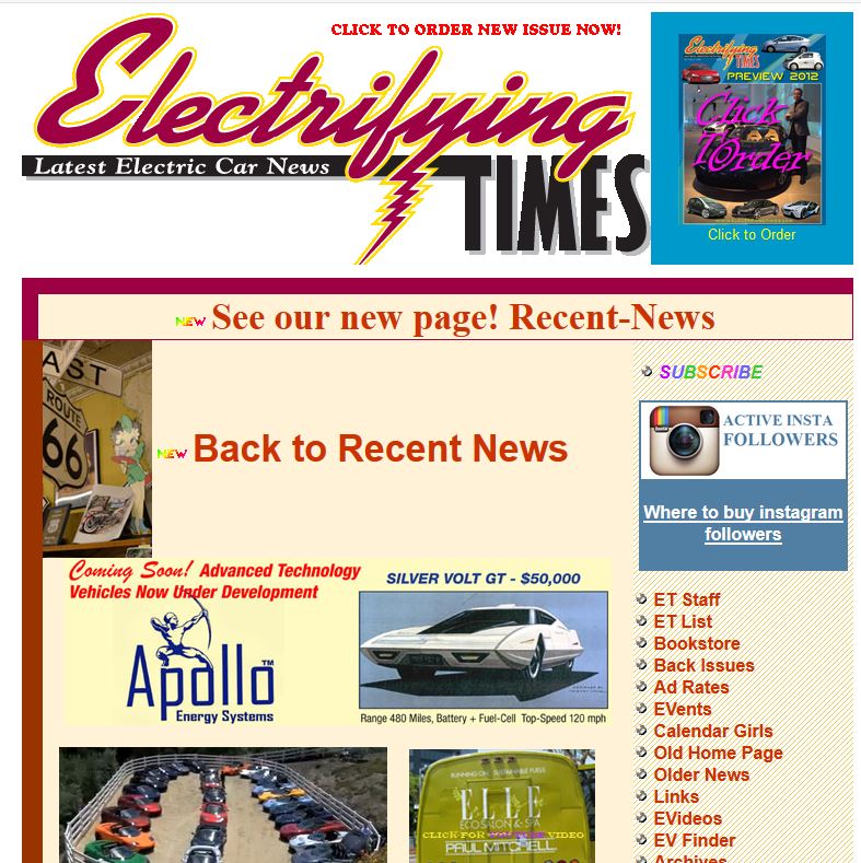
Given that the majority of your website visitors are going to view it on mobile devices, a cluttered web design simply will not do.
All you’ve got is a couple of seconds, and then they’ll zoom off faster than a speeding bullet.
Have a look at the Electrifying Times website below, and weep.
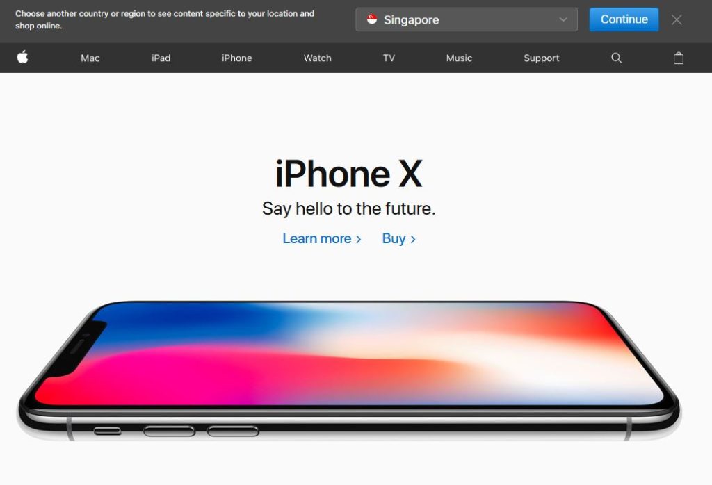
Thankfully, there are beautifully simple and easy to navigate websites out there. Like Apple, the world’s biggest “fruit” company.
#4 Lousy Visuals
I often find it amusing how companies are willing to spend so much on online advertising, yet fail to take a decent photo or produce a good video for their landing page.
Folks, visuals are IMPORTANT. Many people don’t even read the copy on websites anymore. Their eyes skip and dart from object to object.
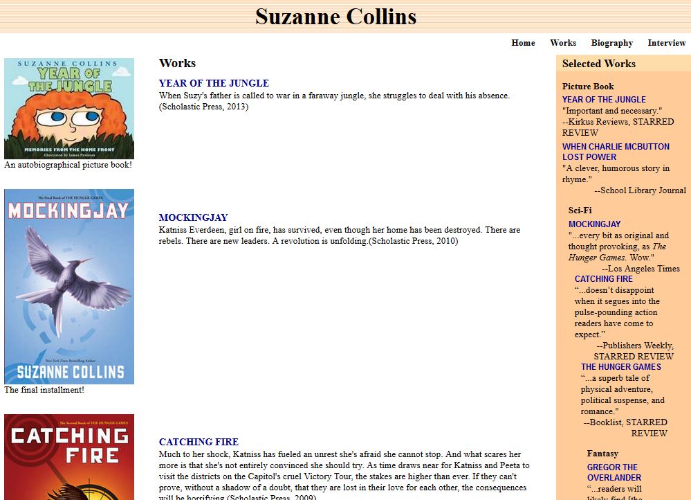
Hunger Games creator Suzanne Collins may be a phenomenally bestselling author, but the visuals on her website are something else altogether. And it isn’t even mobile friendly!
Have a look below.
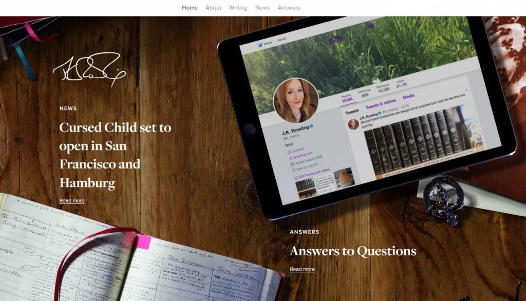
On the other hand, Harry Potter author J K Rowling’s website is simply….breathtaking! Have a look at how it cleverly uses a huge visual as the backdrop.
#5 Scary and Scammy Copywriting
Authenticity is the new name of the digital marketing game. Nobody likes a shill online, and trying too hard may often backfire against you.
I’ve seen so many Internet marketer websites filled with hard-sell copy that makes you retch.
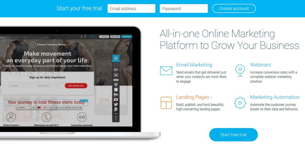
Thankfully, there are companies that get it. Like email marketing software provider Get Response. Their website design is easy to navigate, and copy is well-written without overselling.
#6 Lack of Social Proof
Social proof is the digital currency that can win you friends almost instantaneously.
For websites, it can help to reduce the inertia which comes from being inundated by numerous marketing messages and offers.
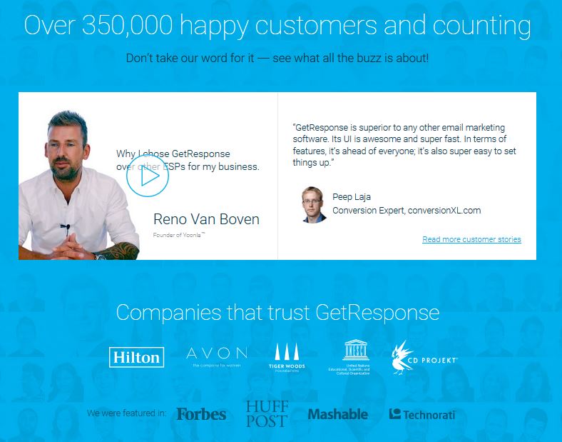
Once again, Get Response “gets” it here. Their website displays the total number of customers they have, plus some pretty nifty testimonials and endorsements on the home page.
#7 Too Many Choices
Have you heard about the Paradox Of Choice?
Conceived by British psychologist Barry Schwartz, the theory states that offering fewer options to your customers may actually help you to sell more.
Likewise, focus on only one main thing on your conversion pages. Make it simple and easy for your visitors to sign up for your programme or buy from you.
Make it easy for them to follow what you have, and guide them to a single Call To Action (CTA).
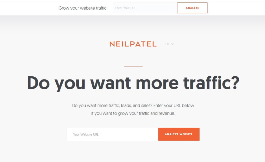
Neil Patel’s website is a great example of offering a simple and direct choice. See how its home page look below.
#8 Lengthy and Onerous Forms
Studies have shown that conversion rates drop precipitously when you ask people to fill up multiple fields.
Getting people to whip out their credit card number, annual income, and life histories is also a big “No no” when they chance upon your page for the first time.
Make it easy for people to download a eBook, sign up for a trial, or register for an event. Keep your data-fields to the minimum needed. You can always contact them for more information later.
According to Ascend2’s Email List Growth Survey, opt-in rates decrease significantly with more fields.
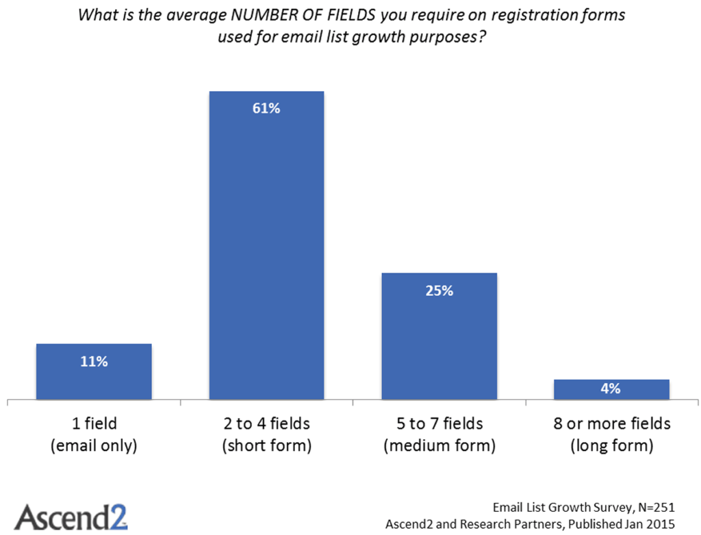
Courtesy of Pinpointe Marketing Blog
#9 No Trust Builders
Expecting a first-time visitor to immediately purchase from your website without any ‘proof’ is pretty unrealistic. Given the exponentially growing number of scams and phishing websites around the world, any online visitor would naturally be wary.
According to Unbounce, there are 15 ways for you to build trust on your landing page. Have a look at these and see if you can apply them—they may just be the thing to grow your business multi-fold online:
- Ensure that you provide brand & message consistency
- Offer some valuable content for free first—and consider doing it several times before you ask for the sale!
- Avoid gimmicky sales tactics
- Minimise popups/pop-unders—just one will do
- Use verifiable facts
- Use endorsements by famous people/organisations
- Write Terms and Conditions in layman’s terms
- Don’t ask for information you don’t need
- Use testimonials (see social proof above)
- Certification logos
- Professional design
- Don’t exaggerate
- Privacy policy statement
- Show a phone number
- Co-brand with a famous partner
#10 Poor Call To Actions (CTA)
Last, but certainly not least, you need to consider your CTA forms and buttons on your website.
Often, poorly structured CTAs have made it difficult for people to navigate landing pages and act on them.
Online video juggernaut Netflix certainly knows a thing or two about crafting CTAs. Look at how the home page of their website looks like.

Conclusion
Conversions are the holy grail of any digital marketing efforts. By avoiding these 10 common mistakes in the design and copy of your landing page, you can vastly improve the chances of your visitor filling in a form or contacting you with their enquiry.
Are there other ways you can improve your conversion rates through the art and science of CRO? I’d love to read your thoughts.

Nice Post for New seo learners
thanks great job
Hi Walter,
So many great points improving conversion rate optimization and thank you for sharing where most of us are lacking. Improving conversion rate is crucial but what what most important to develop a successful business website, here you can learn more about it: https://savedelete.com/design/how-can-you-develop-a-successful-business-website/
Nice Post
Useful Content
Very informative and useful for begineers. Thanks for sharing these type of useful post. keep posting.