Business vector created by pikisuperstar – www.freepik.com
Successful landing pages are concise, engaging, and — crucially — quickly sum up what you’re trying to offer and why a potential customer should be interested.
B2B products and offerings, however, can be challenging to describe quickly…
For a start, you may offer various related services or products.
These offerings may be comprehensive, fully featured or targeted at a specific niche with a unique or particular vocabulary — and, as a result, you might struggle to boil them down into a few sentences of marketing copy.
Fortunately, B2B landing pages can be just as powerful as any other — even if you’re selling a complex product or have a varied service catalog.
These tips, tricks and examples will help you design the perfect landing page to market your B2B business, regardless of your niche or the clients you serve.
The Do’s
1. Do: Provide Visitors With Value
An excellent landing page shows what your company has to offer. Whether you sell a product or service or provide free resources, highlight something specific on your page.
With a quick scan, visitors should understand what your business provides and how they can move forward in the decision-making process.
2. Do: Use Images to Communicate Your Services
“Hero” images or groups of graphics are a go-to technique for web designers — primarily because they’re prominent, relevant, visually engaging and help you communicate complex concepts at a glance.
For an example of how this looks in action, see this landing page from NTS Unitek, a Virginia-based supply chain quality company.
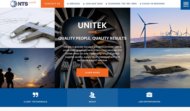
NTS Unitek provides a relatively wide variety of services, which may make the full breadth of the company’s offerings hard to communicate with text alone. Quality images help the company quickly summarize what it does, potentially intriguing visitors in the company’s target audience.
3. Do: Keep It Concise
The services you offer may be somewhat complicated, a little technical and challenging to explain well in only a few sentences.
However, overexplaining is more likely to cost you potential clients or users than it is to close sales.
It’s best to find a way to break down your offerings at a glance. If someone thinks your products may be for them, they’ll probably continue to research and move further along the sales funnel.
This landing page from Slack — best known as the developer behind the workplace communication tool of the same name — shows how short, attention-grabbing copy can be more effective than detailed, explanatory writing.
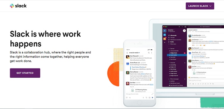
The header copy is engaging, but not too descriptive of the services Slack offers. The subheading explains a little bit more, though it primarily covers the basics. Much more detailed information is available deeper in the site.
4. Do: Use a Clear-Cut CTA
Landing pages will work best when it’s evident where interested visitors are supposed to go if they want to move forward in the buying process.
Before a visitor clicks on your CTA, they should have a good idea of where that button or link will take them.
For example, see this page from Singular, the developer of a marketing intelligence platform. There are two CTAs on this page — one directing potential clients to a demo scheduling form field, and another pointing them toward the company’s free trial option.
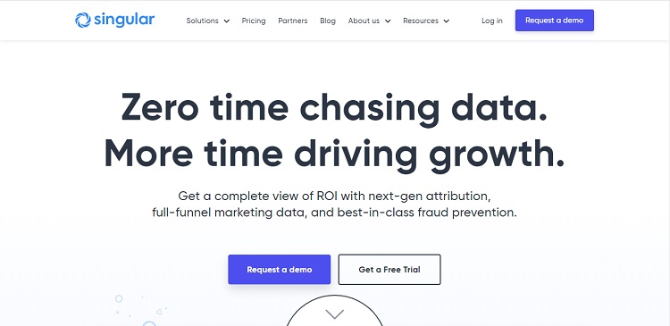
Both are unambiguous, and provide two options for potential clients wanting to investigate the product further.
5. Do: Avoid Extra Design Elements
Some companies strip away site navigation elements, like the header or sidebar, on their landing pages. This tactic helps keep the landing page as lightweight as possible, and reduces the possible directions an interested visitor can take — making it more likely they move to conversion.
This move isn’t the right decision in every situation. However, it can be a valuable tool if you find your customers tend to veer away from your landing pages and CTAs to look elsewhere on your website.
The Don’ts
1. Don’t: Double up on Campaigns
If you are using your landing page to promote a specific service or campaign — rather than all your company’s offerings — it’s a good idea to avoid doubling up.
Trying to advertise one offering may be hard enough. Two or more, especially if they’re relatively varied or marketed to different segments in your target audience, can quickly make a landing page confusing.
Where possible, keep pages simple and clean. Advertise the most crucial and relevant offering, instead of trying to cover multiple bases simultaneously.
2. Don’t: Ask for Too Much Info
Long lead forms can be a conversion killer — the more details you ask a visitor to enter all at once, the more likely they are to navigate away, especially if they are already short on time.
Even if you need to ask for a lot of information up front, you can organize your lead forms in a way that makes them look less intimidating.
Spreading lead forms over a series of pages, or creating forms with multiple columns so the overall form takes up less space, can help cut down on lead form appearance without stripping out any fields.
3. Don’t: Make Your Visitors Scroll
Relevant info should be visible at a glance. Don’t tuck a central landing page element below the fold, like your CTA or part of your form field.
If your users feel like they have to hunt for the information they need to move forward in the buying process, they may be much less enthusiastic about proceeding.
How Any B2B Company Can Build a Robust Landing Page
B2B businesses face some unique challenges when it comes to creating a landing page. However, with the right practices, you can build an effective landing page for whatever service or product you offer.
Keeping the landing page clear, making your page copy concise and using hero images to communicate what you’re selling will all help you design engaging landing pages that can drive conversions.
(PS—you can also read more about building effective landing pages in this article.)
Lexie is a graphic designer and marketing enthusiast. She loves checking out local flea markets and taking her goldendoodle on hikes. Follow her on Twitter @lexieludesigner and check out her design blog, Design Roast.