
Why do your customers prefer certain websites over others? Can you improve your digital marketing results by appealing to their brains?
A firm believer in the power of neuromarketing and marketing psychology, I’ve always believed that digital marketing is more about psychology than technology.
Thanks to the book Neuro Design by Darren Bridger, I’ve learned many useful neuromarketing principles that can optimize your digital marketing performance.
Before we dive into these concepts, let us first learn what neuro design is all about.
What is Neuro Design (And Why Does It Matter)?
Using insights from neuroscience and psychology, neuro design is the art and science of creating effective designs.
It draws from fields like computer image analysis, behavioral economics, and evolutionary psychology to conceive more powerful ways to influence human behaviours.
In digital marketing, you can apply these neuromarketing principles to improve the effectiveness of your websites, landing pages, videos, emails, infographics, banner ads, and other digital campaign materials. By tapping on both your prospects conscious and unconscious mind, neuro design can increase the effectiveness of any marketing channel.
There are seven key principles in neuro design covered by the book:
- Neuroaesthetics: How insights from neuroscience can influence aesthetics in digital channels
- Fluency: The ability to process information in a non-conscious and less energy-sapping manner
- First Impression: Why humans rely on “thin slicing” to make quick judgements
- Visual Saliency: How our brain visually processes and prioritizes information
- Behavioural Economics: Psychological “short cuts” to decision making
- Screen Centric Designs: Why we process information differently on screens
- Viral Design Principles: Characteristics of viral images and videos
Let us learn some of the salient points from each of these principles.
#1 Neuroaesthetics

A relatively new field, neuroaesthetics uses neuroscience to understand why we find certain things to be more beautiful than others. Two leading neuroscientists—Vilayanur Ramachandran and Semir Zeki—have developed useful theories in this arena.
a) Ramachandran’s 9 Principles
These universal laws of art explain why we get a mini jolt of pleasure when we encounter something.
- Peak Shift and Supernormal Stimuli: Exaggerating an element of a person’s face (eg large nose), or a feature on a landscape makes them more distinctive and memorable
- Isolation: Use white space around design elements you wish to draw attention to, and avoid clutter
- Grouping: We tend to prefer similar shades of colour, patterns, and hues
- Contrast: Objects with good levels of contrast are more easily recognised
- Peekaboo: Simple, easy-to-resolve visual puzzles can capture attention—consider partially obscuring an object very familiar to viewers
- Orderliness: We prefer regular and orderly patterns
- Visual Metaphors: Borrow from cartoonists to make your text reflect the meaning of the words, or design images that communicates concepts (read this article for more).
- Abhorrence of coincidence: Visual coincidences feel wrong—we tend to think that they are improbable
- Symmetry: Symmetry is pleasing to our eye
b) Semir Zeki’s Laws
Informed by the work of artists, Zeki claims that different visual elements are processed at slightly different times. Often, we process colour, then form, then motion. Thus, if you are trying to convey a particular element—colour, form, movement, line orientation—it works best to dampen down variation in other elements.
There are two laws here:
- Constancy: We tend to recognise objects and process them based on their rasa—ie their essence.
- Abstraction: In our minds, we tend to have ideal models of things we rarely see in the real world. Art can provide us with visual examples of these ideals.
#2 Processing Fluency
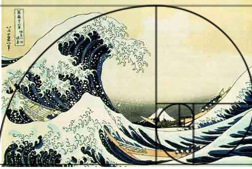
Example of a fluent artwork using Fibonacci Sequence (image source)
Our brain has two systems:
- System 1 is automatic and effortless, driven by what we see, non-conscious, superficial, perceptual in fluency, and the default mode for judging images.
- System 2 requires more effort and attention. It is driven by the viewer’s thoughts, conscious, triggered by our motivation to understand more about an image, mainly conceptual in fluency, and more in-depth.
The best designs have both conceptual and perceptual fluency. They possess what’s called propositional density—conveying as much meaning as possible, with as little graphical detail as possible. These have low surface complexity and high information content.
Logos are a good example: the Apple logo depicts an apple with a bite taken out of it, yet carry multiple elements of meaning.
Beyond this, other factors can influence how well we like an image:
- Novelty: A novel image is preferred if it carries a lot of meaning that is easy to decode
- Exposure helps make the unfamiliar familiar (and more likable)
- Compressible patterns are easier to process and preferred—this is called the ‘beauty in averageness’ effect where we prefer average or prototypical images
- Low-complexity designs with an underlying regular pattern are easier to compute. Examples include geometric patterns found in nature like the basic shapes in trees, lightning, river and lungs.
To make your designs more fluent, consider the following:
- Incorporate familiar designs but include intriguing details (propositional density)
- Inject higher levels of contrast between subject and background
- Adopt self-similar patterns—simple on the surface but with intriguing compressible information within. These have low Kolmogorov complexity.
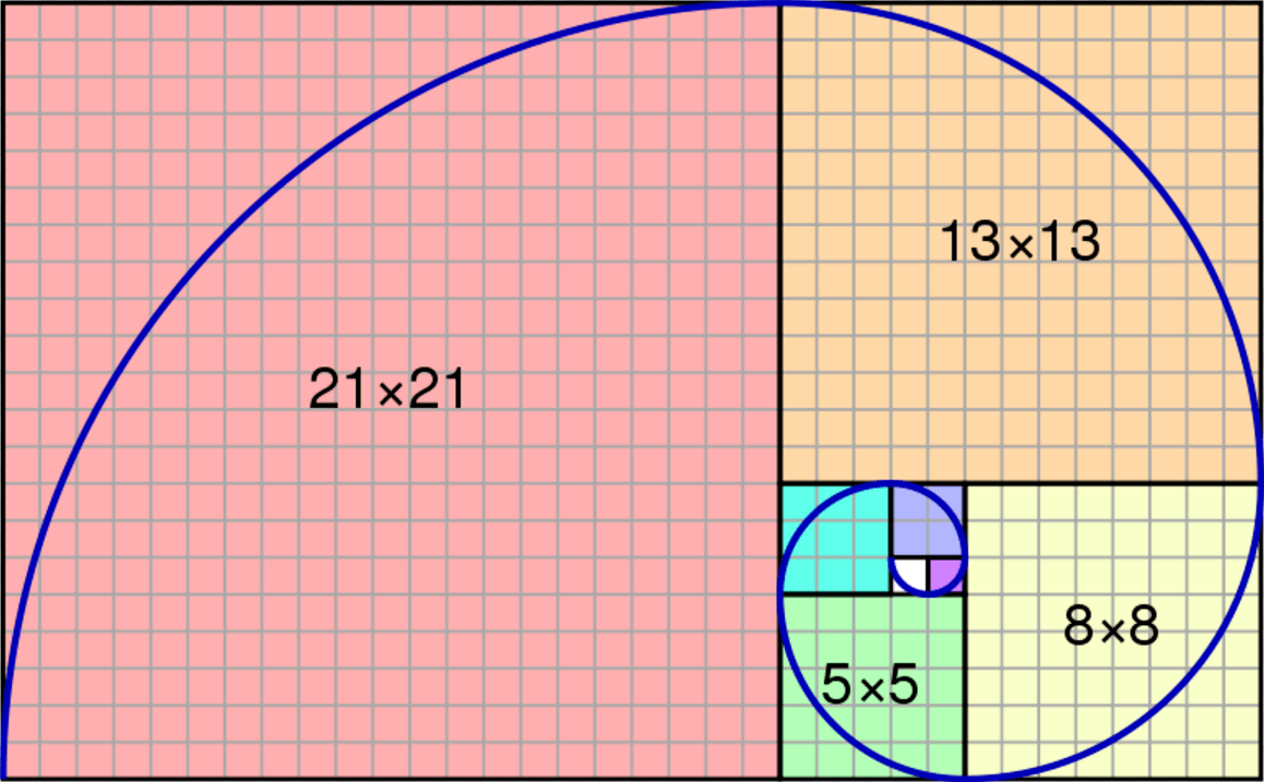
- Use the Fibonacci sequence (see below)
- Employ fractal patterns (see below) like those in nature

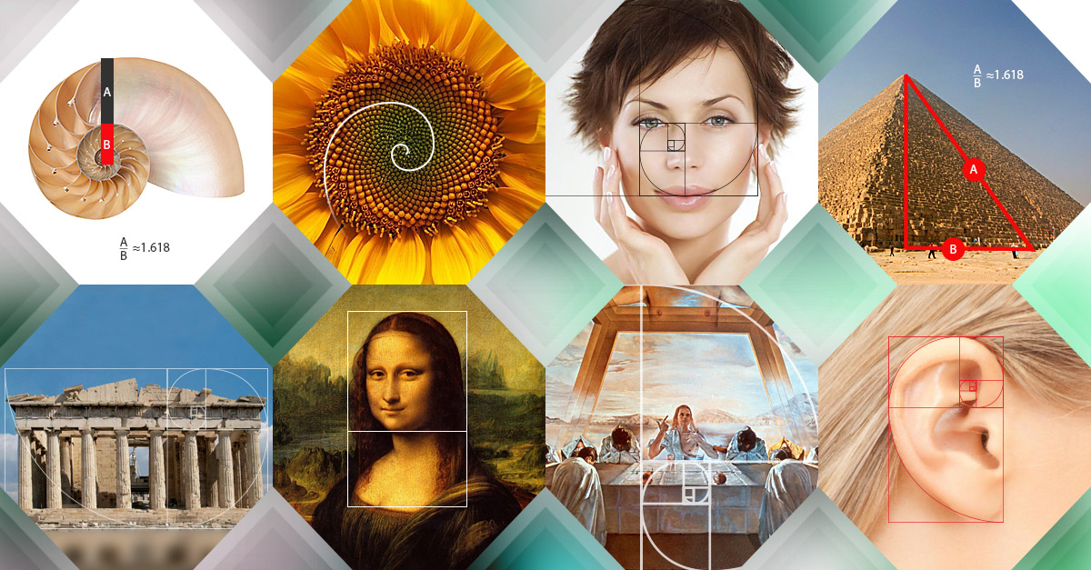
- Use the Golden Ratio—a pair of lengths where the difference between the long and short lengths is the same as the difference between the total length and the long length. See examples below:
Courtesy of Company Folders
- Rule of Thirds—the universal rule used in photographs
- Symmetry, preferably around a vertical axis, followed by horizontal axis and diagonal axis
- Preference for the left, aka pseudoneglect—our tendency to be more influenced by visual things in our left visual field
- Use of a visual hierarchy to guide our viewer’s eyes
- Priming and context—the phenomenon where exposure to something makes things we strongly associate with easier to recognise and understand
- Perceptual subitizing—our ability to instantly see how many things there are—is usually limited to three or four items
- Orientation sensitivity and oblique effect—our preference for lines, edges and objects to be vertical or horizontal. Multiple edges should be at least 30 degrees apart.
- Use of embodied cognition, eg using body metaphors that are intuitive. For example, when we say we have a rough day, or smooth day.
- Show not tell—Showing images lowers cognitive load for users.
#3 First Impressions
Like the rest of us, your potential customer is going to make snap judgments. Also called the halo effect, these first impressions tend to last.
An example is the ‘beautiful is good’ impression where people think that those who are physically attractive are also more intelligent and trustworthy.
There are some valuable lessons here.
First, showing your brand too early risks turning people off. Next, humour works well. Other emotional tones, particularly suspenseful in the first five seconds, helps to sustain attention. Using a recognisable face also prevents viewers from clicking away.
Designing progress bars on loading websites, especially those with a ribbing effect, helps to reduce clicks away.
Consider too the influence of prototypicality (how well a design matches a typical format), and the importance of having simple and clear imagery.
#4 Visual Saliency
Our visual system works in both a bottom up and top down approach.
Bottom-up processing involves raw visual elements like colours, contours, contrasts, luminosity, movement and textures. They are autonomous and pre-attentive.
Top-down processing are more memory, context and goal related. They can only occur with one small area at a time.
To achieve visual salience, we need to design objects to be different from their background:
- Inject some movement for moving images and videos
- Include bright colours, patterns (stand out from background) and size (larger better) to stand out
- Consider cues in a design to suggest depth, shape, or flicker
You can use visual saliency mapping software to determine how people look at web pages. This could include eye tracking
#5 Behavioural Economics
Contrary to popular advertising belief, the old AIDA (Attention, Interest, Desire, Action) model may not work that well.
Persuasion is influenced by factors like saliency, processing fluency, first impressions, and the affect heuristic (the phenomenon of making something emotionally charged to sway people in your favour).
People are also not that rational—our behaviours may influence how we think more than the other way around.
To address this, we can inject behavioural economics principles to allow people to take mental shortcuts. These help our prospects to overcome three barriers that usually block them from buying:
- Risk
- Uncertainty
- Difficulty
Start with designing the right forms. Make it easier for people to fill in the blanks so to speak.
Heuristics (non-conscious shortcuts or rules of thumbs)
Here are some quick ways to smoothen and quicken your prospect’s decision making process:
- Mental availability: Ensure that the information required is readily available (eg including calories in food) or use visual ways to communicate abstract ideas (eg infographics).
- Anchoring and framing: Provide comparisons to show what good value your product or service is, and include it in a choice set to look like a good option.
- Hyperbolic discounting: We tend to value pleasures and rewards in the moment more than the future. Hence, find a way to immediately gratify your users!
- Loss aversion: Include free trial schemes to give people ‘ownership’ of your product early
- Social proof: Find a way to let other people know that others like them have used your product and enjoyed it
- Fairness and reciprocity: We like to reward companies and brands that treat us well
Beyond the above, do also consider incorporating visual nudges to influence or evoke behaviours. For example, using green, amber or red coloured icons to denote good, average or bad.
#6 Screen Friendly Designs
To make your content stand out on screens, consider using frames to boost visual saliency. These can increase the contrast in an image.
Make reading on screens easier by writing shorter copy, using easier words, and encouraging skimming or scanning. You can also make use of the Flesch-Kincaid readability formula to make your text easier to scan online.
Consider too the effect of fonts—use those which are easier to read on mobile devices.
Note too that people online tend to behave more honestly. This is called the disinhibition effect, and it means that they may be more open to sharing more information about themselves.
Using videos or rich imagery can help to make your user feel good about doing business with you and generate feelings of security.
You should also employ gamification techniques to reward loyalty, or progress on a specific regime.
Finally, consider the central fixation bias when you design for a sreen, as well as the horizontal viewing bias (we prefer to scan from left to right rather than up and down.
#7 Viral Designs

Last, but certainly not least, the right kinds of design can help your content to go viral.
Memes were first introduced by Richard Dawkins in his book The Selfish Gene as an idea that can get adapted and copied. It normally includes mash-up imagery borrowing images from pop culture, leading to their familiarity appeal. Or they may propagate something with widespread appeal like cute cats or babies.
Internet Memes often include popular characters like Barack Obama, Jackie Chan, Freddie Mercury, and others. They usually include some text and are written to tap common feelings, eg “Remember how it feels when…” or “You know how you feel when…” or “That moment when your mum steps into your room…”
Most memes tap the following neuro design principles:
- Peak shift effect: exaggerated features of caricatures
- Minimalism: simple and easily understood
- Unexpected familiarity: incorporate universal feelings that are unexpected yet familiary
- Prototypicality: pure expressions of typical feelings that we all have
- Emotional appeal: Appealing to social emotions like embarrassment, incredulity or admiration
- Visual saliency: Colourful and tend to pop out to catch attention
- Social proof: Sharing memes help to bond people socially to an in-group
Mimetic desire is the desire or wanting that we experience when we see someone selecting an object. It is an effect of our mirror neurons.
Conclusion
Rooted on how your customer (or would-be customer) thinks, feels and acts, neuro design helps you to tap on the power of neuromarketing to design and create better online channels and content.
By applying these principles, you’ll be able to nudge your viewers and prospects to take the right action. This leads to greater profitability and better ROI in your digital marketing efforts.
Have you considered any of these psychological and neuroscience principles before? Which ones would you adopt and why?