Wish to improve brand perception, increase sales, and grow bottom-line performance? Start with your landing page.
Almost every element of your landing page can be the difference between a conversion and a customer who clicks away.
While most business owners know how important landing page design can be, only some consider customer experience (or CX) when creating these pages.
Customer experience is commonly overlooked in landing page design, but is possibly one of the most important elements in creating pages that convert.
These five reasons show why every business owner and website designer should consider CX when creating a landing page.
1. Landing Pages Are a Key Brand-Building Opportunity
The most effective landing pages should be closely aligned to your business’s overall brand. This helps to make your landing page stand out from the competition, while allowing you to build your brand at the same time.
Simple considerations like tone, colour, shape, language and the use of graphic design elements can have a major impact on how customers feel about your brand identity.

We know from CX research that visitors develop opinions on pages extremely quickly — within just 50 milliseconds (or 0.05 seconds) according to some studies.
Before visitors read anything about what you’re promising, they’re taking in the look and feel of your page and judging your brand purely based on its online aesthetics.
At the same time, these aesthetics present an invaluable opportunity to build your brand and reinforce associations which visitors may have.
Carefully aligning your landing pages with your overall branding strategy will help you both create more effective designs and strengthen your business’s identity at the same time.
2. Small Details Can Set Visitor Expectations
Even the smallest changes to a landing page can have a major impact on how they’re perceived by visitors. Changes that help your visitors to know what a link will do are often some of the most impactful edits you can make.
For example, check out this landing page from ParetoHealth, an employee health benefits solution provider.
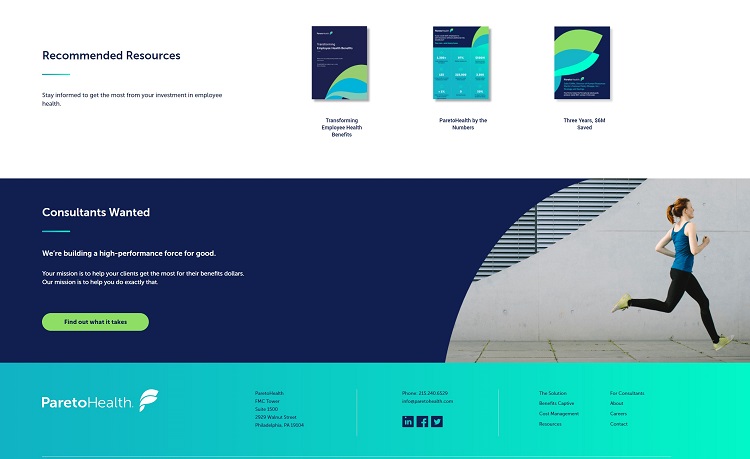
Its recommended resources section uses a few design elements to clearly set visitor expectations.
The combination of the resource title and a preview image of the resource helps visitors know roughly what each link will contain — reducing the risk that they may get lost or end up browsing content that’s not relevant to their interests.
Descriptive titles like “Three Years, $6M Saved” also help to guide visitor expectations — before you click, you have a good idea of the message this graphic is going to communicate.
3. Interactive Design and Real-Time Communication
Real-time communication is one of the best ways to field visitor questions as they arise.
New tools like chatbots, live customer service chat and co-browsing allows you to provide direct support to visitors who are already interested in your brand.
Even simple interactive elements can go a long way if it’s not possible for you to implement an AI-powered chatbot or labour-intensive live chat widget.
For example, check out this landing page from Landbot — a developer of interactive chatbots for landing pages.
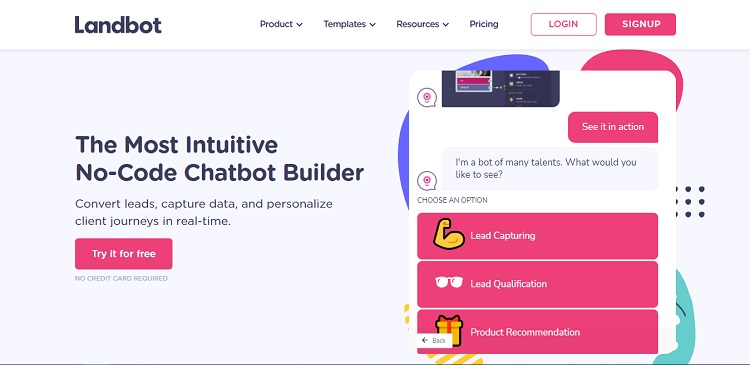
The page shows off what the company offers using an interactive chatbot that, through pre-set dialogue options, allows a visitor to learn more about the service at their own pace.
The site effectively functions as both an interactive help system and product demo. If potential customers have questions about how the service works or what kind of utility it can offer, this page can probably put some of their concerns to rest.
Interactive elements like these can let you provide a lot of information to a visitor without overwhelming them with large blocks of text. If you want to explain what your business offers, find ways to slowly introduce information — like Landbot does here — in order to seriously boost your landing page’s CX.
4. Simplicity Sells
Landing pages typically work best when they do as little as possible. Because visitors form opinions within just 50 milliseconds, simpler and easier to digest designs usually work better than designs that communicate more but are complex.
This landing page from Shopify shows how simple you can make a landing page with the right approach.
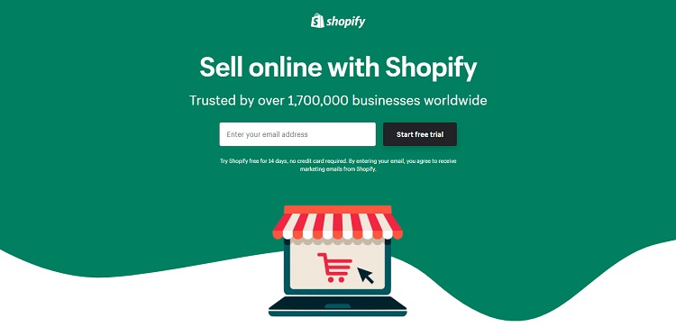
The design, palette and copy are all simple and clear. Additional information on the benefits of Shopify are available, but tucked beneath the fold, helping to keep a visitor’s initial impression as clutter-free as possible.
The biggest elements on the page are the tagline and the email submission field, which takes the visitor to the next step in the sales process.
Some information and explanation will always be necessary. Keeping your landing pages as light as possible, however, is a great way to make them more compelling and easier for visitors to understand.
5. Demonstrating Value Can Help Convince Visitors
Every landing page worth its salt works hard to persuade its visitors to take a specific action. While the proposition may vary from page to page, it is in your business interest to quickly assure potential customers that you offer a unique and valuable service.
Demonstrating this value can be difficult. Non-tangible assertions tend to less convincing to a prospect — for example, you may say your business can save customers money, but they may not trust you unless you can show them how much they can save.
This landing page from Wise, a financial technology company specializing in international transfers, shows how hard numbers can be convincing.
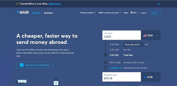
The interactive widget on the side of the page shows exactly how much it will cost to transfer money abroad using Wise’s service. Users can easily adjust the amount they want to send and instantly receive an estimate of how much the transfer will cost.
This frictionless calculator makes it easy to get a real-world sense of what Wise’s data will look like in a customer’s life.
These numbers can easily be compared with estimates from other wire and transfer services located beneath the fold — letting customers know how much they can save.
The design is simple, but quickly shows how much the company’s service is worth in real dollar terms. This can help turn the abstract UVP on the left side — “A cheaper, faster way to send money abroad” — into a concrete proposition.
Using real-world numbers and similar evidence — like testimonials, reviews and case studies — can help make your landing page more convincing.
How to Prioritize CX on Your Landing Pages
When designing landing pages, simple tweaks can help you ensure the best customer experience possible.
Considering the user experience and how the landing page fits into your overall branding and customer acquisition strategy can help you find the right changes to make.
In general, simplicity and brand alignment are good places to start.

Eleanor Hecks is editor-in-chief at Designerly Magazine. She was the creative director at a digital marketing agency before becoming a full-time freelance designer. Eleanor lives in Philly with her husband and pup, Bear.